22 proportion
“Without proportion there can be no principles in the design of any temple; that is, if there is no precise relation between its members, as in the case of those of a well-shaped man.”
VITRUVIUS (ITALIAN, C. 80–C. 15 BCE) Architect, Author, Engineer
pro·por·tion \prə-'p r-shən\ n
3: the relation of one part to another or to the whole with respect to magnitude, quantity, or degree
Proportion is the systematic relationship of one thing to another in any given composition. In visual communications, it is an essential design principle defined as the integral relationship of sizes within a composition. These integral relationships are transparent and function as an underlying framework for all compositional elements. Proportion also represents the critical relationship between one part of a composition and another or between the whole of a composition and its size, quantity, or degree. Generally the goal of any proportional system is to produce a sense of coherence, harmony, and integrity among the elements.
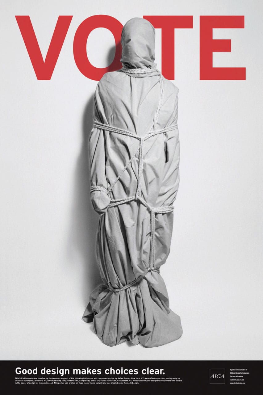
This poster, sponsored by AIGA and promoting the get-out-the-vote campaign for national elections, presents a simple, evocative, and intriguing image and message. Posed in front of bold, sans serif typography that spells “vote,” an enig-matic figure is wrapped and bound, ultimately raising questions about freedom, identity, self-expression, change, and power—and their opposites. The vertical proportion of this poster’s format, married with the monumental proportion of the wrapped, bound figure and its vertically proportioned letterforms, further creates a seamless and integrated visual composition.
ALFALFA STUDIO LLC
New York, NY, USA
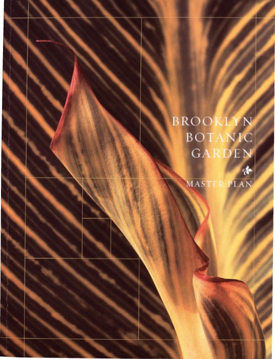
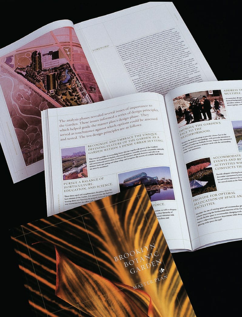
This book’s proportional format, as well as its interior layout, is derived from the Brooklyn Botanic Garden’s overall plan designed by the Olmsted Brothers and based on the golden section or rectangle. This proportional formula is also graphically articulated as a continuous series of hairline borders and frames that contain, isolate, and highlight a wide range of photographic, illustrative, and narrative content throughout the book.
POULIN + MORRIS INC.
New York, NY, USA
Historical References
Proportion has shaped our visual world throughout history—it is an intrinsic part of the Parthenon (432 BCE), da Vinci’s Mona Lisa (1519), and Michelangelo’s David (1504).
Euclid (c. 300 BCE), the influential Greek mathematician, was the first to put the theory of proportion into words and images. He divided a line into two sections in such a way that the ratio of the whole line in relation to the larger part is the same relationship as the larger part is to the smaller.
Vitruvius (Italian, c. 80–c. 15 BCE) defined proportion in terms of unit fractions, the same system used by the Greeks in their orders of architecture.
One of the most universal images representing the visual theory of proportion is Leonardo da Vinci’s (Italian, 1452–1519) iconic drawing Vitruvian Man (c. 1490), which first appeared in the 1509 book, Divina Proportione, by Luca Pacioli (Italian, 1445–1517). It was here that daVinci attempted to codify proportion based on his studies of the human form, as well as his numerous observations and measurements of proportions for all its parts. He referred in these notebooks to the works of Vitruvius. Many artists of the Renaissance subsequently used proportion as a primary design principle in their work.
In the fifteenth century, Albrecht Dürer (German, 1471–1528) determined what characteristics of the human body were visually balanced and beautiful by accurately measuring and documenting its proportions.
1957
Univers Family of Typefaces
ADRIAN FRUTIGER
Paris, FR
Adrian Frutiger and Univers
ADRIAN FRUTIGER (Swiss, 1928–2015) is one of the most prominent typographers of the twentieth century and the designer of one of the most notable typeface families ever to be created—the sans serif Univers.
As a young boy, he experimented with invented scripts and stylized handwriting as a negative response to the formal, cursive penmanship being enforced at the Swiss school he was attending. At the age of sixteen, he began a apprenticeship as a compositor with an Interlaken printer. During this apprenticeship, he also learned woodcutting, engraving, and calligraphy.
Between 1949 and 1951, Frutiger studied at the Kunstgewerbeschule (School of Applied Arts) in Zurich. In 1952, Charles Peignot (French, 1897–1983) recruited Frutiger for Deberny & Peignot, one of the world’s foremost type foundries in Paris. At that time, Deberny & Peignot was using a new phototypesetting process and wanted Frutiger to adapt typefaces for it, as well as design a large, matched typeface family of different weights. During this period, he began to design the Univers family.
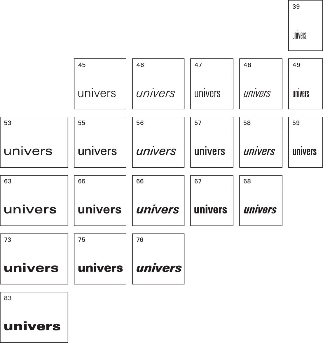
The twenty-one variations of the Univers typeface family have five weights and four widths. At its center is Univers 55, the equivalent of a standard “book” weight. Frutiger also proposed to abandon imprecise terms such as condensed, extended, light, bold, roman, and italic, and instead use a reference numbering system that illustrated the proportional relationships between each variation. At the time, it was a revolutionary concept of how typefaces and their related families could be described.
He also created a visual “periodic table” for the Univers family—its vertical axis identifies different weights, and any variation beginning with the same number is of the same weight. Its horizontal axis identifies perspective shifts, from extended to condensed with italic variations. Any weight ending with an even number is italic. Roman variations are designated with an odd number, oblique variations with an even number.
With the design of Univers, Frutiger also started a trend in type design toward a larger x-height with lowercase letters proportionally more similar to their ascenders, descenders, and capitals. The sizes and weights of Univers’s capitals are also closer in size and weight to its lowercase letters, ultimately creating a page of text with visual harmony and ease for the reader.
The Univers family of typefaces is known for its remarkable visual uniformity, which enables a graphic designer to use all twenty-one fonts together as a flexible, integrated typographic system.
In 1986, Adrian Frutiger was awarded the Gutenberg Prize for technical and aesthetic achievement in typography.
The three-column page grid of this publication for Lux, a regional theater and arts center in southern France, is fully integrated to, as well as based on, the proportional design principle of the golden section. The use of this proportional page relationship further guarantees visual cohesiveness and continuity throughout this publication, as well as related posters, announcement cards, and collateral print material that is diverse and varied with
HELMO
Montreuil, FR
Basic Relationships
Not obvious, and not hidden, the principle of proportion can be simply conveyed. In Priya Hemenway’s Divine Proportion: Phi in Art, Nature, and Science, she states, “The whole is to the larger in exactly the same proportion as the larger is to the smaller.” Proportion lends insight into the process of design and gives visual coherence to com-position through visual structure.
In basic proportional relationships, the outer dimensions determine the format of a two-dimensional composition and are its most basic proportion. A square and rectangle are formats with unique proportions that affect particular characteristics of a composition. Outer proportions or dimensions can have an integral relationship to internal divisions and alignments, affect the viewer’s orientation, and are often dictated by the composition’s ultimate proportion.
The relationship between outer dimensions and internal divisions also provides you with a system for managing design decisions. Proportional systems have been used for centuries in architecture and art, and are based on ratios—a comparison of one set of sizes with another. Although ratios are commonly expressed in mathematical terms, they also can be expressed as visual relationships. For example, the golden section is a ratio that dates back to the ancient Greeks, and its proportional properties have both aesthetic beauty and structural integrity.

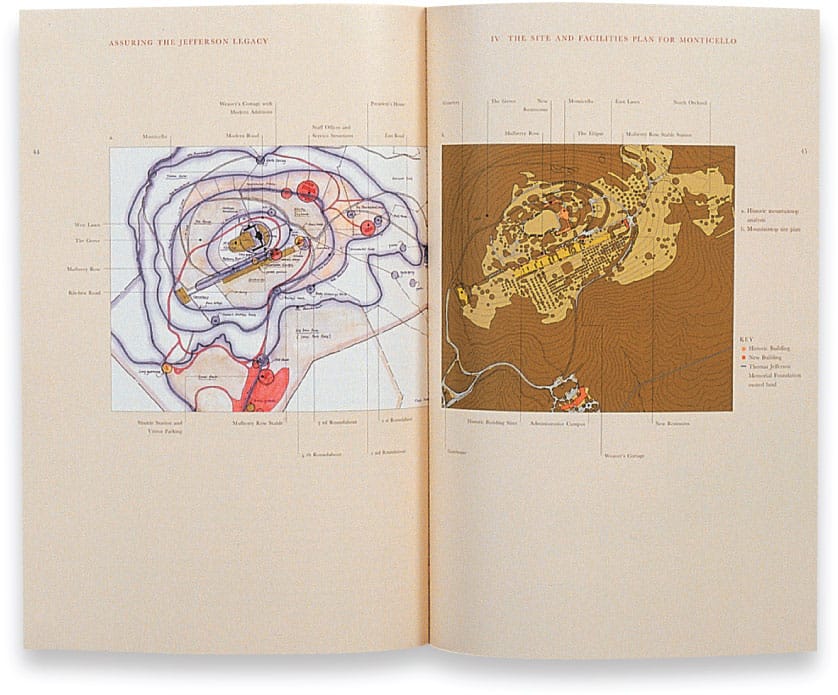
The format and page design of Assuring the Jefferson Legacy: The Site and Facilities Plan for Monticello is fully influenced by the design and planning principles used by Thomas Jefferson in all of his work. These visual principles are reflected in the book’s layout, typography, and color palette. They are also evident in the overall proportion of the book, which is based on the golden ratio, furthering Jefferson’s ideal of harmony found in nature as well as in the built environment.
POULIN + MORRIS INC.
New York, NY, USA
The Golden Ratio
The golden ratio is the ratio between two segments or elements of an object such that the smaller (bc) segment is to the larger segment (ab) as the larger segment (ab) is to the sum of the two segments (ac), or bc/ab = ab/ac = 1.618.
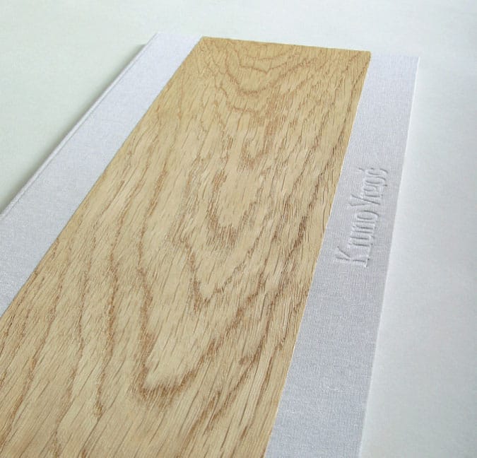
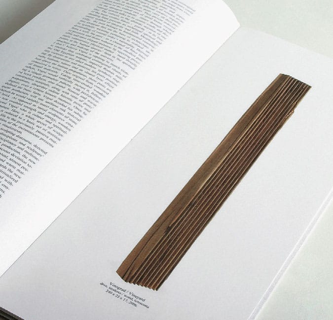
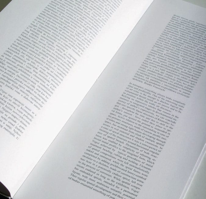
The relationship of form and content is an obvious influence in the design of this monograph for Kruno Vrgoc (b. 1957), a Croatian artist and sculptor. The extreme vertical proportion of this monograph’s format is directly reflective of the artist’s use of similar extreme proportions in his sculptural work. This format is enhanced and strengthened by a textural wood detail on the cover with its grain oriented on the same vertical axis as the book, as well as the use of a singular column of justified typographic text.
STUDIO SONDA
Poreč, HR
It can be found throughout nature, as well as throughout the history of visual and applied arts. This proportional ratio is evident in natural forms such as pinecones, nautilus shells, seed patterns in the center of sunflowers, and the human body. It is constructed through a series of extended relationships with a strong aesthetic harmony, since the interior proportions relate in scale to the proportions of the original square and its extensions.
The golden ratio can also be extended to construct the golden rectangle, which the Greeks used as the basis for the majority of their city planning and architecture, including the Parthenon (432 BCE). Renaissance artists used it to create overall harmony and balance in works of painting and drawing. Antonio Stradivarius (Italian, 1644–1737) used it in the design and construction of his violins. It has also been used in the planning and design of the Great Pyramid of Giza (c. 2560 BCE), Stonehenge (c. 3100–1500 BCE), Chartres Cathedral (1220 CE),
the LCW chair (1946) designed by Charles Eames (American, 1907–1978), and the Apple iPod (2001). Even today, contemporary graphic designers use the golden ratio as an optimal format for print and digital media. This pro-portional relationship has also been identified in many other ways over the centuries, including the golden mean, golden number, golden section, golden proportion, divine proportion, and section aurea.
Visual communication is partly an experience of visual balance—of the relationship of parts to the whole. Perceiving it as anything else is missing its most fundamental component. Painting, sculpture, architecture, music, prose, or poetry are also organized and methodically balanced around a hidden sense of true proportion.
Most of what we perceive as pleasing to the eye, as well as balanced and harmonious, has some relationship and connection to the rules of proportion.
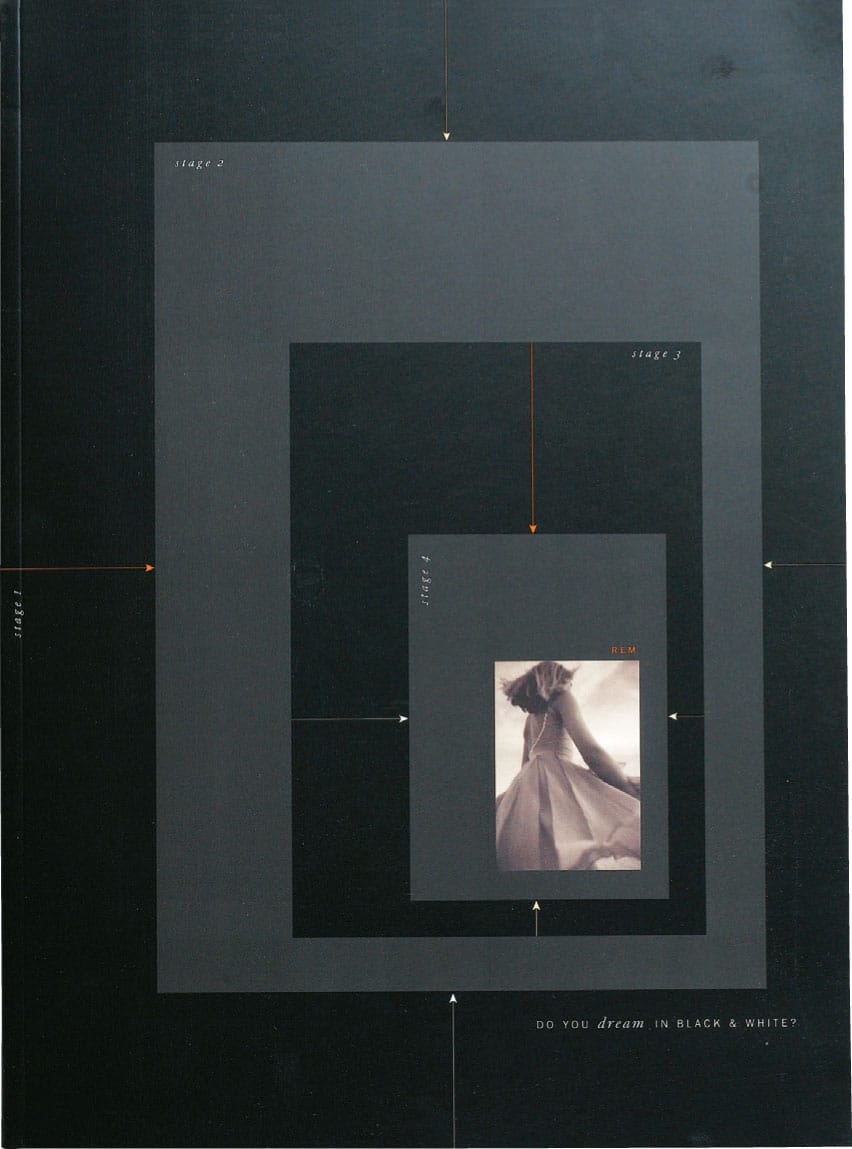
The cover of this promotional brochure for a commerical photographer uses a series of proportional frames or “stages” to further symbolize the creative process undertaken by a photographer in realizing his work, as well as the conventional format of a photographic image.
MERCER CREATIVE GROUP
Vancouver, BC, CA
How to Construct the Golden Section Rectangle
Step One
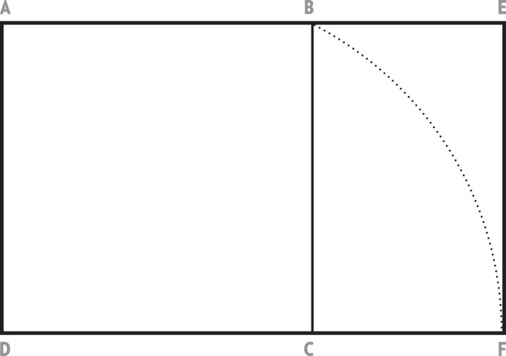
Step One
Draw a perfect square, ABCD.
With the midpoint of DC as a center, draw an arc with a radius equal to the length of a line drawn from the midpoint of DC to B.
Step Two
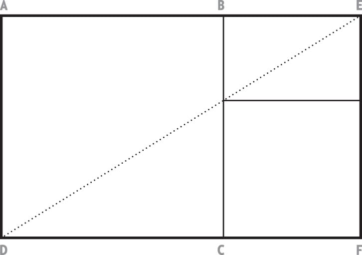
Step Two
Draw a line from D to E to divide the rectangle into smaller divisions.
Step Three
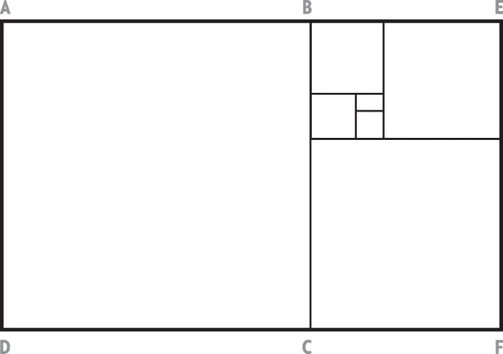
Step Three
To continue, draw a line between opposite corners of the rectangle. For example, a line from F to B.
Step Four
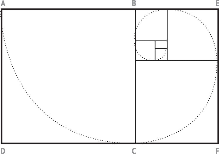
Step Four
This is the proportion recognized as the golden section or rectangle.
A golden rectangle is one whose side lengths are in
the golden ratio,  or 1:1.618.