20 figure-ground
“Everything we see hides another thing; we always want to see what is hidden by what we see.”
RENE MAGRITTE (BELGIAN, 1898–1967) Painter
fig·ure–ground \'fi-gyər
'gra nd\
n
nd\
n
1 a: relating to or being the relationships between the parts of a perceptual field which is perceived as divided into a part consisting of figures having form and standing out from the part comprising the background and being relatively formless
Figure–ground is primarily the visual relationship between the foreground and background of a composition. This relationship between figure and ground is one of the primary principles of visual perception and visual communications. Related design elements of shape and contrast have a critical direct effect on how a figure and its ground interact with one another. Figure–ground relationships also refer to the phenomenon that occurs when specific design elements in any composition appear to move forward or recede. For example, the page that you are currently reading contains typographic text and images that constitute “figure,” and the book’s white paper constitutes “ground.” How and to what degree these two compositonal elements interact, creating either tension or harmony, is fully determined by you and ultimately will contribute to the success or failure of this chapter, as well as the reader’s interaction with and understanding of this narrative and visual information.

The symbol for “Peace One Day,” a public awareness campaign for global cease-fires and nonviolence, relies upon an ambiguous figure–ground relationship between a dove’s wing and a profile of a person’s face to further reinforce that we are directly connected to one another and ultimate peace in the world. In this compositional relationship, the symbol’s positive figure—a silhouette of a dove with an outstretched wing—and its negative ground, a side profile of a person’s face, are one and the same.
JEANELLE MAK
New York, NY, USA


This circular symbol for APA Technologies, a manufacturer of watches that monitor ultraviolet rays, uses figure–ground to create a dual visual effect. Lines radiate from the symbol’s center representing the Sun, as well as create narrow triangular shapes that move inward bringing attention to the product name.
WINK
Minneapolis, MN, USA
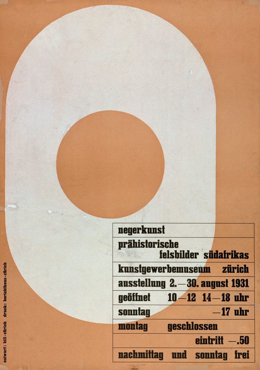
1931
Kunstgewerbemuseum Exhibition Poster
MAX BILL
Zurich, CH
Max Bill and Swiss Modernism
MAX BILL (1908–1994), born in Winterthur, Switzerland, was an architect, painter, typographer, industrial designer, engineer, sculptor, educator, and graphic designer.
Bill was initially a student at the Kunstgewerbeschule and apprenticed as a silversmith before beginning his studies in 1927 at the Bauhaus in Dessau, Germany, with teachers such as Wassily Kandinsky (Russian, 1866–1944), Paul Klee (German, 1879–1940), and Oskar Schlemmer (German, 1888–1943).
He permanently settled in Zurich, Switzerland, in 1929, and in 1937 became involved with a group of Swiss artists and designers named the Allianz. The Allianz group advocated the concrete theories of art and design and included Max Huber (1919–1992), Leo Leuppi (1893–1972), and Richard Paul Lohse (1902–1988).
In 1950, Max Bill and Otl Aicher (German, 1922–1991) founded the Ulm School of Design (Hochschule fur Gestaltung-HfG Ulm) in Ulm, Germany, a design school initially created in the tradition of the Bauhaus and that later developed a new design education approach integrating art and science. Bill served as the school’s director from 1951 to 1956. Ulm is notable for its inclusion of semiotics, the philosophical theory of signs and symbols, as a field of study. Faculty and students included Tomás Maldonado (Argentinian, b. 1922), Josef Albers (American, 1888–1976), Johannes Itten (Swiss, 1888–1967), Otl Aicher, Walter Zeischegg (Austrian, 1917–1983), and Peter Seitz (German, b. 1931).
Bill was the single most decisive influence on Swiss graphic design or the International Typographic Style, beginning in the 1950s with his theoretical writing and progressive work. He stated, “It is possible to develop an art largely on the basis of mathematical thinking.”
From 1967 to 1971, he was a professor at the Staatliche Hochschule fur Bildende Kunste in Hamburg and chair of environmental design.
As a graphic designer, he fully and enthusiastically embraced the tenets and philosophical views of this modernist movement. The majority of his graphic work is based solely on cohesive visual principles of organization and composed of purist forms—modular grids, san serif typography, asymmetric compositions, linear spatial divisions, mathematical progressions, and dynamic figure–ground relationships.
His powerful use of figure–ground relationships is never more evident than with his exhibition poster, designed in 1931, for the Kunstgewerbemuseum in Zurich, Switzerland. The poster’s figure–ground is its primary compositional principle; its bright white figure is asymmetrically located and set against a muted-tone background. The pure geometry of the figure’s inner circle is a powerful focal point further offset by the pure linear square containing information on the exhibition.
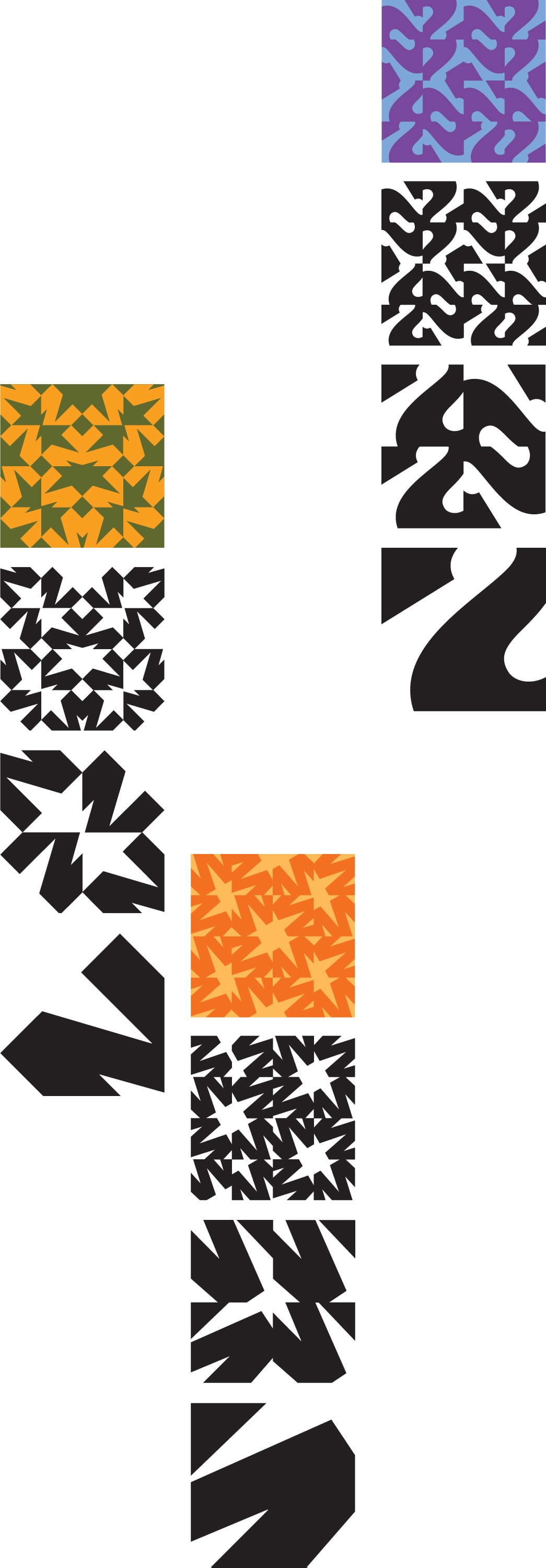
This assignment is a study of unit, structure, pattern, and figure–ground created in the repetition of a single, cropped letterform. Students start with a compositional exercise involving a black letterform on a white surface, cropping away pieces of the letterform within a 7.8-inch (20 cm) square. These letterform compositions are used to generate patterns of four and then sixteen units within a predetermined grid system. Attention is given to the complexity of figure–ground relationships within each pattern. Color is introduced in the final stage of the assignment as students explore further means to enhance pattern, rhythm, and figure–ground relationships.
ERINI FAHIM, SEHYR AHMAD, OMAR MOHAMED, Students
AMIR BERBIC, RODERICK GRANT, Instructors
AMERICAN UNIVERSITY OF SHARJAH
Sharjah, UAE
Definition of Elements
Design elements in any composition are perceived as either figure (objects or focus) or ground (the remaining background or the rest of the perceptual compositional field).
It is also critical to remember that ground, or the space surrounding a figure, is also a shape. Shapes can exist independently as well as overlap each other, depending on the specific figure–ground relationship of a composition.
Figure is also considered a positive compositional element, while the space, or ground, around it is considered opposite and a negative compositional element. Each is dependent upon the other—it is impossible to change one without affecting the other. Creating dynamic relationships between positive and negative is the cornerstone of well-resolved visual compositions.
Figure is a compositional element to which we pay attention. It is also identified as a positive shape in a visual composition. It is defined as the outline, form, or silhouette of an object. It refers to an active, positive form revealed against a passive, negative ground. In the simplest visual compositions there may be only one figure that the viewer needs to pay attention to. In more complex visual compositions, there may be multiple figures. Familiar, figurative, and representational visual objects are easy to see and assimilate as figure.
Ground is the surrounding space of an object or compositional element. It is also defined as the negative space in a composition, as well as everything else that is not a figure. As attention shifts from figure to figure, the ground also shifts so that an object can go from figure to ground and back.
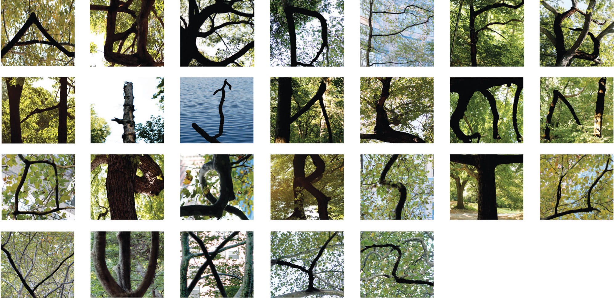
These arboreal-based letterforms are the outcome of a student’s thorough photographic exploration of letterforms found in nature. They are also a primary representation of a simple figure–ground relationship, one in which the figure’s, or the foreground’s, darker branches and limbs are positive and active, whereas its ground, or, in this case, the background’s, green textures in the surrounding woodlands are negative and passive.
TAKASHI KUSUI, Student
JI LEE, Instructor
SCHOOL OF VISUAL ARTS
New York, NY, USA
Types of Figure–Ground
There are three basic types of figure-ground compositions and relationships:
Simple
A simple figure–ground can be created when a coherent, independent object is juxtaposed in a space that functions as its surrounding ground. The ground can be compressed or shallow, or convey an illusion of depth. In a simple figure–ground composition, the figure is positive and active, whereas its ground is always negative and passive. In this compositional relationship, the figure is clearly visible and separate from its background.

This public awareness campaign’s logotype for Terence Higgins Trust’s HIV program—“Get It On”—uses the exaggerated negative space, or counter, of its lowercase n for a figure–ground reversal of a symbolic condom.
FELTON COMMUNICATION
London, UK

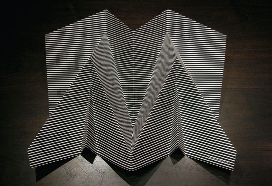
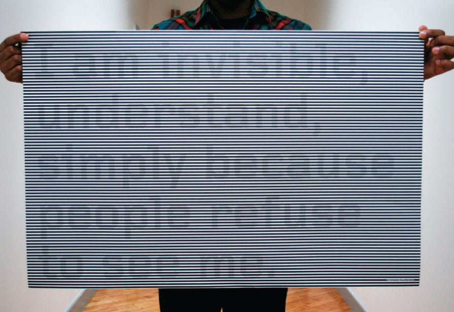
This promotional poster, titled Stealth and developed for New York City’s Studio Museum in Harlem, is an exploration of identity through the use of figure–ground, visual texture, and three-dimensional form. Despite the posters ultimately becoming a dynamic physical object, its essential message is revealed in its form and is based on a quote from the Invisible Man—“I am invisible, understand, simply because people refuse to see me.” When flat, it reveals this almost invisible typographic statement through the illusion of figure–ground. When folded, the poster’s form is evocative of a stealth bomber (hence its name).
THE MAP OFFICE
New York, NY, USA
Reversal
A figure–ground reversal can be created when a figure functions as a ground and ground as figure. This graphic inversion is caused by shapes that form in the spaces located between the parts of the figure, creating the reversal. This type of figure–ground composition can be a dynamic means to activate neutral white space in a visual composition. In a simple figure–ground composition, the borders are perceived as limitless, whereas a figure–ground reversal bounds and limits an image.

This symbol, a simple figure–ground relationship, clearly illustrates green trees and brown mountains. However, the symbol’s white “negative” space, framed by the upper and lower “positive” figures, creates a negative or visual ground that reads as a W for Mountain Woods, a rural community in Colorado.
WINK
Minneapolis, MN, USA
Ambiguous
An ambiguous figure–ground composition is created when the graphic relationship between a composition’s figure (or object) and ground (or space) is undetectable, yet fully comprehensible. With this type of figure–ground relationship, a pair of objects share the same edge or profile. A classic example of an ambiguous figure–ground relationship is Rubin’s vase, developed by psychologist Edgar Rubin (Danish, 1886–1951). In this image, the black positive space forms two profiles of a human face that appear to be ready to kiss, and the inverse negative space forms a vase. Visually, the eye’s concentration on either the black or white alternates between the faces and the vase.

Bold, all-cap sans serif letterforms juxtaposed with delicate handmade letterforms composed of branches and flowers create a dramatic and memorable composition, as well as a simple figure–ground reversal for this brochure cover for the Fort Worth Opera Festival.
THE MATCHBOX STUDIO
Dallas, TX, USA
Characteristics
The principle of figure–ground is one of the most basic in visual communications because it refers to our ability to visually separate elements based on contrast—dark and light, black and white, and positive and negative. In the simplest terms, the figure is what we notice and the ground is everything else we tend to not notice.

This circular symbol for Girard Management, a residential property management company, uses the principle of figure–ground to combine the cap letter G with a lockset.
WINK
Minneapolis, MN, USA
An effective and perceptible figure–ground relationship occurs when the eye can identify a figure as an object distinct and separate from its ground or compositional background. This perception is dependent solely on the design principle of contrast.
A composition’s figure–ground relationship is clear and stable when the figure receives more attention and immediacy than the ground. When a figure–ground relationship is unstable, it is ambiguous; therefore, its compositional elements can be interpreted in different ways.
Balanced and effective figure–ground relationships animate any composition, adding visual impact and power to its message.
However, when a figure dominates its ground, the effect can be clear but potentially boring. Locating a clearly defined object in the center of a composition leaves no doubt about the subject, but its presentation may lack visual nuance and power.
Ultimately, figure–ground is one of the most important design principles to consider when creating any visual communication. In doing so, you can further guarantee that the work you are producing will be effective, communicative, memorable, and highly meaningful to the viewer.
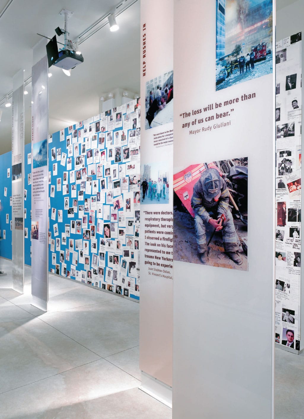
This mural is an integral storytelling element of the overall visitor experience at the 9/11 Tribute Museum, located fewer than 50 feet (15 m) from Ground Zero directly across from the World Trade Center (WTC) site. Most New Yorkers remember how extraordinarily blue the sky was the morning of 9/11. This 80-foot (24 m)-long wall begins as an expanse of blue, like the sky that day, then gradually fills with missing-person posters, stretching from floor to ceiling at the far end of the gallery. This collagelike figure–ground treatment invokes the iconic image of walls all over lower Manhattan covered with posters for weeks after the disaster, as families looked for their missing loved ones.
POULIN + MORRIS INC.
New York, NY, USA
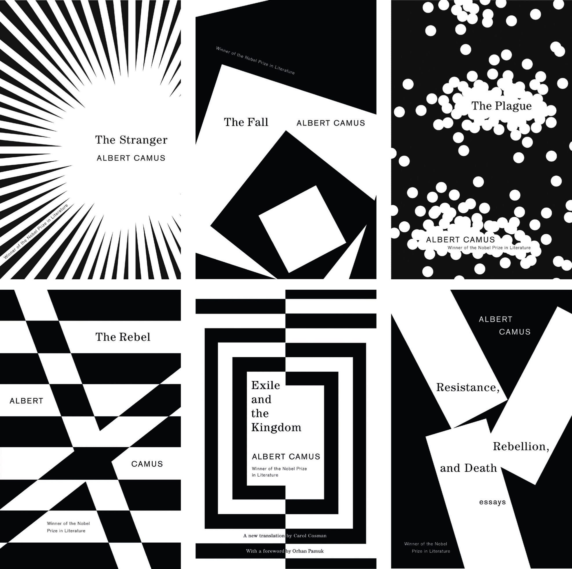
These book covers for Albert Camus’ (French, 1913–1960) The Stranger, The Plague, and The Fall are seminal studies in simple figure–ground relationships fully articulated using fundamental design elements such as point, line, and shape, as well as a stark black-and-white color palette.
JOHN GALL
New York, NY, USA