7 texture
“One touch of nature makes the whole world kin.”
WILLIAM SHAKESPEARE (BRITISH, 1564–1616) Author, Playwright, Poet
tex·ture \'teks-chər\ n
3 b: the visual or tactile surface characteristics and appearance of something
Texture is defined as the look and feel of any surface. It is the surface quality of an object, be it smooth, rough, soft, or hard, and is essentially a visual effect that adds richness and dimension to any visual composition. It can be seen and experienced by human touch or interpreted tactilely by visual means. Textures can be described as flat, shiny, glossy, glittery, velvety, wet, feathery, gooey, furry, sandy, leathery, furry, cracked, prickly, abrasive, puffy, bumpy, corrugated, rusty, slimy, and so on.

A diverse set of compositional elements, such as large and small-scale typography, borders, frames, diagrams, and colors are used in this page spread to further enhance the textural qualities of the page and ultimately the reader’s experience.
160OVER90
New York, NY, USA
Texture, along with other elements in a composition, can communicate a variety of different emotions and messages. Rough textures are visually active and kinetic, while smooth textures are passive and calm.
Primary Characteristics
Texture has characteristics similar to color. Like color, texture cannot function independently without being integrated to other design elements such as line and form. It is used primarily to enhance other elements relying on shape and space to exist.
In visual communications, texture is the surface character of any object. It can be two- or three-dimensional and distinguished by visual and physical properties such as rough or smooth and shiny or dull. A tactile texture such as sandpaper can be experienced by touch; however, visual texture can only be suggested, interpreted, and understood by the human eye.
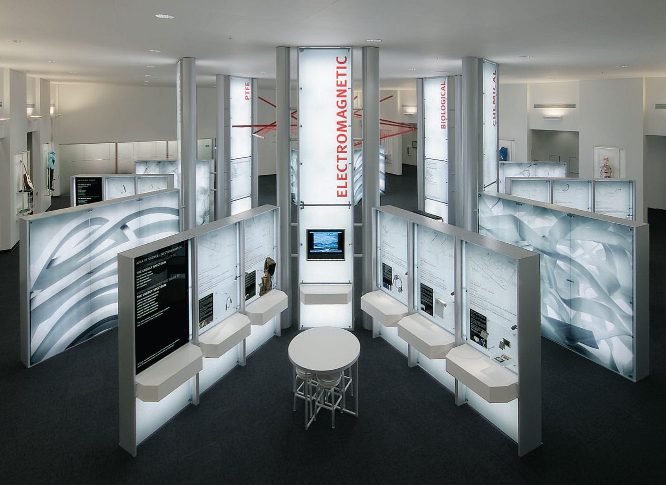
This capabilities showroom for W. L. Gore—maker of fluoropolymer Gore-tex products, presents the company’s technical superiority in making ingredient products for a wide range of industries—from medical, to military, to leisure. Large-scale photographic images of material textures are used as emblematic and engaging visual backdrops for the presentation of complex data and scientific information in a compelling and accessible manner for a wide audience.
CARBONE SMOLAN AGENCY
New York, NY, USA
1959
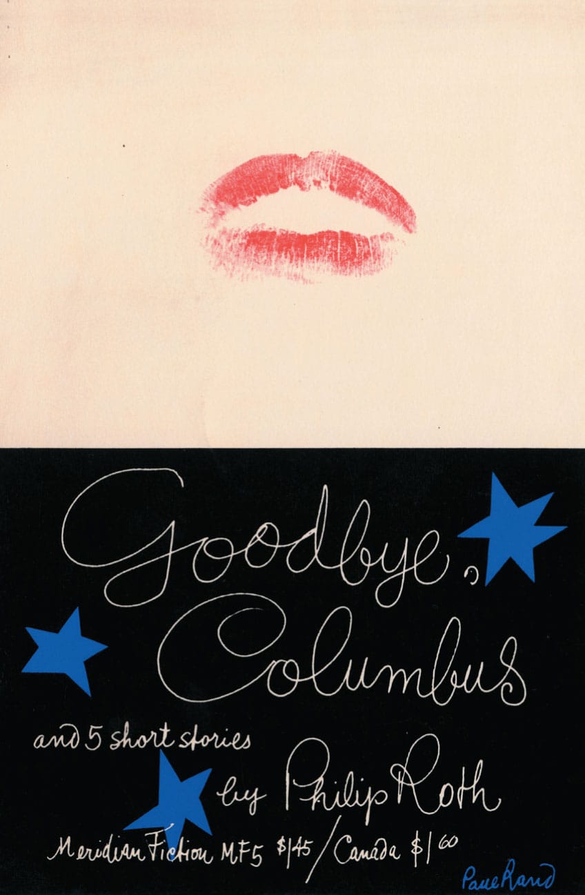
Goodbye, Columbus and 5 Short Stories Book Cover
PAUL RAND
New York, NY, USA
Paul Rand and Goodbye, Columbus
PAUL RAND (1914–1996) was an American designer, author, and educator who shaped and influenced the course of twentieth-century graphic design. For forty years, he also devoted himself to teaching graphic design at Cooper Union, Pratt Institute, and Yale University. Through his work, writings, and teaching, he has educated and inspired generations of graphic designers worldwide.
Rand was educated at Pratt Institute, Parsons School of Design, and the Art Students League under George Grosz (German, 1893–1959). In 1937, at the age of twenty-three, he became art director of both Esquire and Apparel Arts magazines, for which he created a series of now classic magazine covers.
In 1941, he left the publishing world to become an art director for the William H. Weintraub Advertising Agency, where he created a series of innovative campaigns for Coronet Brandy, Dubonnet Aperitif, El Producto Cigars, and Orbach’s.
With his early work for American publishers such as Meridian, Knopf, and Vintage, Rand proved that modernism did not have to be serious, cold, and clinical. Rand gave modernism “heart and soul.” His whimsical approach, as well as his use of unconventional methods and familiar elements to communicate a variety of different emotions and messages, proved to be a new and groundbreaking interpretation of the European modernist movement in American graphic design.
His 1959 cover for Philip Roth’s Goodbye, Columbus is a pivotal prototype for the use of familiar, humanistic, textural elements—irregular, cut-out shapes, the designer’s own handwriting, and the powerful use of a graphic “kiss.” The slightly parted lips, rendered in a bright, red lipstick on a stark, white field, are another example of visual texture that reinforced a real sense of physicality. This provocative image immediately and memorably communicates the sexually obsessive theme of the author’s text, as well as the hands-on approach of the designer’s process. Here, the textured image is a visual metaphor not only for the book’s theme but also for the designer’s creative, interactive response.
Rand continued to explore a broad range of possibilities with texture and abstraction in his publishing work—pure color fields, organic and ragged cut-out shapes, splatters of ink and paint, as well as the use of his distinctive handwriting. He approached book covers as if they were small canvases or sculptures where the artist or, in this case, the graphic designer, could express his individuality, intuition, and most importantly, creativity.
In American book publishing during the 1950s and 1960s, Rand influenced numerous graphic designers, such as Alvin Lustig (American, 1915–1955), Leo Lionni (Dutch, 1910–1999), Ivan Chermayeff (American, 1932–2017), Tom Geismar (American, b. 1931), and Paul Bacon (American, 1923–2015), who continued to pursue their beliefs that graphic design in book publishing was an act of creative expression and invention.
Rand’s “play” instinct transformed the written word through book-cover designs with wit, humor, and a timelessness unmatched in the history of graphic design.

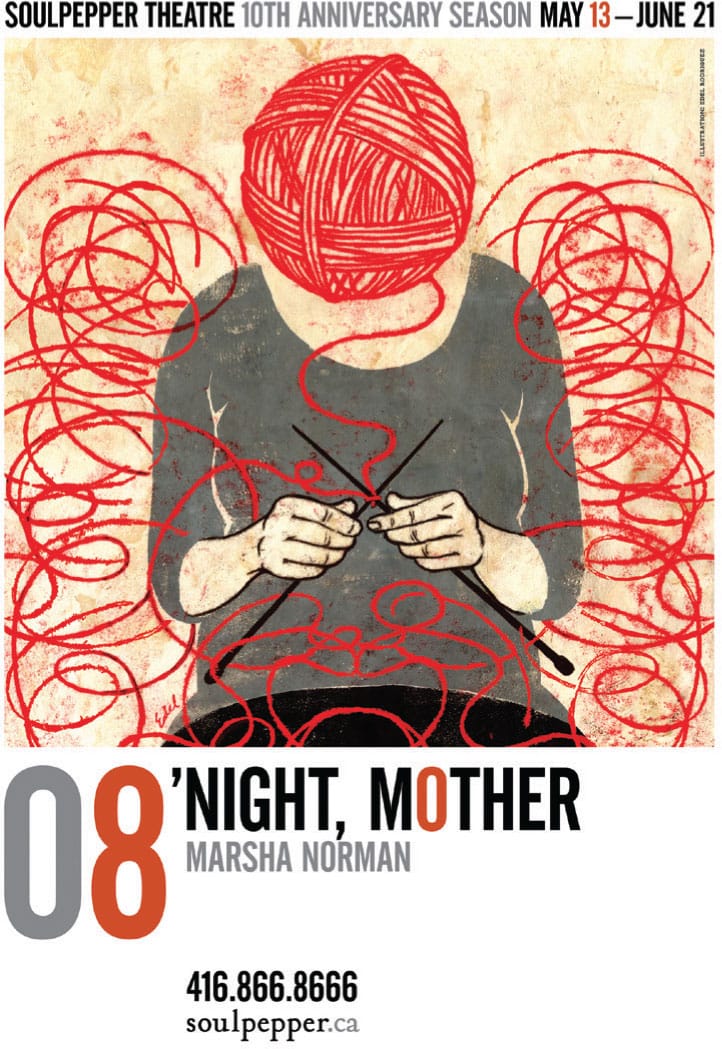
The character-based figurative illustrations in this series of posters for Soulpepper Theatre have a visual textural quality that captures and strengthens each of the play’s diverse themes while still communicating the essence of each of the main characters. In this context, texture is used as a common visual element, represented as line, pattern, tone, modeled color, and varied scale typography in each composition.
EDEL RODRIGUEZ
Mt. Tabor, NJ, USA

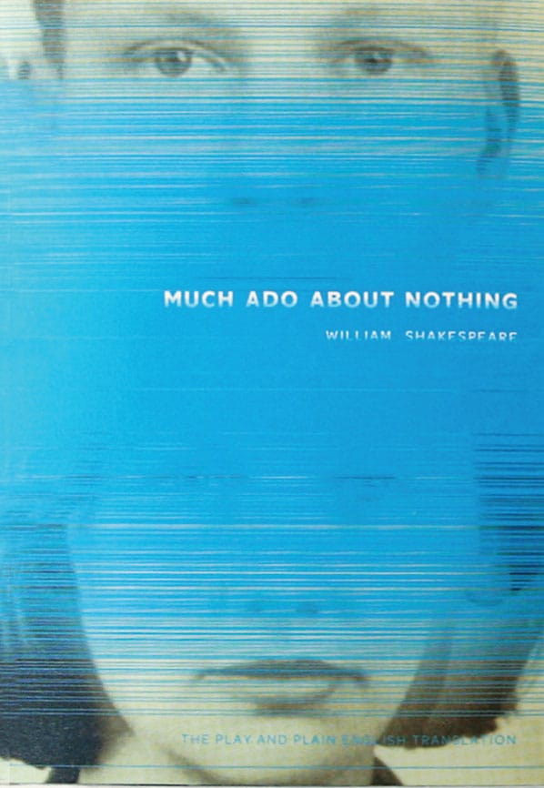
The book covers for these three plays, Shakespeare’s Much Ado about Nothing, As You Like It, and The Comedy of Errors, use a subtle and consistent visual metaphor to support each play’s character-driven themes of identity. The primary visual element of each book cover uses a linear texture as a symbolic theatrical scrim or veil that partially hides or reveals photographic portraits or the identities of the each of the play’s main character(s).
TAKASHI KUSUI, Student
JI LEE, Instructor
SCHOOL OF VISUAL ARTS
New York, NY, USA


Types of Texture
There are three types or classifications of texture in visual communications:
Physical or Literal
Tactile texture, also defined as physical or literal texture, is an actual tactile variation on an object’s surface. For example, wood, grain, sand, fur, glass, leather, canvas, and metal are all physical textures. This type of texture differentiates itself from visual texture by having a physical quality that can only be felt by human touch. One of the most obvious ways to evoke a response to texture is by using physical or literal textures—materials that already have noticeable and familiar textures. The use of this type of physical or literal texture in a visual communication can provide further emphasis, rhythm, movement, tension, pattern, and contrast, ultimately having a direct effect on its message and meaning.
Light is also important when considering physical or literal texture in a composition since it can influence how a surface is viewed and understood. Intense light on a smooth surface can obscure the immediacy and readability of an image, while the same effect can create a strong, visible contrast on a textured surface like wood or canvas.
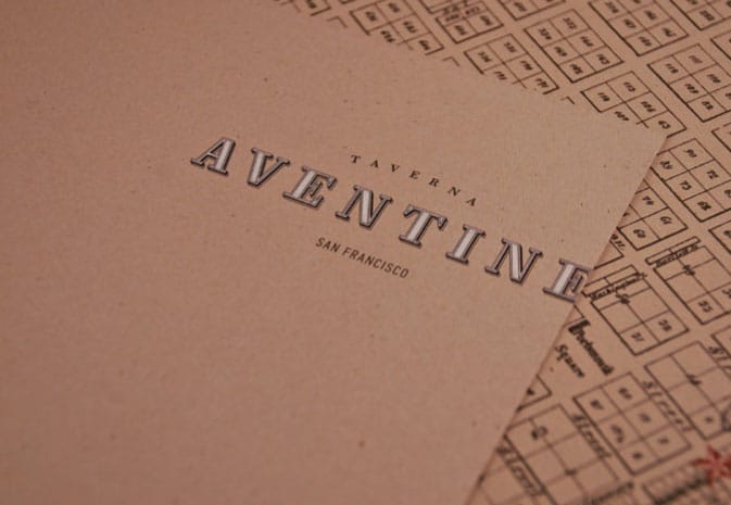
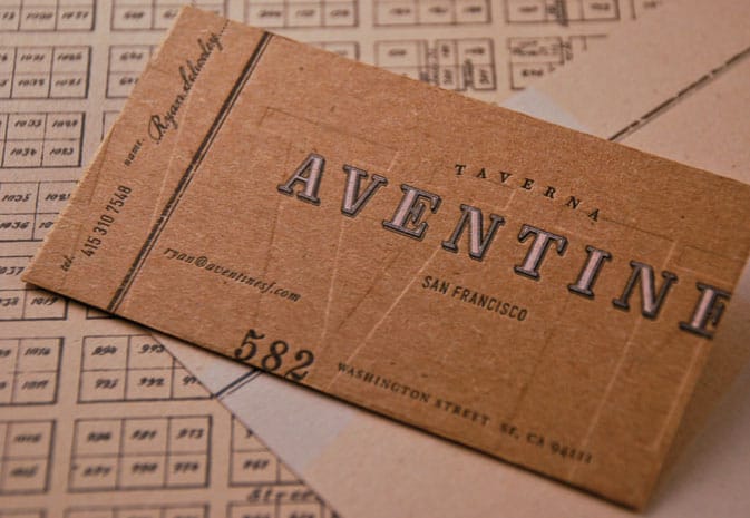
Inspired by the ancient Roman taverns it was named for, Aventine’s identity and branding program has a strong textural appearance derived from the inline letterforms paired with smaller serif and sans serif typography. These contrasting typographic forms are further enhanced with line drawings, frames, and maps, as well as debossing and letterpress, which further enhances the textural identity, richness, and warmth of this program.
MARKATOS MOORE
San Francisco, CA, USA


Kanuhura, a luxury resort located on a remote atoll in the Maldives, celebrates its authentic and remote locale with a wide range of textured brand elements—a hand-woven K monogram based on a repeating line pattern device; a custom typeface made of palm leaves; and a color palette evocative of white sand contrasted by aqua sea, sunsets, and local spices. This textural theme continues with hand-stitched “recycled” leather holders for information, wood stationery, and driftwood signs made in the island’s craft workshops.
PENTAGRAM
London, UK
Visual
The illusion of a physical texture on an object’s surface is identified as visual texture. These illusory effects can be achieved through the use of design elements such as point, line, shape, form, light, tone, contrast, and pattern.
Every material and structure has its own inherent texture and needs to be taken into account when creating a composition. Materials such as canvas and watercolor paper are considerably rougher than Bristol board or laser paper and may not be the most suitable for creating a flat, smooth surface.
Implied
An implied texture is a visual texture that has no basis in everyday reality. It is most often utilized in works of abstraction.
Creating Texture
Textures can be created through a variety of design elements and techniques such as repetition, typography, collage, assemblage, impasto, rubbings, transfers, moirés, erasures, and computer-generated effects.
Visual textures can be created by reproducing the color, tone, and pattern of actual textures; darks and lights can be used to suggest the grooves and irregular surface of the bark of a tree or the three-dimensionality of an irregular stone surface.
Lines of typographic text, coated and painted surfaces, applications of dry media such as pencil or charcoal, or actual surfaces photographed or digitally scanned, replicate actual texture but function as visual texture.
Texture provides any design element used in a composition with visual surface and feel. This can be achieved with line, shape, or photographic images of specific surfaces.
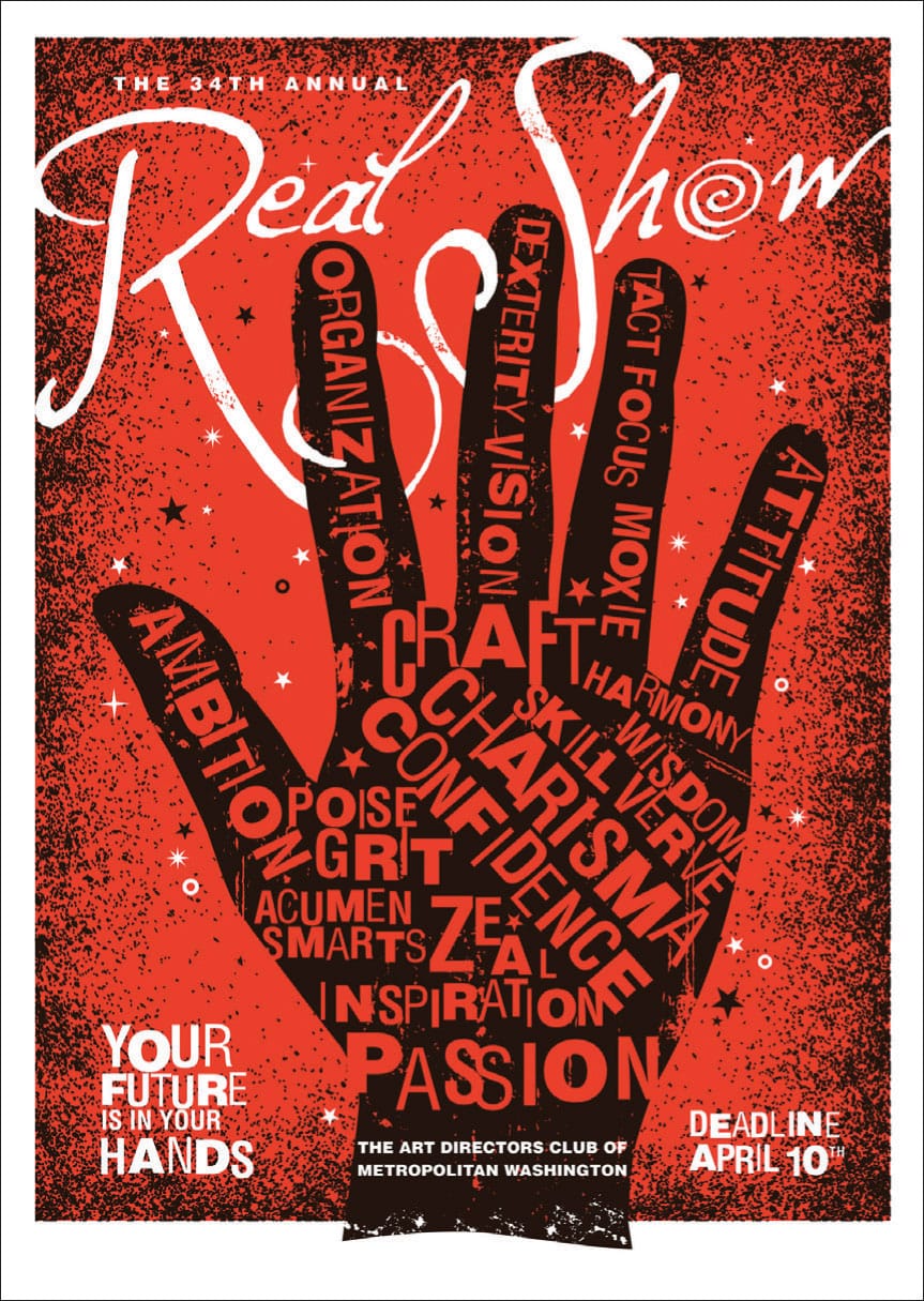
This poster, titled the Real Show for the Art Directors Club of Metropolitan Washington, DC, combines different sizes and weights of sans serif typography with fluid, scriptlike hand lettering to enhance the visual texture of the poster’s promotional message. Additionally, the textured border of the composition, as well as the extreme color contrasts between black and red and red and white, further enhances the textural characteristics of the poster’s two-dimensional surface.
FUSZION
Alexandria, VA, USA
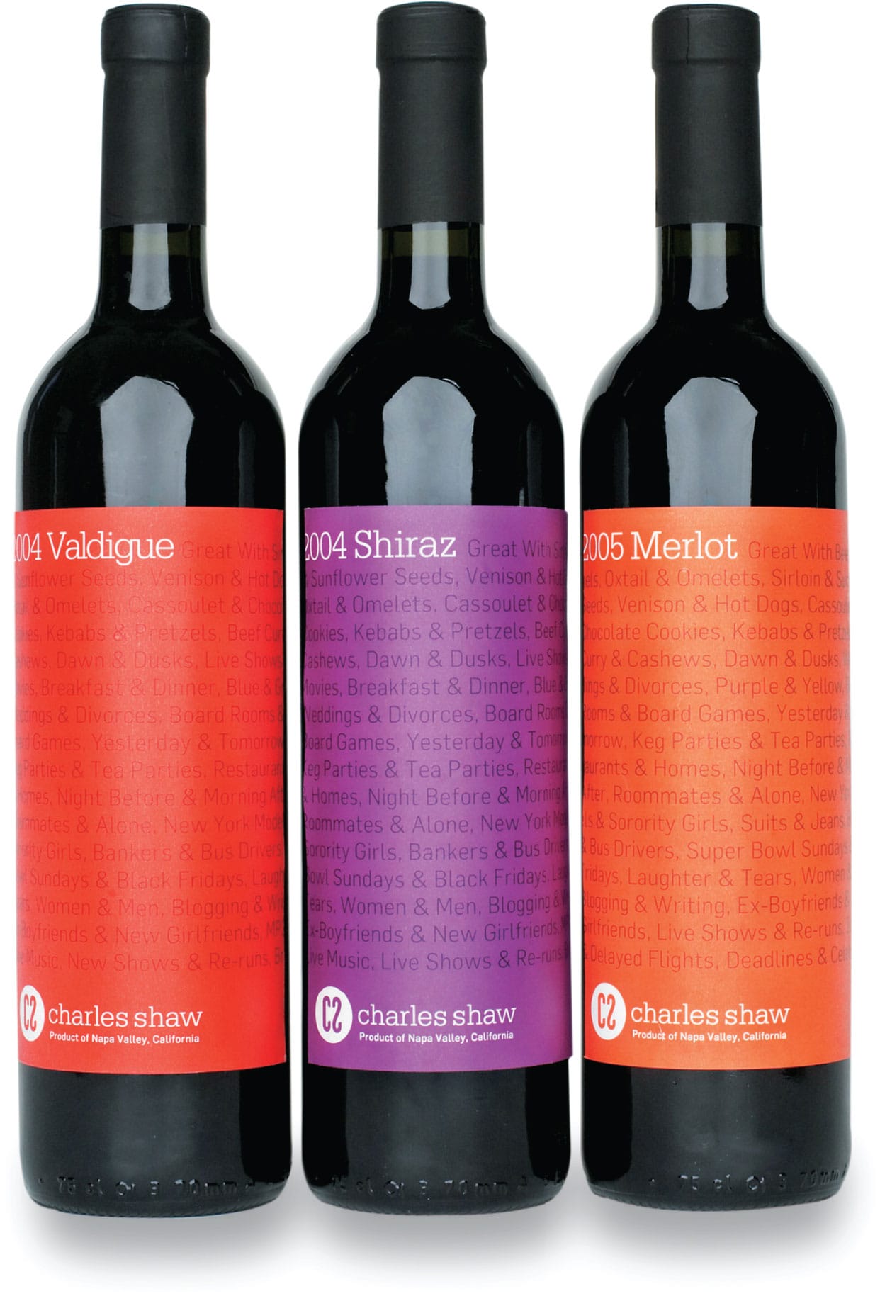
Continuous typographic line treatments are used as visual backdrops for the branding of this Charles Shaw wine label series. These textural backgrounds describe the taste, flavor, and character of each wine—Valdiguié, Shiraz, and Merlot—and are further enhanced by their subtle monochromatic color palettes, which provide maximum contrast for identifying the wine name, year, vintage, and vineyard.
ANDREW LIM, Student
MICHAEL IAN KAYE, Instructor
SCHOOL OF VISUAL ARTS
New York, NY, USA
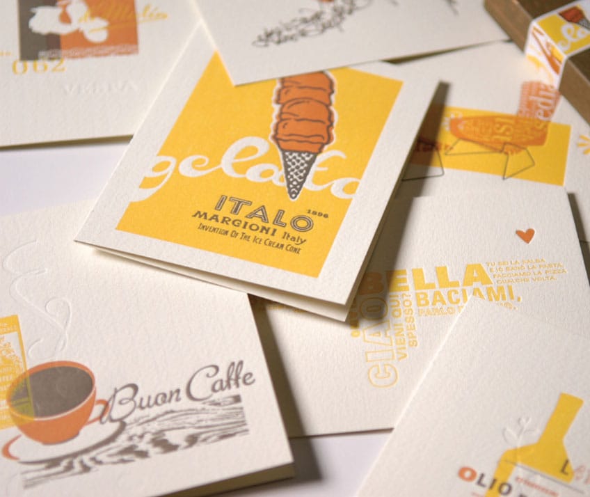
The Everything Italian postcard series for Fox River Paper is composed of a set of eight themed postcards—all letterpressed to celebrate the textural surface qualities and properties of a new line of paper to add to its popular ESSE collection. All postcards use a diverse sampling of typography, patterns, and line drawings, all unified with the same color palette.
MIRIELLO GRAFICO
San Diego, CA, USA

This dual front-and-back book jacket uses texture to communicate the essence of both Nathanael West (American, 1903–1940) novels. Miss Lonelyhearts is represented with a repetitive pattern of hearts organized in a series of free-form, horizontal lines. The Day of the Locust is treated in the same manner but as filmstrips. Both communicate the essence of each narrative, create a thematic connection with the reader, and ultimately convey a cohesive and unified message.
RODRIGO CORRAL DESIGN
New York, NY, USA

Built-up media, such as oil or acrylic paint, can produce rough textures from brushstrokes or palette knives. Type can also be used to create a texture that ultimately has more importance in a composition than the legibility of the letters themselves. In traditional printing with letterpress or metal type, each letterform or number to be printed consists of a raised image—an actual texture—on a flat background.
Texture gives a “tonal” quality to the surface of any design element such as a line, shape, or form, enhancing its visual presence as well as the viewer’s emotional response. In this case, textural characteristics and qualities can be defined as descriptive adjectives in visual communications. Appropriate and meaningful texture can give the simplest visual element resonance and a spark of life. Effective use of texture can communicate a variety of emotions and messages.
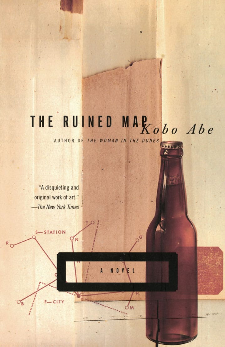
In this book cover for Kobo Abe’s (Japanese, 1924–1993) The Ruined Map, the visual characteristics of collage, assemblage, and photomontage of paper, board, object, line, image, and typography are used in various styles and sizes to enrich the overall textural power of the composition. Light and shadow, as well as a diverse range of tones coupled with a monochromatic color palette, add to the surface character and visual power of this kinetic book cover.
JOHN GALL
New York, NY, USA
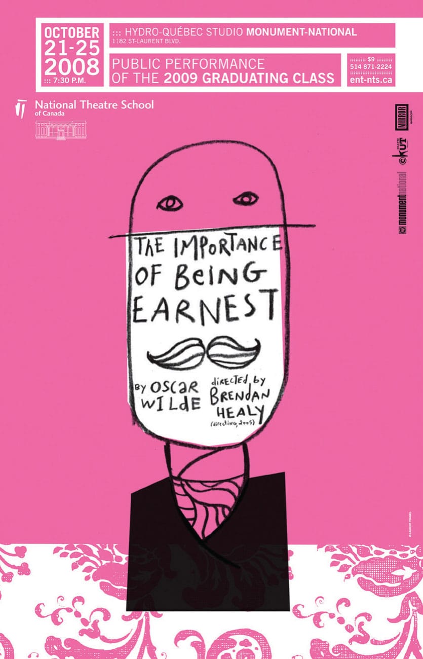
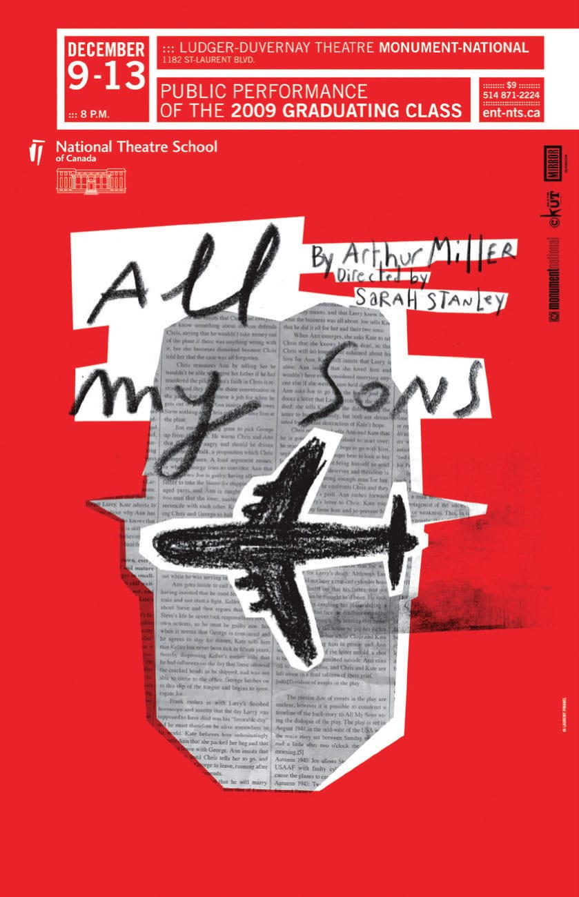
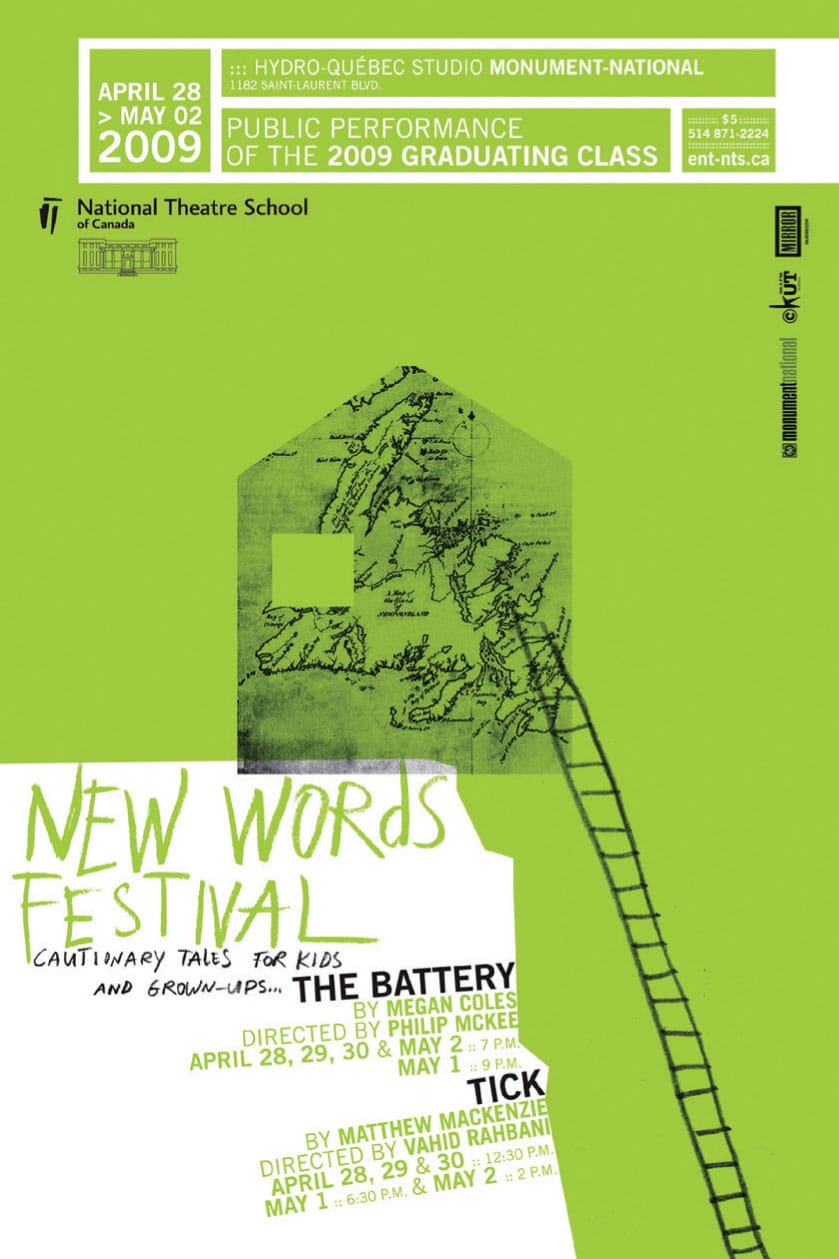
Collage, hand lettering, and freehand line drawings add enhanced visual impact, strength, and texture to this poster series for the National Theatre School of Canada. The sole structured element evident in each composition is the framed typographic information at the top of each poster identifying the specific times, dates, and locations for each production.
LAURENT PINABEL
Montreal, QUE, CA