18 tone
“Every hour of the light and dark is a miracle.”
WALT WHITMAN (AMERICAN, 1819–1892) Essayist, Journalist, Poet
tone \'tōn\ n
7 a 1: color quality or value
7 a 2: tint or shade of color b: the color that appreciably modifies a hue or white or black
In visual communications, tone (also identified as value or shade) means the degree of lightness or darkness apparent on the surface of an object. Tone is also the relative degree of a color’s lightness or darkness—its content of black or white. It can be characterized by the degree of light that falls on an object and how it is then reflected, and ultimately perceived. It is also one of the most important principles in visual communication because it helps define an object’s size, form, and position relative to orientation and composition.
Because the majority of our perceptible world is defined by color, it is critical that we understand its characteristics and effects.

Muted tones of color, pattern, and typography are used as visual, figurative textures to further enhance the identity program for Ödün, a Mexico City restaurant featuring cuisines from China, Thailand, Japan, Vietnam, and other Asian countries. The overall identity, as well as its broad palette of tones, colors, and patterns, was inspired by a diversity of flavors, scents, and spirits found throughout Asian cultures.
BLOK DESIGN
Mexico City, MX
Characteristics
Tone gives a composition unique characteristics that cannot be achieved with flat color. These visual characteristics are spatial depth, texture, and movement. Tone can also increase visual impact in a powerful and immediate way or create extreme visual restraint and nuance that is still obvious and palatable to the eye of the viewer.
Color is an absolute presence in our visual world; therefore, it is extremely difficult to extract the characteristic of chroma or hue from all of its other qualities.
Value
A tone (or shade) is a color to which black or another dark color or hue has been added to make it darker, thereby tending to make it more neutral in color. For example, black added to green creates a darker shade of green. Value changes in pure colors or hues are called shades and tints. This can be more clearly understood by viewing these variables on a color wheel.
Toning (or shading) shows changes from light to dark or dark to light in a composition by darkening areas that would be shadowed and by leaving other areas light. The blending of one value into another is also identified as feathering or gradient. Toning is often used to produce the illusion of dimension, volume, and depth.
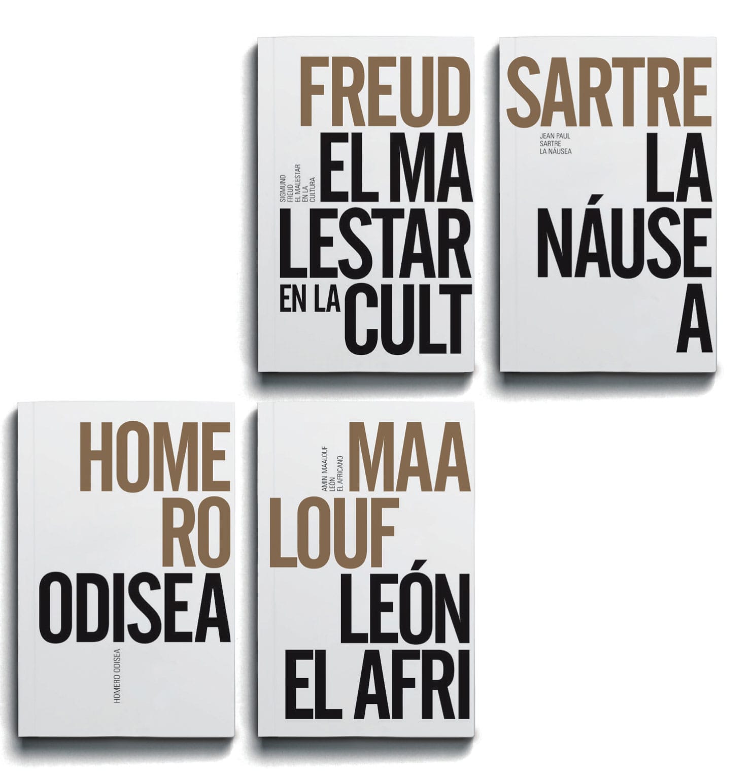
Bold, tonal typography is used for these dual front-and-back book jackets to create active white space reinforcing each author’s name and book title as iconic, singular, and immediate identifiers for both publications.
ESTRADA DESIGN
Madrid, ES
1956
Experimenta typographica
WILLEM SANDBERG
Amsterdam, NL
Willem Sandberg and Experimenta typographica
WILLEM SANDBERG (1897–1984) was a Dutch typographer and graphic designer, as well as a unique presence in the Dutch cultural world during the 1940s and 1950s.
He was born in Amersfoot, the Netherlands, and studied art at the State Academy of Art in Amsterdam. As a young man, he served as a printer’s apprentice in Herrliberg, Switzerland. In 1927, he studied in Vienna and then at the Bauhaus in Dessau. Following his return to Amsterdam, he worked as a graphic designer until he was appointed deputy director of the Stedelijk Museum in Amsterdam in 1938.
His main sources of inspiration were Hendrik Werkman (Dutch, 1882–1945) and Piet Zwart (Dutch, 1885–1977), both groundbreaking Dutch typographers whose pioneering work abandoned the tenets of conventional symmetry. Sandberg also initially agreed with the “neue typographie” of Jan Tschichold (German, 1902–1974) and began to incorporate lowercase typographic characters and unjustified text in the majority of his work.
During World War II, Sandberg became a wartime hero as the only surviving member of a Dutch resistance group that in 1943 burned down Amsterdam’s Municipal Office of Records in protest against the administration of the Nazi government.
After Europe’s liberation in 1945, Sandberg became the director of the Stedelijk Museum. It was at the Stedelijk that he personally designed hundreds of its catalogs and posters, providing the museum with a unique brand and identity. As a designer, he produced innovative work characterized by the use of bold type, vivid colors, textured papers, and signature torn-paper forms. From 1943 to 1945, while hiding from the Germans and working for the underground resistance, Sandberg produced the basis for Experimenta typographica, a series of print experiments in form, space, and tone, presented in eighteen short, mostly handmade, books that were finally published in the 1950s and subsequently inspired his later work. These experiments included unjustified text settings and sentence fragments composed freely, with varying type weights and styles for visual interest or emphasis. They are void of symmetry and use bright colors, strong contrasts, and subtle tones for rhythm and pacing. Crisp sans serif typography is combined with large-scale, torn-paper, collaged letterforms with rough, irregular edges.
These sensitive explorations of compositional tone and space became enormously influential among a generation of graphic designers, as well as becoming the basis for many of Sandberg’s later Stedelijk Museum catalogs, which were seen and then imitated around the world.
His body of work was a provocative marriage of the “neue typographie” combined with the expressive freedom of surrealism and the inevitable compromises of a wartime Europe.


In this series of brochures and posters for a regional theater and arts center, titled Lux, lighter, intense tints of color are used as tonal textures and patterns that provide a visually rich and animated series of background layers for the typographic information running throughout these collateral print promotions.
HELMO
Montreuil, FR
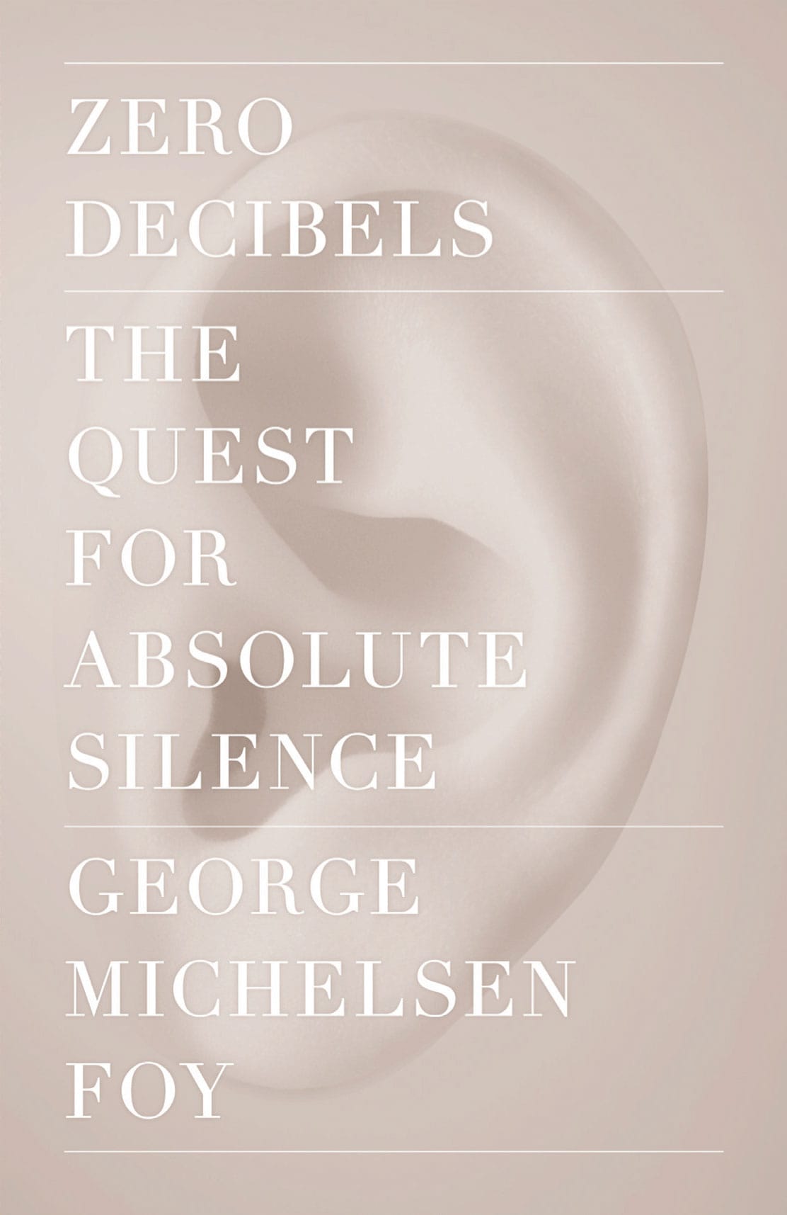
The subtle, muted tone of the photographic image on this book cover for Zero Decibels: The Quest for Absolute Silence is used as a visual metaphor for silence, with an intent that it can be read and understood, but just barely. The added restraint of the serif typography, with its extreme thick and thin stroke nuances, adds a quiet presence to this message.
MOTHER DESIGN
New York, NY, USA
Graduated Color Wheel
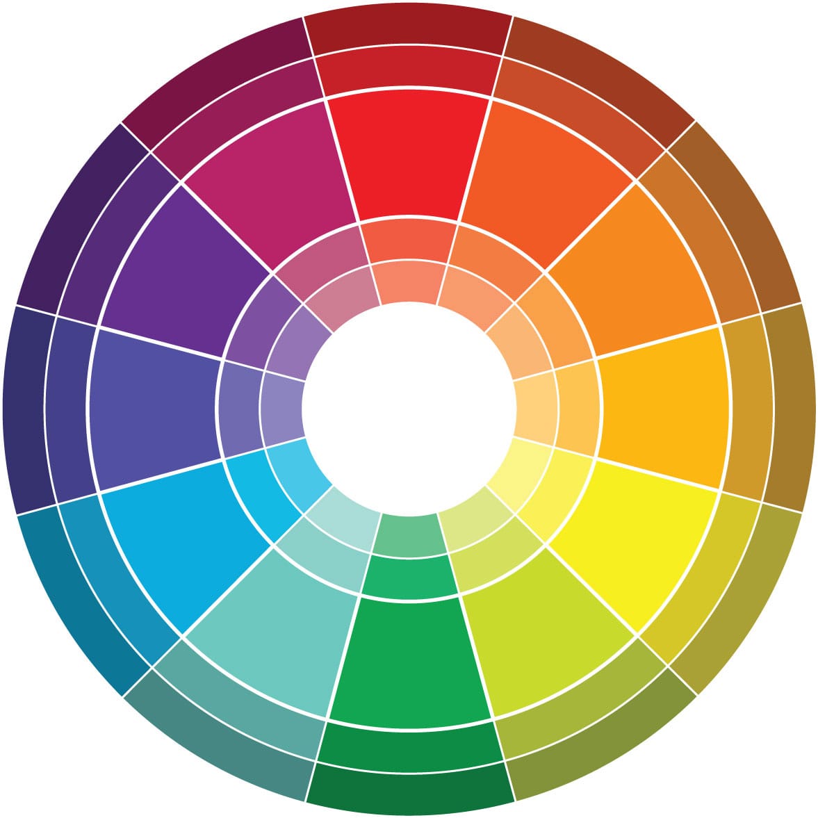
Graduated Color Wheel
Each hue is shown here in a progressive or graduated series of values (tints and shades). Note that the point of greatest saturation is the same for each hue. Yellow is of greatest intensity toward the lighter end of the scale, while blue is more intense in the darker zone. Use this graduated color wheel to look for combinations that are similar in value or saturation, and to build contrasting relationships.
Tone
These color tonal wheels demonstrate changes in saturation and value by adding or subtracting black, white, or gray. When white is added to a bright red, the value is lighter and the resulting color is less saturated. Adding black to a bright red results in a dark red closer to the neutral scale because of saturation changes. If gray is added, the saturation is lowered but the value is unchanged.
Shade
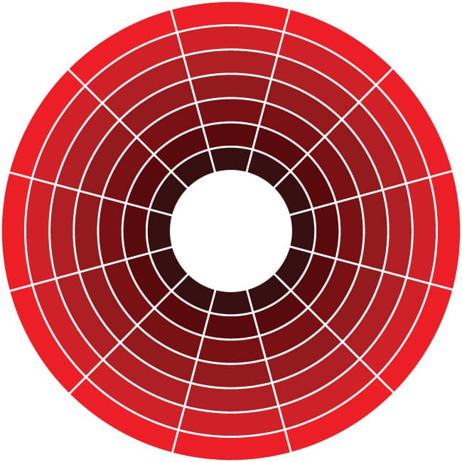
Tint

Saturation/Chroma

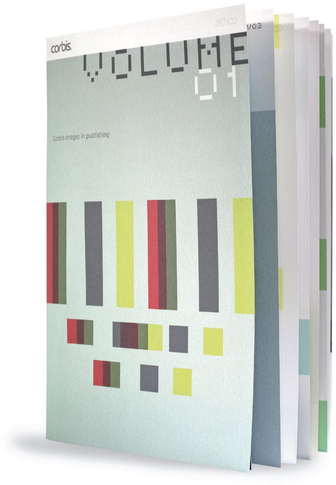
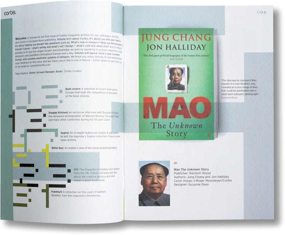
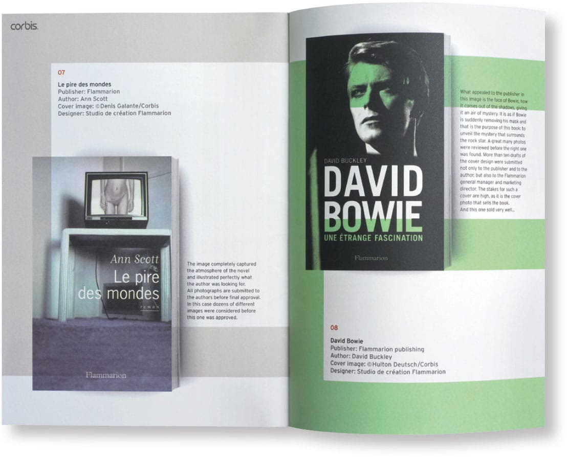
Volume magazine, a sales tool specifically designed for the image library, Corbis, to communicate with its book publishing clients, showcases recently designed book covers and publications using Corbis–based imagery. The visual diversity of this work is further accentuated by the framing and displaying of each cover or publication on a variety of background patterns. Each spread, activated with a different, distinct tone or shade, is actually an overscaled fragment of a custom-designed, pixilated letterform. These structured letterforms symbolize a digital age in which most publications are designed and set electronically using pixels rather than picas.
JOG LIMITED
London, UK

These three brand identity variations for the financial group Liquid Capital use a single color with related light and dark tones of that same color to further convey movement and diversity in their various organizations. Greens are used for markets, magentas for securities, and a range of oranges for the overall group. This concept is further reinforced and represented in the group’s brand photography—dynamic images that support the group’s key brand messages.
JOG LIMITED
London, UK
Types and Effects
In color theory, a tint is the mixture of a color with white, increasing its lightness, and a shade is the mixture of a color with black, reducing its lightness. Mixing a color with any neutral color, including black and white, reduces its chroma or colorfulness, while its hue remains unchanged.
A tone can also be gray or what is called a midtone. It is identified as achromatic and is mixed from black to white. Tones can range from light to dark values in a gray scale. Grays can flatten and minimize the brilliance of any pure color or hue. Darker grays also affect color or hue in a way similar to black; lighter grays affect color or hue in a way similar to white. For example, a tone mixed with yellow produces a rich, colorful, earth tone that resembles ochre and umber.

A variety of subtle tones are used in this promotional poster for a jazz ensemble performance titled “A Tribute to Kind of Blue” at American University. The poster’s composition, as well as its use of different color tints and shades, reinforces the identity and meaning of jazz in American culture as a diverse, multifaceted, multilayered, musical experience.
CHEMI MONTES DESIGN
Falls Church, VA, USA

A range of light- and dark-colored tonal values and layers on these notebook covers provides a strong visual dynamic, spatial depth, and kinetic movement to these swirling, curvilinear color compositions.
ADAMSMORIOKA INC.
Beverly Hills, CA, USA
Monochromatic tone is a single color mixed with either a tint, shade, or tone. This type of color scheme can effectively simulate the presence of other colors or hues through use of tone and its effects on individual and distinct colors.
In theory, there are an almost infinite number of value gradations between true black and true white. The contrast between these two extremes is mitigated by midtones, from the palest to the darkest of grays.
It is due to these primary factors that tone is a valuable conceptual and compositional element in visual communications.
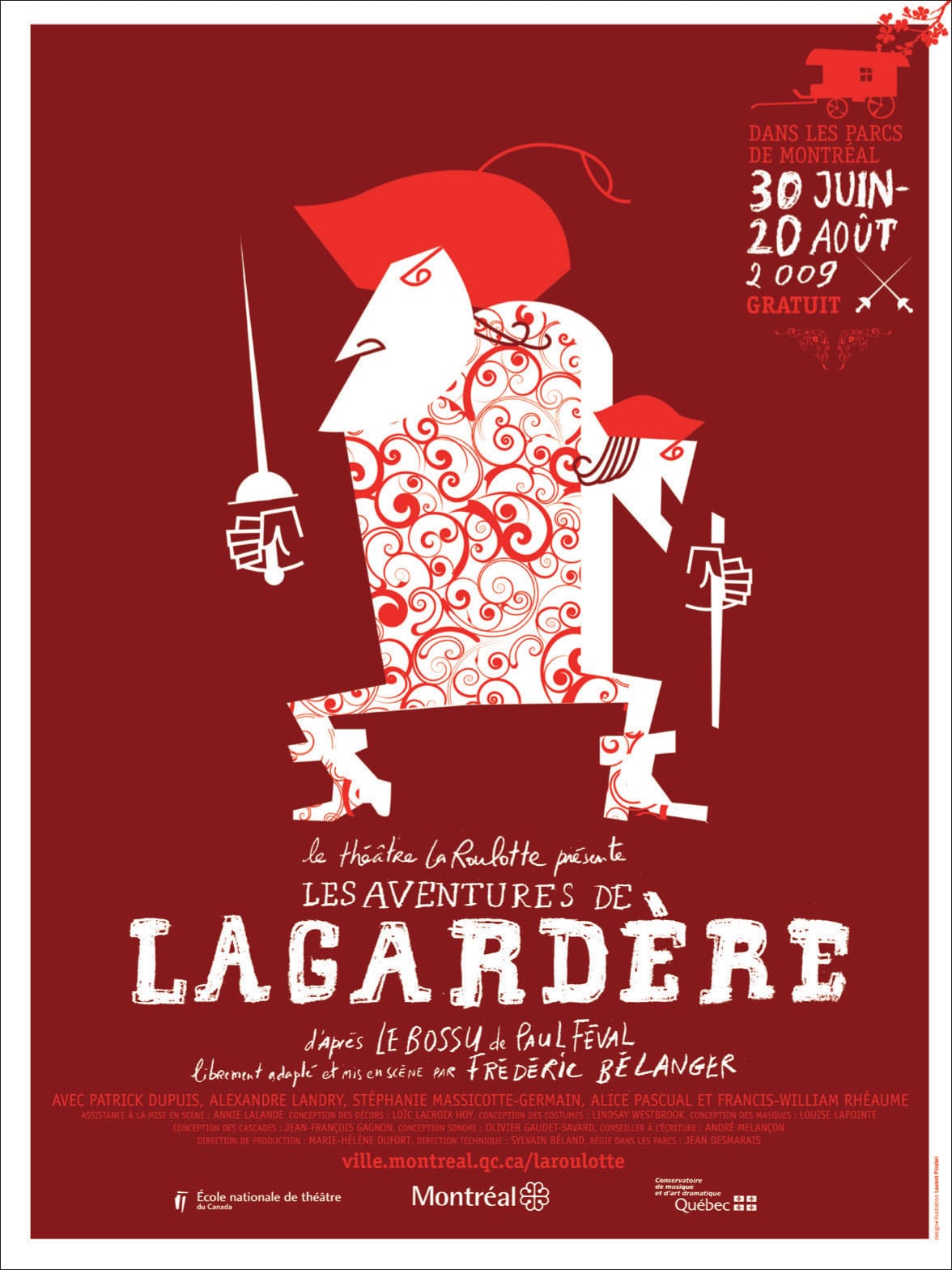
Line illustration and hand lettering for this poster, Les Aventures de Lagardére, are further strengthened by the effective use of a monochromatic color palette—an intense, vibrant red paired with a darker tone of the same color. Here tone simulates the presence of another color, thereby adding volume and depth to the overall composition.
LAURENT PINABEL
Montreal, QUE, CA
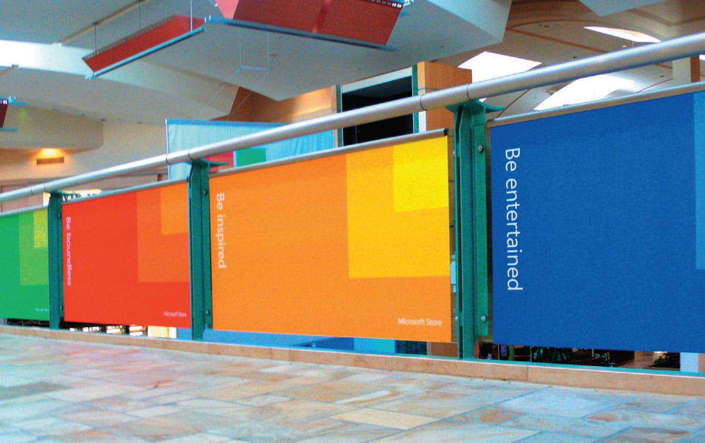
The identity and branding for the Microsoft Store, a square divided into four smaller squares, uses tones or tints of quadratic colors—red, green, yellow, and blue. This reliance on tints provides this symbol with depth, dimension, and visual activity. Variations on this same monochromatic theme of color and tone are used in environmental graphics and promotional elements, reinforcing the visual language of this program, as well as symbolizing the diversity of the company in a retail environment.
COLLINS
New York, NY, USA
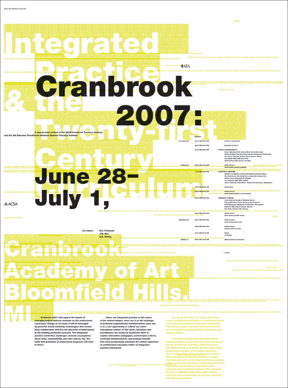
Intense color and tone is effectively used as a secondary informational layer to this poster announcing a series of educational programs at the Cranbrook Academy of Art. Sans serif typography set in various scales and contrasting colors, paired with figure–ground, allows the reader to change focus in an immediate manner, allowing easy access to layers of information.
JACK HENRIE FISHER
Brussels, BE