19 contrast
“There are dark shadows on the earth, but its lights are stronger in the contrast.”
CHARLES DICKENS (BRITISH, 1812–1870) Author
con·trast \’kän-‚trast\ n
1 a: juxtaposition of dissimilar elements (as color, tone, or emotion) in a work of art
Contrast is a visual principle that fundamentally provides the eye with a noticeable difference between two things or objects—large and small, red and green, light and dark, or hot and cold. In visual communications, contrast is the perceptible difference in visual characteristics that makes an object (or its representation in an image) distinguishable and distinct from other objects in a composition as well as its surrounding background. Contrast in a composition is the opposite of visual harmony.
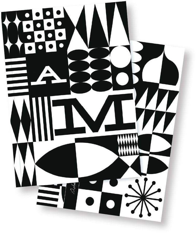
These notebook covers effectively use the design principle of contrast to present a graphic message that is powerful, and immediate. The bold use of pure geometric shapes, textures, figure–ground, and letterforms, further strengthen this concept.
ADAMSMORIOKA INC.
Beverly Hills, CA, USA
It can be achieved by exaggerating the visual differences in size, shape, color, and texture between compositional elements, thereby enhancing and making a message more immediate and understandable to a viewer. Contrast can also draw and direct attention, create a mood or emotion, and create hierarchy and emphasis in complex information in any visual message.
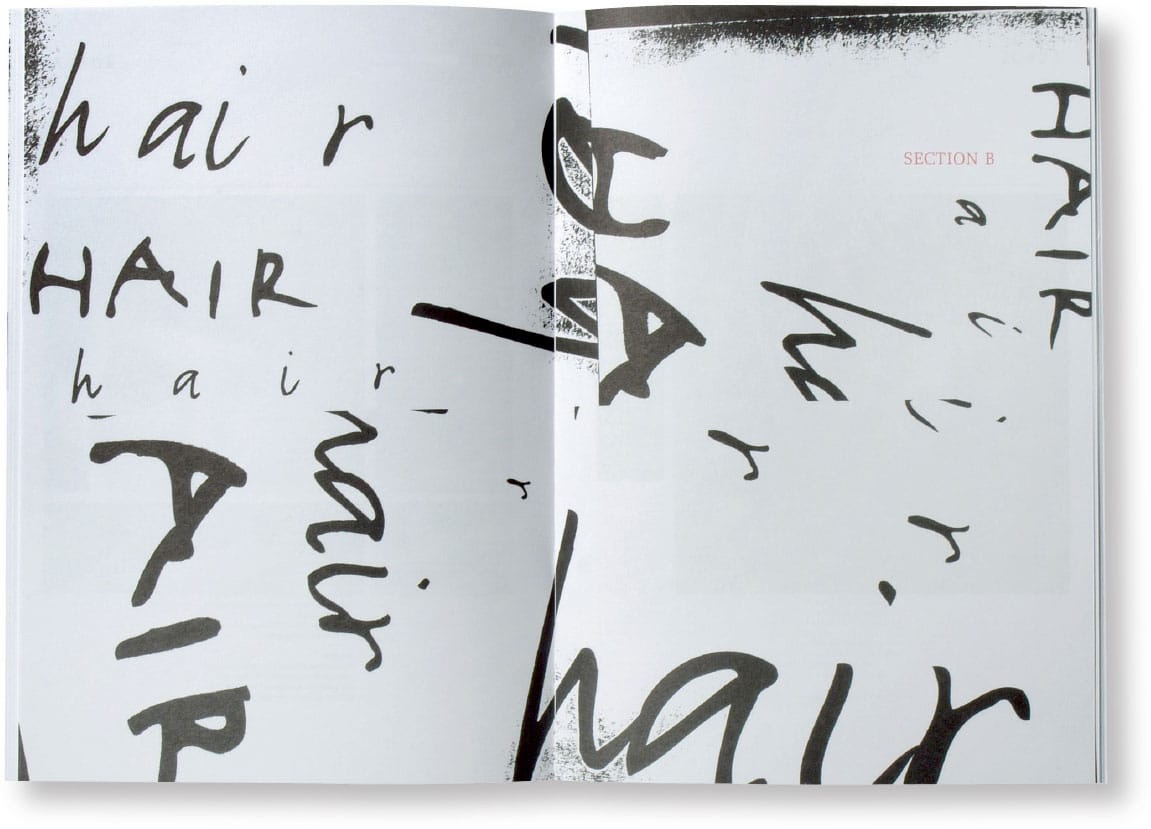
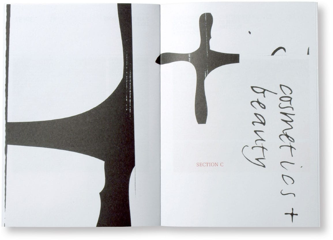
The extreme scale, cropping, and juxtaposition of these fluid, calligraphic letter-forms, placed in counterpoint to formal serif typography and articulated in a stark black-and-white palette, provide contrasts that create tension, movement, and visual impact to each and every one of the spreads in this promotional brochure for Colour Cosmetica.
VOICE
Adelaide, SA, AU
1967
Emil Ruder: Typography Book Cover
EMIL RUDER
Basel, CH
Emil Ruder and Typographie
EMIL RUDER (1914–1970) was a Swiss typographer, graphic designer, author, and educator instrumental in starting the Allegmeine Gewerbeschule (Basel School of Design), as well as developing the International Typographic Style or the Swiss School.
As a young man, Ruder studied in Paris and trained as a typesetter in Zurich. At the age of fifteen, he began a four-year compositor’s apprenticeship and attended the Zurich School of Arts and Crafts.
In 1948, Ruder met the artist-printer Armin Hofmann (Swiss, b. 1920), and they began a long period of collaboration and teaching that achieved an international reputation by the mid-1950s.
Ruder was also a writer and published a basic grammar of typography titled Emil Ruder: Typography, which was published in German, English, and French in 1967. This groundbreaking book helped spread and propagate the International Typographic Style and became a basic text for graphic design and typography throughout Europe and the United States.
The International Typographic Style was defined by sans serif typefaces and employed a rigorous page grid for structure that produced asymmetrical layouts. Its philosophy and tenets evolved directly from the de Stijl movement, the Bauhaus, and Jan Tschichold’s New Typography.
In Ruder’s work, as well as in his teachings, he called for all graphic designers to find an appropriate balance in contrasts between form and function. He believed that typography loses its function and communicative value when it loses its narrative meaning. He further believed that typography’s primary role in any visual composition is legibility and readability. A careful and critical analysis of visual contrasts, or the contrast of macro and micro, was essential to understanding both of these parameters—the negative, or white, space of the page and the negative, or white, space of letter and word forms, such as counters, letter spacing, and word spacing.
Ruder stated, “Typography has one plain duty before it and that is to convey information in writing. No argument or consideration can absolve typography from this duty.”
He also promoted an overall, systematic approach to the design of page layout and the use of complex, structured grids to bring all compositional page elements into a unified, cohesive whole while still allowing for contrasting variations in narrative and visual and content.

Comparative Relationships
Contrast is the comparative relationship between light and dark. Many other types of contrast in visual communications refer to comparative relationships or juxtapositions between two or more compositional elements. These juxtapositions can be positive and negative, geometric and organic, organized and chaotic, smooth and rough, static and kinetic, and large and small.
Contrasting relationships can be further articulated by combining elements to achieve variety and unity. Here, the ultimate challenge is to create a composition made up of disparate elements that work together as one orchestrated whole. Contrasting size, weight, direction, value, color, texture, and form can all add effective and meaningful visual interest by allowing one element to contrast and complement the other.
For example, a serpentine curve appears more curvilinear when it is close to an extremely orthogonal and straight element. A color such as red will always appear redder when it is adjacent to or surrounded by its complementary color—green.
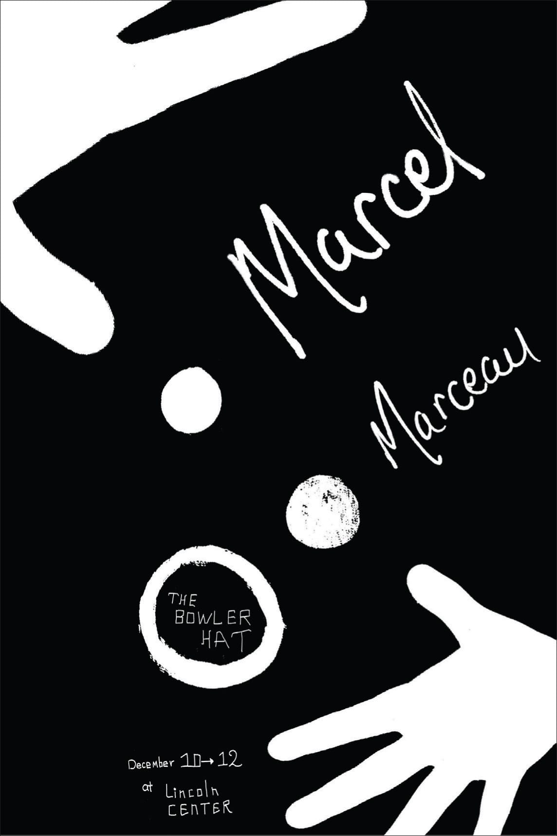
Contrast between black-and-white letterforms and hand-written script, as well as in the scale of graphic forms and textures, provides visual drama and excitement to this poster promoting a performance by the world-renowned French mime Marcel Marceau (1923–2007). The emblematic use of a black-and-white palette, the dynamic cropping of the graphic hands as if they were moving beyond the edges of the poster, and the pure representation of the performer’s face as a visual anchor and frame for the title of the performance all add to this series of visual contrasts found in this active and impactful composition.
TAKASHI KUSUI, Student
KEVIN BRAINARD, Instructor
SCHOOL OF VISUAL ARTS
New York, NY, USA
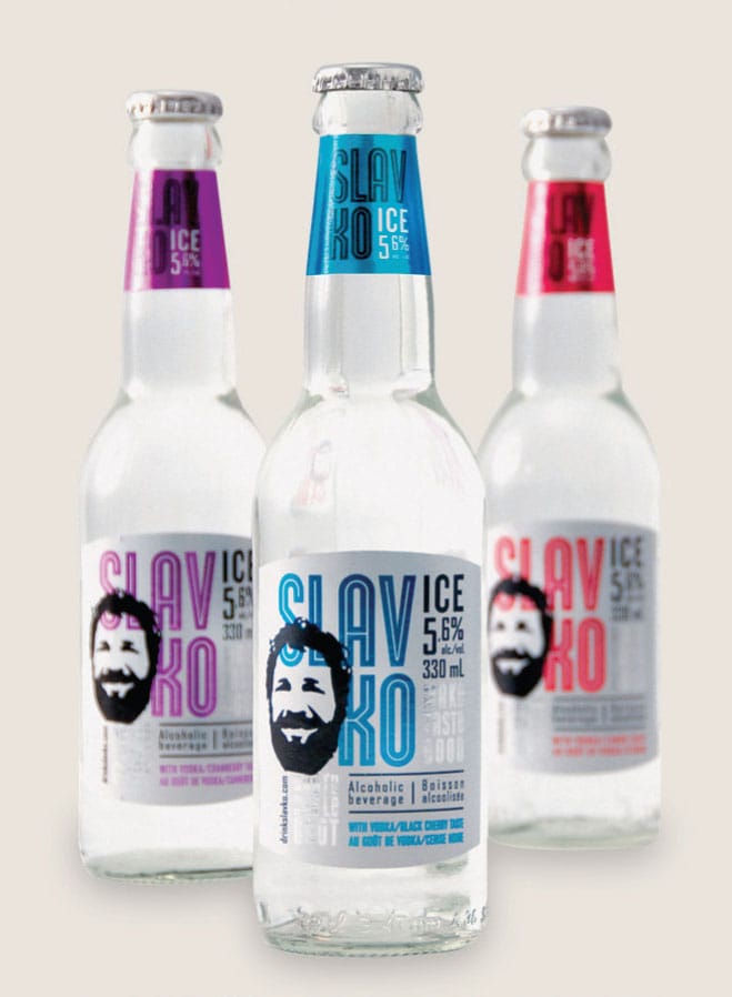
These Eastern European–inspired labels and packaging for Slavko, an alcoholic beverage line, were created using contrasts in color, scale, typography, and graphic form. Bold, inline letterforms layered with high contrast, posterized imagery, and bright, saturated colors all give increased visual emphasis, weight, and prominence to this branding program.
LG2BOUTIQUE
Montreal, QUE, CA

Characteristics and Functions
Contrast can create emphasis by establishing juxtaposition with compositional elements to stress their visual differences. For example, bright colors juxtaposed with dark colors, angular shapes with curvilinear shapes, and minuscule elements with monumental elements can create visual excitement and emphasis, as well as direct attention to focal points in a composition and organize hierarchal orders in a visual message.
Contrast creates emphasis, importance, weight, or dominance for an element of a composition. A composition lacking contrast may result in visual monotony, neutrality, and even confusion.

Solid black fields layered over existing textural elements and intense colors of a tabloid newspaper create a highly distinctive contrast for this publication celebrating the ten-year anniversary of a contemporary art museum in Bregenz, Austria. Large-scale, sans serif letterforms and blocks of narrative text are knocked out of these black fields, allowing existing backgrounds of the newspaper to show through and provide ample contrast for immediacy and readability of specific information.
SAGMEISTER & WALSH
New York, NY, USA


The promotional materials for the AIGA Boston Twenty-Fifth Anniversary use a subtle ornamental background pattern, composed of fragmented decorative and typographic elements set against a silver metallic, highly reflective, foil-stamped version of the event’s logotype. In this context, contrast is used in both a restrained and obvious manner, to achieve surface variation, nuance, and an immediate visual impact.
STOLTZE DESIGN
Boston, MA, USA

Types of Contrast
Contrast effectively uses opposing design elements such as tone, color, and shape in a composition to produce an intensified, visual effect. For example, chiaroscuro (Italian for “light-dark”) in fine art and photography is characterized by strong tonal contrasts between light and dark. It is also a technical term used by artists and art historians for using contrast of light and dark or tone to achieve a sense of volume in modeling three-dimensional form such as the human body.
Since we live in a world of color, using it as a contrasting force can immediately be understood by the viewer when conveying or emphasizing differences among visual elements in a wide variety of messages and compositions. Distinct, contrasting shapes can also produce striking reactions from the viewer. For example, a conventional shape appears more conventional and normal when an irregular, nonconventional shape is present in the same composition.
Contrast can exist on many obvious and subtle levels in a composition. The human eye can simultaneously detect contrasts in scale, value, shape, direction, and surface. It can clarify and strengthen any visual message by providing stability and clarity to the cohesiveness of a composition, draw the eye’s attention to a specific area, and affect a figure–ground relationship by maximizing or minimizing its visual immediacy.
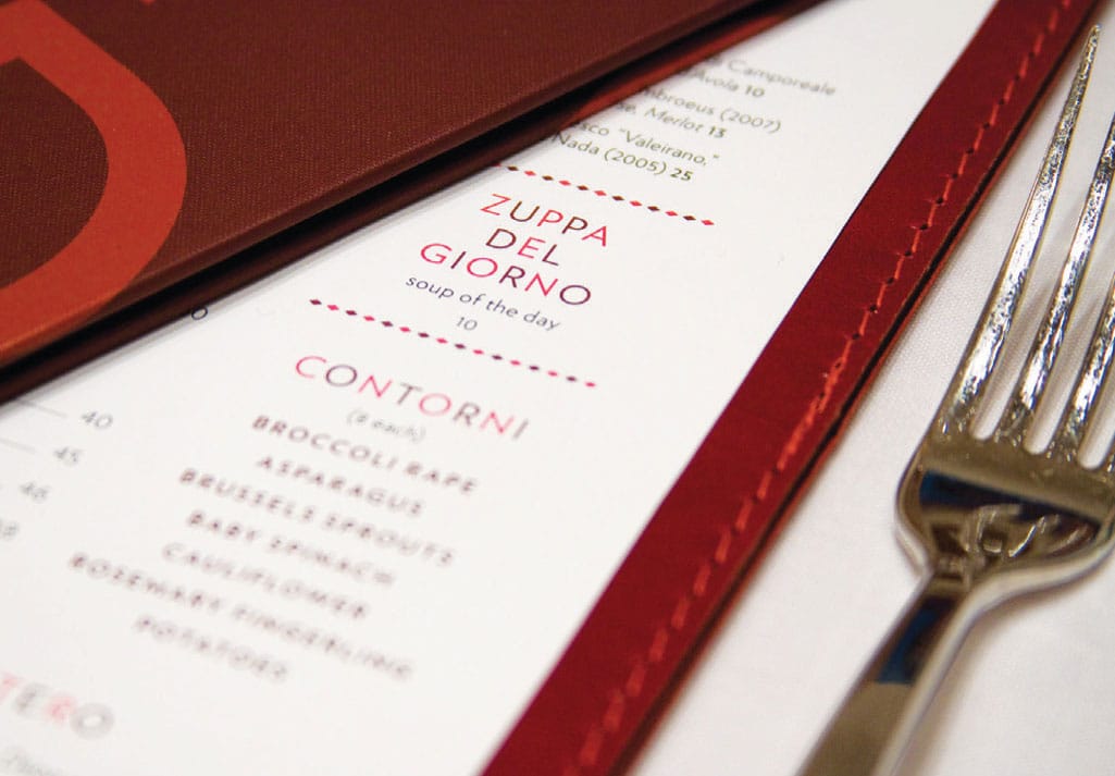
The visual branding program of Casa Lever, a restaurant located in a modernist New York City architectural landmark, uses warm colors, bold shapes, and simple geometry to evoke the spirit of Italian modernist work. Graphic contrasts can be found throughout the visual characteristics of this contemporary program—in its typographic form, two-tone color palette, informational scale and hierarchy, as well as in its logotype, packaging, and website.
MUCCA DESIGN
New York, NY, USA

This bold and distinctive brand identity and packaging program effectively uses contrast by pairing two different typefaces from two distinct type classifications, modern and sans serif geometric, and presents the brand typography reading in both orientations, offering different visual experiences when viewing and pouring.
DEVICE CREATIVE COLLABORATIVE
Winston-Salem, NC, USA
This logotype for Terence Higgins Trust’s HIV campaign in the United Kingdom draws visual attention with the effective use of extreme contrast. A vibrant red symbolizing the potential nature of a person’s HIV status is set against flanking monolithic black letterforms, creating a dramatic focus to the powerful impact of HIV throughout our society.
FELTON COMMUNICATION
London, UK

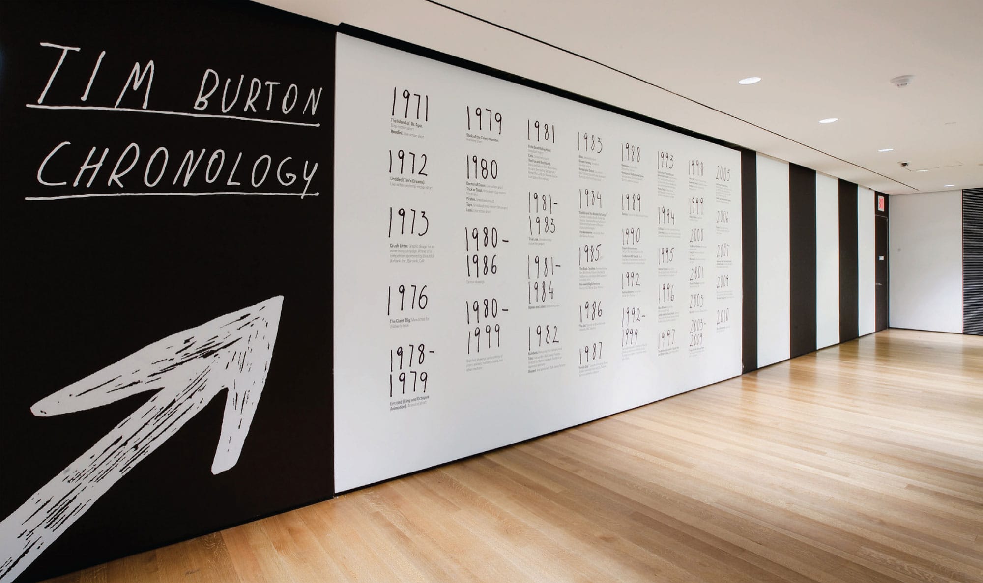
Simple, obvious contrasts of large and small, black and white, and serious and playful, are all evident in the interpretive graphics for a Tim Burton (American, b. 1958) retrospective exhibition at the Museum of Modern Art in New York City. For example, Burton’s hand lettering is juxtaposed with formal sans serif typography used for an introductory timeline, and a large-scale, spiraling floor graphic, which directs itself onto an introductory entry wall while simultaneously underlining the exhibition title “Tim Burton,” shown in his own smaller-scale, restrained hand lettering.
JULIA HOFFMANN
New York, NY, USA


This memorable poster celebrating Fritz Gottschalk’s (Swiss, b. 1937) seventieth birthday is a study in graphic simplicity, visual immediacy, and linear contrast. A segment of the crisp, evenly continuous outline of the universal cross symbol found in the Swiss flag is abruptly ragged and irregular, reconfigured to create a letterform. The designer literally tore off the left side of the cross and recomposed it into an F for Fritz. Here, the simple transformation of graphic form is further realized with contrasts in line, shape, color, and letterform.
CARBONE SMOLAN AGENCY
New York, NY, USA

In this editorial spread titled “Ashamed to be Asian?”, dynamic contrasts appear between its compositional elements—the figure–ground of black and white; the free-form character of letterforms and the sharp, cutout lines of illustrations; the intense and muted colors of the figurative illustration; and the scale of large and small elements.
TAMMI CHAN, Student
CHRISTOPHER AUSTOPCHUK, Instructor
SCHOOL OF VISUAL ARTS
New York, NY, USA