10 space
“I think that the ideal space must contain elements of magic, serenity, sorcery, and mystery.”
LUIS BARRAGÁN (MEXICAN, 1902—1988) Architect
space \'spās\ n
2 a: a limited extent in one, two, or three dimensions: distance, area, volume
4 a: a boundless three-dimensional extent in which objects and events occur and have relative position and direction
Space is a key element in visual communications. However, unlike other elements such as line, shape, form, color, and texture, space cannot be placed or located in a composition. Space refers to the distance or area between, around, above, below, and within other elements such as lines, shapes, forms, colors, textures, frames, and images in a composition. It can be two dimensional or three dimensional and described as flat, shallow, deep, positive, negative, open, closed, actual, ambiguous, or illusory.
The fundamental principle of space is an integral design element to be considered in any two-dimensional composition and can appear open, dense, compact, loose, empty, full, flat, or voluminous depending on how space is being used, organized, divided, or in other words—activated.

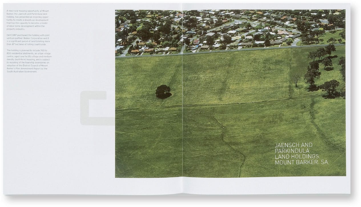
The modulated page grid and the overall size of this brochure for Daycorp Property Development share the same proportional relationship that allows for the creation of related spatial compositions from page spread to page spread throughout the brochure. Additionally, the modulated structure of the brochure’s custom letterforms, combined with regulated and consistent letterspacing and leading, creates uniform positive and negative spaces in each page composition.
VOICE
Adelaide, SA, AU

Describing Space
Space is usually identified as negative space or white space—terms that refer to the empty but often active areas of any visual composition that are void of graphic elements. Space containing elements such as shapes, forms, and images, is identified as positive space. The varied degrees or amounts of negative or positive space in any composition can create an illusion of depth through careful, established spatial relationships of foreground and background or figure–ground relationships. When negative and positive space are equal, spatial depth is lacking and a more visually static composition is created.
For example, think of compositional space as a room in your home. The room is a three-dimensional space containing your personal possessions—or compositional elements. Is it cluttered or is there ample room to live, work, and relax? You design the room by filling it with objects on its walls, floors, and ceilings. You can do the same thing by creating a composition with shape, form, color, image, and type within a two-dimensional space.
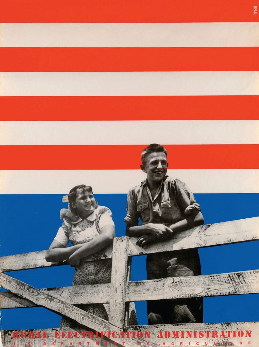
1939
Boy and Girl on a Fence, Rural Electrification Administration Series Two Poster
LESTER BEALL
New York, NY, USA
Lester Beall and the REA Posters
LESTER BEALL (1903–1969) was a twentieth-century American graphic designer notable as a leading proponent of modernist graphic design in the United States.
He was born in Kansas City, Missouri, and later moved to Chicago, where he studied at the University of Chicago and later at the Art Institute of Chicago. As a self-taught graphic designer, he initially designed exhibits and wall murals for the 1933 Chicago Century of Progress World’s Fair. In 1935, he relocated to New York City and eventually opened his own design consultancy in Wilton, Connecticut.
Beall was deeply influenced by the European avant-garde and produced award-winning work in a minimalist, modernist style for clients such as the Chicago Tribune, Hiram Walker, Collier’s, Abbott Laboratories, Time-Life, and International Paper. Throughout his work and career, he was known for utilizing angled elements, vibrant colors, iconic arrows, silhouetted photography, and dynamic shapes in an innovative and provocative manner.
Among his most recognized works are a series of public information posters that he designed for the U.S. government. The Rural Electrification Administration (REA) was one of the primary public improvement projects initiated by President Franklin Delano Roosevelt to revive a battered U.S. economy by building dams and hydroelectric power plants in rural areas of the country. The REA, a part of the U.S. Department of Agriculture, was responsible for promoting the use of electricity in rural areas throughout the United States. This now classic series of large-format posters received national and international attention. All three sets of six silk-screened posters for the REA were designed and produced over a four-year period. Their graphic simplicity and flat illustrative elements were appropriate for an audience with minimal reading skills and were reminiscent of the public posters designed by the Russian Constructivists twenty years earlier. Each poster is a thorough and thoughtful study in minimalist form and compositional space.
Boy and Girl on a Fence, a poster from Series Two, is considered one of the greatest American posters of all time. It features a young boy and girl smiling and looking to the future as they lean against a wood fence bordering their farm. Beall used flat, vibrant color, photomontage, and a juxtaposition of angled and orthogonal bands to further enhance an implied and active space in the poster’s composition. It also conveys the strong, humanistic, and patriotic spirit of rural America. This poster series is also an early example of graphic design put to work for the public good.
In 1937, Lester Beall was the first American graphic designer to be honored with a one-man solo exhibition at the Museum of Modern Art in New York City.

This symbol for a real estate developer, LargaVista Companies, uses pictorial space to convey a three-dimensional environment or volume through an isometric projection of form contained within a six-sided trapezoid.
HINTERLAND
New York, NY, USA
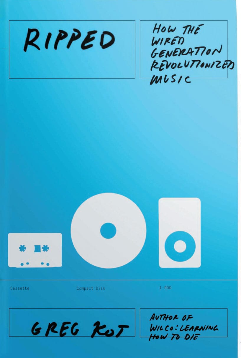
The open compositional space of this book cover for Ripped: How the Wired Generation Revolutionized Music, guides the reader’s eye in immediately focusing on the three relevant music devices iconographically represented—tape cassette, CD, and iPod.
THE OFFICE OF PAUL SAHRE
New York, NY, USA
Types of Space
In addition to the formal considerations of space as a compositional element, graphic designers can create specific types of compositional space to further enhance and strengthen any visual message:
Actual Space
The area that a visual composition physically occupies is identified as actual space.
Pictorial Space
The manipulation of flat surfaces to create a perception of depth, movement, or direction is called pictorial space. It relies on illusion to deceive the mind and eye of the viewer.
Psychological Space
A visual composition that influences the mind and eye of the viewer is called psychological space.
Physical Space
In this type of compositional space, the elemental, aesthetic, and functional requirements of space are critical physical considerations for any graphic designer, since they require an interface with the built environment. A wayfinding sign program for an airport, an exhibition of art and artifacts in a museum, or a large-scale display for an urban retailer are all representative examples of physical compositional space.
Characteristics and Techniques
Historically, visual artists and designers have created a number of methods to interpret and perceive spatial depth in a composition.
Compositional space in visual communications is essentially flat. It has height and width but not depth. However, the illusion of spatial depth and three-dimensional space in compositions can be achieved in the mind, as well as the eye, of the viewer through specific visual characteristics and techniques.
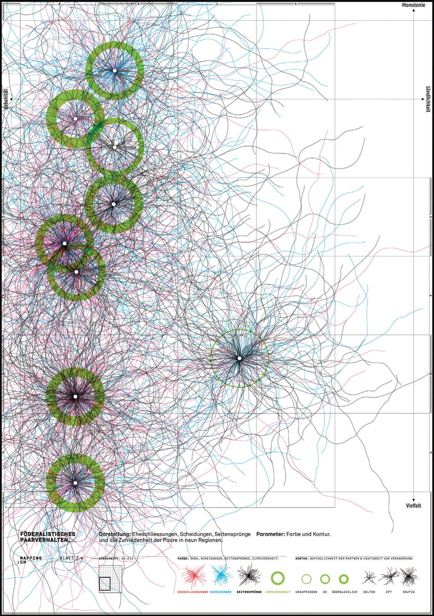
This information-based poster uses positive and negative white space to create imaginary visual landscapes for the intersection and interplay of statistical data formulated in this study on people living in selected cities. Cities are ranked according to their diversity and the degree to which they are rural or urban. Circles and spheres illustrate relationships between values and emotions—fidelity and infidelity, happiness and sadness. The different densities of colors suggest arbitrary ranking and proximity, implying that there is no simple explanation for this data.
LORENZO GEIGER
Bern, CH
Relative size in spatial relationships is one of the easiest visual characteristics for creating the illusion of space in a two-dimensional composition. A larger element will always appear closer in a composition than a smaller one.
Overlapping in spatial relationships is another way to suggest depth in a two-dimensional composition. When compositional elements overlap one another, they are perceived as if one is covering parts of the other so that one appears in the foreground and the other appears covered and in the background of the composition.
Location in spatial relationships refers to where an element is found vertically in a two-dimensional composition. The bottom of the composition is perceived as the foreground; the area nearest to the viewer and the top of the composition is perceived as its background—the area farthest from the viewer. The higher an element is placed in a composition, the further back in the composition it is perceived.

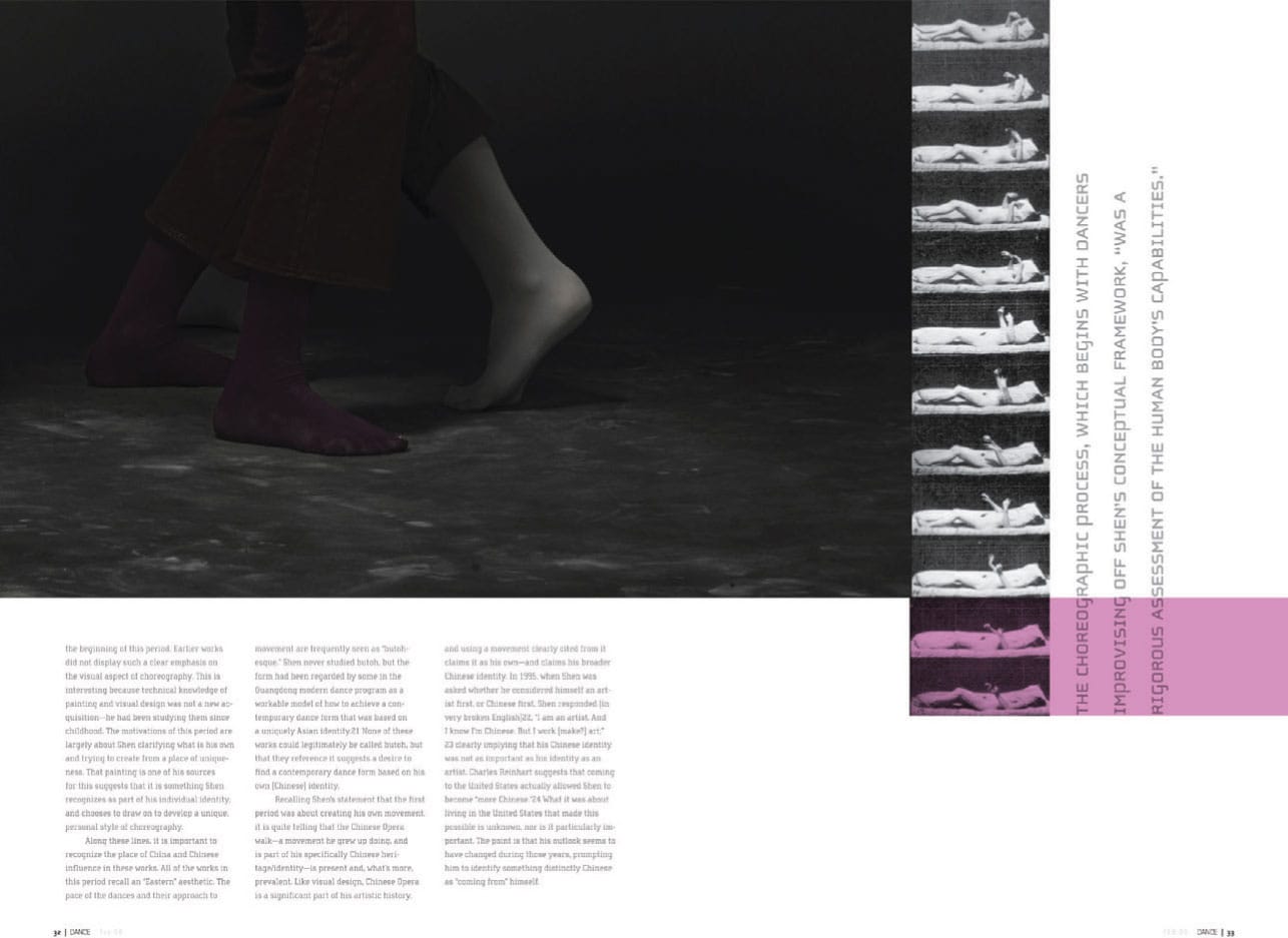
Effective compositional space is evident in these page spreads for Dance magazine. Reliance on extreme scale variations with compositional elements, such as photographic imagery, typographic blocks of text, bands of flat color, and repetitive patterns of images, reinforces movement across the active and inactive spaces of each spread.
LAURA GRALNICK, Student
RICHARD POULIN, Instructor
SCHOOL OF VISUAL ARTS
New York, NY, USA
Types of Perspective
There are three types of perspective techniques that you can rely upon to enhance spatial depth:
Atmospheric Perspective
This type of perspective in spatial relationships is another visual effect that relies on elements such as color, tone, and contrast to create the illusion of space in a two-dimensional composition. When elements appear in the distance and farther away from the viewer, atmospheric haze can obscure their visibility. This effect can be achieved by changing or modifying the visual characteristics of the composition’s elements—by lightening their value, lowering their contrast, softening their edges, minimizing their detail, or muting their color. For example, increasing the blue tone of an element also creates a sense of depth in a composition because cool colors appear to recede whereas warm colors appear to come forward.

This book cover and spine for The Language of Things immediately focuses the reader’s attention on the pristine white space that dominates its overall composition. Small-scale, iconic-color halftone images and a black dialog box containing the book’s title and author are in a secondary position and set against a stark white or black space.
MOTHER DESIGN
New York, NY, USA
Linear, or One-Point, Perspective
Parallel lines converging toward a single vanishing point located on a horizon line is called linear, or one-point, perspective.
Perspective lines above a horizon line are drawn diagonally down toward the vanishing point; lines below this line are drawn diagonally up toward it. Vertical lines indicate height and horizontal lines indicate width; in both orientations the lines remain parallel. (See diagram shown here.)

This page spread utilizes effective and meaningful white space to create a visual immediacy with the free-form silhouette of the large-scale image as well as with the common intense red color found in each photograph.
MERCER CREATIVE GROUP
Vancouver, BC, CA

While ample white space provides a visual anchor for its primary photographic image, typographic scale and weight variations used in this promotional poster for the theatrical production Sondheim on Sondheim create atmospheric perspective, which further reinforces an illusion of spatial depth in an otherwise flat, two-dimensional composition.
SPOTCO
New York, NY, USA
For example, if you see for miles along a straight road, the sides of the road in reality are parallel to one another; however they appear to draw closer and closer to one another and finally disappear at a vanishing point far off in the distance. It is one of the most common visual techniques to create spatial depth in two-dimensional compositions. This technique was first developed and used by Renaissance artists; they initially plotted perspective lines as a base to their compositions, using them to create realistic illusions of depth in drawings and paintings of architectural scenes.
Planar, or Two-Point, Perspective
In this type of perspective, the two visible sides of an element stretch away toward two vanishing points in the distance located on a horizon line. Vertical lines within the composition remain parallel to one another. The remaining lines that in reality appear parallel in the composition also appear to diminish diagonally toward one of the two vanishing points to either side of the horizon line. (See diagram shown here.)
Using these visual characteristics and techniques, singularly or in combination with each other, will strengthen the illusions of depth and space in any visual composition.
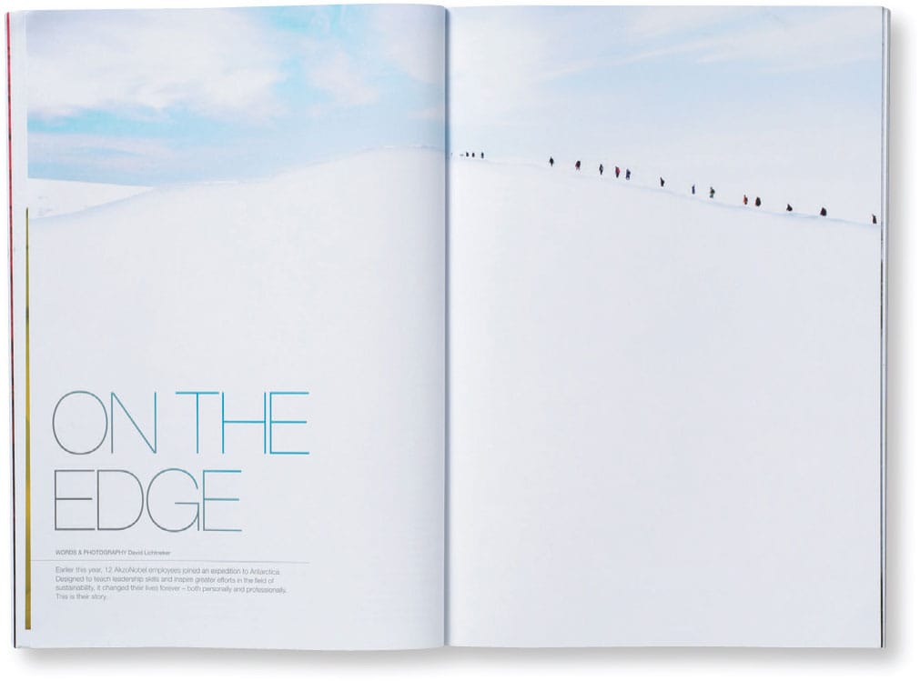
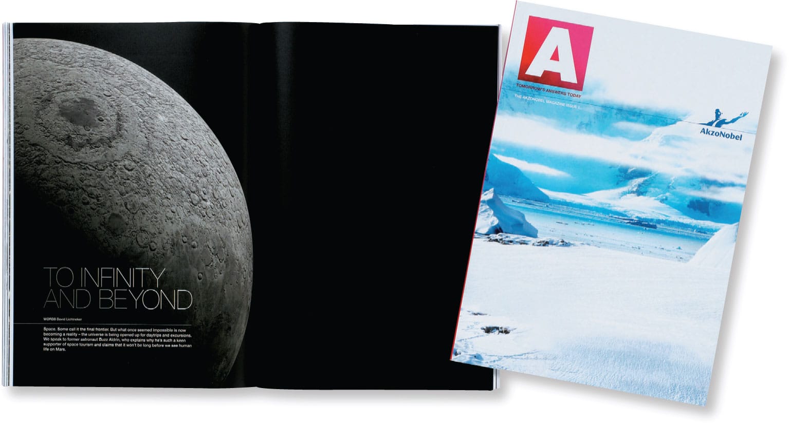
The effective use of ample pictorial or “white” space is apparent in these page spreads for Akzo Nobel’s A Magazine and further shows how depth, movement, and direction can create dynamic and active compositions.
PENTAGRAM
London, UK
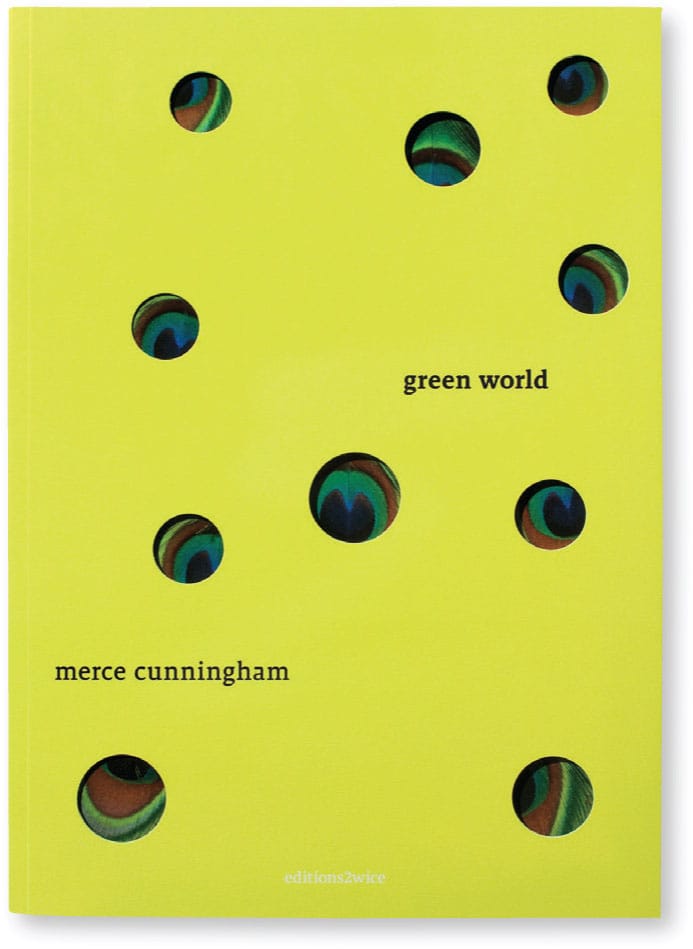
This brochure cover for American dancer and choreographer Merce Cunningham’s (1919–2009) Green World effectively illustrates how location is a critical consideration in spatial relationships when wanting to achieve depth and perspective in a visual composition. In this example, the smaller die-cut circles located at the top of the composition appear farther away, or in the background, as opposed to the circles located toward the bottom, which appear closer to the reader’s eye, or in the cover’s foreground.
PENTAGRAM
New York, NY, USA