Chapter 8
Edit and Repair Still Images
To err is human,
To edit, divine.
Srithip Sresthaphunlarp
Chapter Goals
Once a photo is captured, there are still many things we can do to it to make it more persuasive. This chapter looks at how to edit and repair single-layer images, specifically, photographs. The next chapter illustrates how to create multilayer images, called “composites,” which includes adding text and combining multiple images into one.
In this chapter, we will:
-
 Cover the ethics of editing an
image
 -
 Learn the basics of Adobe
Photoshop
 -
 Open and edit images
 -
 Repair images
 -
 Adjust images
 -
 Save images
OFTEN, THE EASIEST WAY to learn Photoshop is to manipulate an existing image. For example, you may need to get rid of unappealing elements, improve the exposure, add text, or combine multiple images—whatever is necessary to attract the eye of our audience. All of these require image editing, and image editing means Photoshop, which, for many of us, is an intimidating program.
If you’ve been discouraged looking at Photoshop—saying “I’m not an artist”—don’t give up. I’m not an artist either. In the hands of someone who can draw, Photoshop creates amazing images. We aren’t artists. We don’t need to be. What we are is communicators, and Photoshop has tools that we can use every day to improve the clarity and power of our images.
Photoshop Is Not the Only Option
Adobe Photoshop is not the only option for image editing, but it is the most well-known. Other high-quality image editing software includes:
-
Affinity Photo
-
GIMP
-
Pixelmator Pro
In addition, there are a host of painting, drawing, and sketching tools.
Years of disheartening experience have convinced me that I can’t draw a straight line without mechanical assistance. Yet, I still use Photoshop every day to create or edit images for articles and webinars to teach people around the world. You can too.
Entire books are devoted to Photoshop. Two chapters in this one does not equal a book. Instead, I want to share the basic tools you can use in Photoshop to edit, enhance, and repair images. If Photoshop catches your fancy, there are many other books that can take you as far as you want to go.
The Ethics of Image Editing
Before we start pushing pixels, I need to stress that editing an image carries with it ethical connotations. First is copyright, which we discussed in Chapter 7, “Persuasive Photos.” Make sure you have the right to edit an image.
Second is content. The development team at Adobe and I have frequent debates about the ethics of image and audio editing. Adobe makes incredibly powerful tools that allow us to alter images in ways that may not be appropriate, legal, or fair. Adobe’s point of view is that “they just make tools.” My point is that a lot of the “fake news” we are dealing with today is because these tools are so accessible. There’s no easy answer, though I think Silicon Valley, in general, too often treats ethics as “someone else’s problem.”
Andy Grove, the former head of Intel, once said: “A fundamental rule in technology says that whatever can be done will be done.1” However, that doesn’t give us carte blanche to do whatever we want with it.
[1] (Attributed to Andy Grove in: Ciarán Parker (2006) The Thinkers 50: The World’s Most Influential Business. p. 70)
Please consider the ethics of what you are doing.
Journalism ethics require no image editing to any image of any sort. Creating images for advertising frequently requires significant editing. My work is somewhere in the middle. In the photos I shot for this book, I cleaned up blemishes and distracting elements because I wanted to make a certain point. I think that’s ethical. Using the same tools, I could put one actor’s face on another’s body; or put someone in a location they never visited in real-life. I think these are not ethical. These choices are up to you. I simply want to wave a flag and say, “Please consider the ethics of what you are doing. Would you like someone else to mistreat images of you?”
Getting Started with Photoshop
Before opening the app, let’s review the foundation upon which all digital images are built: bitmaps.
Bitmap Fundamentals
A bitmap, as shown in Figure 8.1, is a rectangular grid of generally square pixels where each pixel is the same size as its neighbor, and each pixel has one and only one color. Photoshop, at its simplest, is a pixel editor. (In contrast, Illustrator, at its simplest, edits curves called “vectors.” Vectors are highly useful visual tools, but for this book, I am concentrating on bitmaps.)
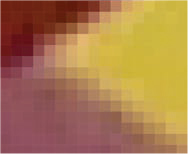
Figure 8.1 An enlarged detail from a photo bitmap. All digital images are composed of rectangular bitmaps.
Pixel
Short for “picture element,” a pixel is the smallest component of any digital image, moving or still. Pixels are fixed in size and aspect ratio, contain one and only one color, and can be transparent, translucent, or opaque. Pixels are organized into a rectangular grid called a bitmap. Everything we do in Photoshop comes down to manipulating pixels. Almost all pixels in digital images are squares.
The big benefit to bitmaps is that they display quickly even on older systems, are easy to edit, and provide lots of color and texture. The limitation of bitmaps is that they create large files, sometimes very large files, and that they can’t be enlarged without getting blurry.
Each pixel can have up to four values associated with it: the amount of red, blue, and green that make up the color, plus the amount of transparency. While a pixel has no default color, all pixels by default are fully opaque.
How Much to Show
One of the challenges I wrestled with in writing this book is determining how detailed the tutorials should be. If I make them too detailed, as soon as the software interface changes, this book is out of date. If I make them too abstract, you’ll understand the concept, but not how to implement it. It’s a tricky balance. If one of these techniques intrigues you, there are a wealth of books and online resources you can refer to learn more.
When you open Photoshop, you see the interface in Figure 8.2, though, ah, without the image. Tools are on the left, tool options across the top, a series of control panels on the right (I will talk about these in the next chapter), and a big window where our images are displayed in the center.
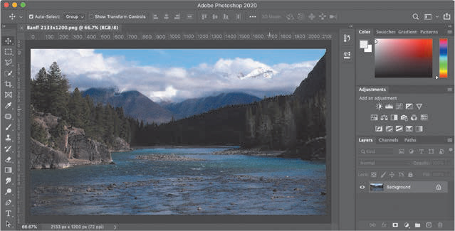
Figure 8.2 The Photoshop interface showing the Bow River near Banff, Canada.
Optimize Preferences
Before we start editing images, we need to change two settings in Preferences and one menu setting to optimize Photoshop for our work.
On Macs, Preferences are in the Photoshop menu. On Windows, Preferences are in the Edit menu.
All digital images are sized in pixels. But, by default, Photoshop measures images in inches. So, change Preferences > Units & Rulers to Pixels (Figure 8.3).

Figure 8.3 Set Units & Rulers to Pixels.
Then, to improve image quality when resizing, change Preferences > General > Image Interpolation to Bicubic Sharper (Figure 8.4). This improves edge definition when resizing lower-resolution images, preserving the apparent focus of an image.

Figure 8.4 Set Image Interpolation to Bicubic Sharper.
Finally, after you open an image into Photoshop, which I’ll get to in a second, go to the lower-left corner, below the image, and click the small right-pointing arrow and change the setting to Document Dimensions (Figure 8.5). This displays the size of your image in pixels, with the horizontal dimension listed first. Since everything we do for the web these days is based on pixels, changing this setting helps us make sure all our images are the right size.

Figure 8.5 Switch the lower-left display to Document Dimensions.
Explore the Interface
As you might guess, to open an image, choose File > Open, the same as any other application. Then, navigate to the image you want to work on.
Other Ways to Open Files
-
Drag one or more images into the interface.
-
Drag one or more images onto the Photoshop dock icon.
-
Double-click an image in the Finder (though this may open Preview instead of Photoshop, depending upon settings in the Finder File > Get Info dialog).
Before you open your first image, or any image actually, make a copy of it. That way, if anything goes wrong, you still have the original as a backup. This is especially true if you are new to Photoshop.
Now that you’ve opened an image, let’s explore the interface a bit. To zoom in, press Cmd+[plus]. To zoom out, type Cmd+[minus]. To fit the image into the screen, press Cmd+0 (that’s a zero). To display the image at 100 percent size, press Cmd+1. (All these shortcuts do is change your view; you are not altering the image in any way.)
All these techniques work exactly the same for Windows users. Simply substitute Ctrl for Cmd and Alt for Option. (Mac users, Cmd is short for “Command.”)
Press V to select the Move tool. This is the most useful tool in Photoshop. When in doubt, press V to reset your tools and switch the cursor back to its default operation.
Press Cmd+[plus] a few times to zoom in. Press the Spacebar, which displays the Hand tool, and drag the image. This allows you to change your view of the zoomed-in image.
All the tools we need to change our images are stored in the Tools panel on the left. The problem is that the position of these tools changes depending upon how you configure your workspace. It is easier to search for a tool than to track it down in the Tools panel.
Click the magnifying glass (the Search icon in Figure 8.6) to display a search window. Enter the name of the tool you need and press Return. Let me illustrate. (You can also access the Search box by selecting Edit > Search or pressing Cmd+F.)

Figure 8.6 The easiest way to find a tool is to search for its name using this magnifying glass in the upper-right corner of the interface.
Getting Started Editing
The best way to learn Photoshop is to edit an existing image. That gives us something to work with, without worrying about how to create it in the first place. Open the image of your choice using File > Open. Then, let’s start exploring by correcting errors we made during shooting.
Straighten an Image
Most of the time, when shooting stills, we hold the camera in our hands. This means that, often, our images may not be level (Figure 8.7). This needs to be fixed because, while we may shoot tilted pictures, our eyes don’t like to look at tilted pictures.
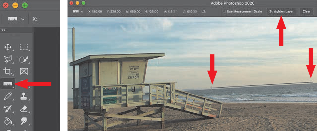
Figure 8.7 The Ruler tool (left), a ruler line (lower two arrows), the Straighten Layer button (top) in the Options bar.
The Options bar, at the top of Figure 8.7, provides optional settings for almost every tool. For example, with the Ruler tool, it displays a variety of precision measurements. Keep your eye on this bar because it provides a wealth of customization options for each tool.
Fortunately, Photoshop has a hidden tool that allows us to easily straighten an image. Click the Search icon in the upper-right corner and enter “Ruler Tool”; then press Return. The Ruler tool is highlighted in the Tools panel (Figure 8.7). See those small arrows in the lower-right corner of many tools? Click one and discover multiple tools hidden under one icon. This is why I like using the Search box—I can never remember which tool is where.
Next, find a line in your image that should be horizontal or vertical. Click and drag the Ruler tool along that line. (In this example, I raised the line slightly above the horizon so you can see it more easily. It should actually track along the horizon.) This tells Photoshop the horizon should be level, but isn’t. Finally, in the Options bar, click the Straighten Layer button. Photoshop rotates the image and removes the tilt.
It’s Never Too Late to Change Your Mind
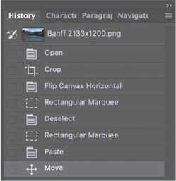
If at any time you realize you made a mistake, press Cmd+Z to Undo it. If you made the mistake a while back, choose Window > History to display a list of everything you’ve done to a file since it was opened. Click any line item to jump back to that point in time.
This is a “multistep Undo” all in one step. (The History panel tracks your last 50 steps; you can change this number in Preferences > Performance.)
The trick to using the Ruler tool is to find something in your shot that is actually supposed to be horizontal or vertical. If the results don’t look right, Undo; then select a different edge and try again.
I find myself leveling a lot of my handheld shots.
Scale an Image
The next task we often need to do is scale, or resize, an image. Most digital cameras shoot images measured in “megapixels,” or millions of pixels. These are far too large to post to the web, any web page that contained them would take forever to load. So, we need to scale these to a smaller size.
Remember, scaling any bitmap larger than 100 percent will always make it look soft, blurry, and, generally, bad.
Go to Image > Image Size to display the dialog shown in Figure 8.8. This changes the size of your entire image. Notice the Resolution setting at the bottom? As mentioned in Chapter 5, “Persuasive Colors,” “resolution” can mean either the number of pixels in an image or pixel density. In this case, resolution means pixel density (pixels/inch), which applies only to images you print.
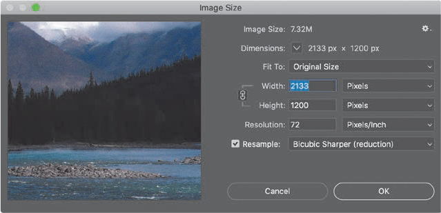
Figure 8.8 The Image Size dialog allows you to change the size of an image.
For all images posted to the web or digital video, you can ignore the Pixels/Inch setting. Instead, pay attention to the total number of pixels across (Width) and high (Height). As well, Bicubic Sharper is the best option for scaling lower-resolution images. (This is why I changed the Preferences settings earlier in this chapter.)
If you click the Pixels menu, you’ll see options that allow you to enter either a pixel or a percentage value for scaling the image. While I generally use the Pixels option, it’s nice to know that we can also use percent when needed. (For example, on my website, all my images need to be no wider than 680 pixels; the height doesn’t matter. So I scale many of my screen captures to fit within this horizontal width limitation.)
Mac Retina Displays
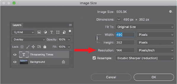
This image represents the higher pixel density of screen shots taken on Mac Retina displays (called HiDPI on Windows). When posting images to the web, ignore the Resolution setting and just look at the total pixels for Width and Height. For web work, I set this to 72, just to keep all my images consistent.
Crop an Image
The process of selecting and retaining just a portion of the image is called “cropping.” A good idea, during your photo shoot, is leave a little more space around the edges than you need. This simplifies straightening images as well as cropping. It is easy, as you are about to learn, to crop images to remove what you don’t need. But, if you accidentally fail to include someone’s head in the original shot, there’s not a lot you can do to fix it.
As Annabelle Lau, one of my teaching assistants, told me after reading this paragraph, “It’s truly a loss. I have a ton of cut-off shoes and feet because you don’t think about this when you take the picture.”1
To crop an image, search for “Crop tool” (Figure 8.9). Then, drag the highlighted corners of your image to select just a portion of the frame. (And, did you notice that Photoshop automatically supplied a Rule of Thirds grid to help guide your framing?)
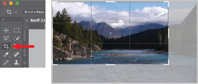
Figure 8.9 The Crop tool (left) and a crop in progress.
In Figure 8.9, I’m cropping a portion of my photo of the Bow River in Alberta, Canada. The Crop tool highlights that part of the image we will keep, while obscuring, but not yet deleting, the portion we’ll remove.
More Crop Tool Options
After dragging the corners of an active crop rectangle, click inside its boundary and drag to change the position of the image within the crop window. Press Option while dragging a crop corner to have all four sides move at the same time. Press Shift to constrain the aspect ratio.
Because cropping selects only a portion of an image, the default Crop tool options always change the pixel dimensions of an image. Most of the images of our two actors in Chapter 7 were cropped slightly to allow me to emphasize specific points in each shot.
If you don’t have strong horizontal or vertical lines in an image, the Crop tool provides another way to level an image. After you’ve started a crop, move the Crop tool just outside a corner of the crop window, as shown in Figure 8.10. A two-headed curved arrow appears, allowing you to rotate the image. The white numbers against a black background show you how far you are rotating the image.
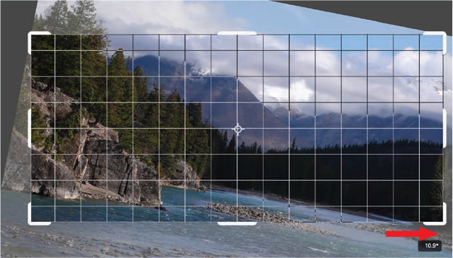
Figure 8.10 Click outside the cropping rectangle and drag to rotate an image. The grid lines in the Crop window provide another way to level an image, this time using your eyes.
When I write one of my online tutorials, it’s not unusual for me to include 20 to 30 images. Each one gets opened into Photoshop, and almost all get scaled and cropped. I use these tools daily.
Save an Image
Just as you need to open an image before you can edit it, you need to save an image before you can send it anywhere.
If you choose File > Save, it saves your revised file using the same name and image format (just as you’d expect if you were saving a Word file).
However, if you choose File > Save As then click the Format menu illustrated in Figure 8.11, then, yup, those pesky codecs came back to confront us with more decisions.
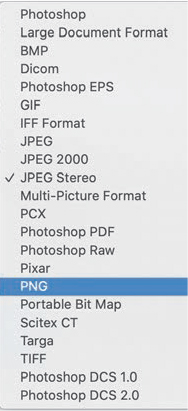
Figure 8.11 Photoshop can save in a wide variety of image formats.
Cloud Documents
New in Photoshop is a button called “Save to cloud documents.” Cloud documents are Adobe’s new cloud-native document file type that can be accessed online or offline directly from within the Photoshop application. Cloud documents can be accessed across devices, while your edits are automatically saved through the cloud. Principally designed for mobile devices, this format is supported in all versions of Photoshop. Cloud documents are not supported on Windows.

TABLE 8.1 Select the Right File Format
|
TASK |
FILE FORMAT |
NOTES |
|
Save a compressed file to post to the web. |
JPEG |
Set image quality between 6–10. |
|
Save a high-quality master file. |
TIFF |
TIFF is high-quality, but support for layers and transparency is not widespread. |
|
Save a high-quality master file, with a smaller file size than TIFF. |
PNG |
Transparency in PNGs is possible, but not widely supported. |
|
Save a high-quality file for later editing with layers, transparency, and wide application support. |
Photoshop (PSD) |
This keeps all elements separate, allowing future changes. |
My preference is to save master files that I might re-edit as PSDs, master files where all elements are saved as a single layer to TIFF or PNG, and all files for the web as JPEG. You can, of course, pick other options, but these options cover all the work that I do on a regular basis.
Repairing an Image
To me, the difference between “editing” an image and “repairing” it is based upon the condition of the image. However, as I write this, I find myself using all these techniques on both old and new images, so perhaps this definition is based on what’s in my mind more than in reality.
Most of the time, repairs are simple: remove a stray piece of hair or a scratch in an old photo, adjust exposures or color balance, or remove a distracting element in the background. This section shows how these are done.
The Spot Healing Brush
Figure 8.12 is a typical repair example; it shows an older photo with some damage. There’s a big white spot near his pocket, a tear near the right side of his neck, and dirt in the middle of his forehead. All of these can be cleaned up using the same tool: the Spot Healing Brush.
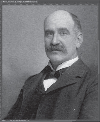
Figure 8.12 This Charles Faben, Jr., image needs repair to remove blemishes.
Search for “Spot,” and Photoshop displays the Spot Healing Brush.
Select the Spot Healing Brush (Figure 8.13) then move the cursor on top of the blemish you want to fix. A small circle appears at the tip of your cursor. Adjust the size of the circle to be a bit larger than the blemish you are trying to fix. (Type the left or right square brackets to increase or decrease the size of the circle.) Click the blemish and—poof!—gone. Photoshop matches the color and texture of the area around the repair and works its magic.
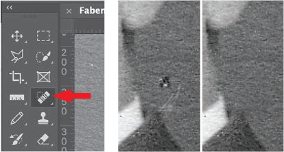
Figure 8.13 The Spot Healing Brush (left) and image damage before (middle) and after repair (right).
In Figure 8.13, I used the Spot Healing Brush to remove the hole in the image and the scratch just below it. I use this constantly to repair/remove scratches, blemishes, background wires, and stray hair. It’s an amazing tool!
Remove Redeye
When taking a quick photo using a camera light, all too often the subject’s eyes glow red. This is caused by light from the camera bouncing off the retina in the back of the eye.
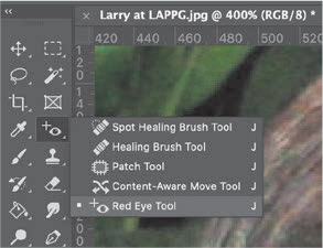
Photoshop has an easy way to fix this. Go to the search box and look for “Red Eye Tool.” It’s in the same menu as the Spot Healing Brush. Select the tool then drag a selection rectangle around each red eye. Poof! Gone.
The Clone Tool
The Spot Healing Brush makes mistakes disappear. The Clone tool allows you to replicate a portion of an image somewhere else. By now, you know how to find a tool—search for its name.
To use the Clone tool, press the Option key and click somewhere identifiable. This selects what you want to copy. (In Figure 8.14 I used the intersection of the tree trunk on the right with the flowers at the edge of the hillside.) Then, click where you want to paint the copied image and drag, as though you were painting. A new tree grows instantly.
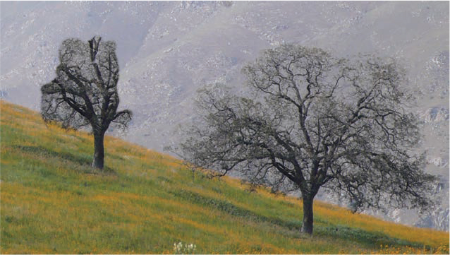
Figure 8.14 The Clone tool copies a portion of an image somewhere else, as we are copying the tree on the right to create a small wooded area.
The trick to using the clone tool is finding the right reference so perspective and horizon lines match. By Option-clicking the edge of the flowers, it becomes easy to paint the new tree starting at the same edge. Using the Clone tool to create believable copies takes a bit of practice, but, with practice, this becomes a useful tool for removing overhead power lines from a scenic shot, adding shrubbery, or removing a wall plate from behind talent (Figure 8.15).
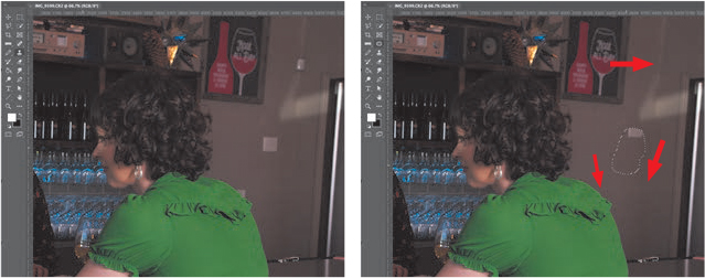
Figure 8.15 These wall plates are a good example of distraction. I used the Clone and Patch tools to remove them.
The Patch Tool
The Patch tool allows us to get rid of areas we don’t like—for example, the white wall plates on the right side of Figure 8.15. Select the Patch tool, then drag to create a small selection circle around the area you want to remove. (A “selection” is a region defined by a dotted line. We’ll use them a lot in the next chapter.) As you drag, the selected region is replaced by the region you drag the selection area into.
In Figure 8.15, I used the Clone tool to remove the wall plate by Allison’s shoulder, because I needed the precision it provided. Next, I used the Patch tool to remove the two units higher on the wall because the Patch tool works better with areas than the Clone tool. Why am I removing these areas? Because they distracted the eye from what I wanted you to see, which was the dialogue between Allison and Kim. There was no reason to keep those distractions in the shot.
To summarize, the Spot Healing Brush replaces a blemish with pixels that match the surrounding area. The Clone tool allows us to copy portions of the image from one place to another. The Patch tool allows us to replace one region with another. I used these tools frequently for the images in this book.
Adjust Image Exposure
Like many older photos, the picture in Figure 8.16 is a bit washed out. (It also needs straightening and cropping, which we already know how to do.) One of my favorite tools in Photoshop—and one of the oldest—allows us to adjust the exposure: Levels.
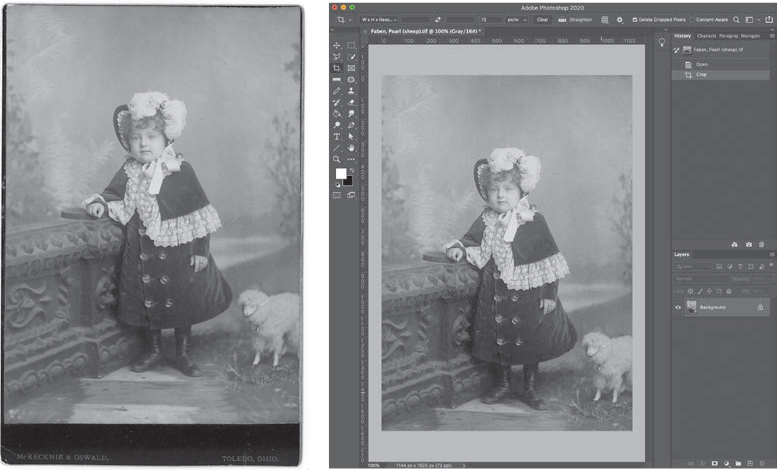
Figure 8.16 Here’s what the well-dressed 4-year-old wore in Toledo, Ohio, in 1884. The left image is the source; the right image is after rotation and cropping. (And, yes, I love that little lamb, too.)
The Levels panel (Figure 8.17) allows us to adjust grayscale values for an image or a selection, which we’ll cover in the next chapter. The Histogram, which we first met in Chapter 2, “Persuasive Visuals,” displays the range of grayscale values for the entire image, with black on the left, white on the right, and midtone grays in the middle.
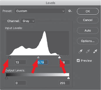
Figure 8.17 The Levels sliders adjust black (left), midtone (middle), and white grayscale values in an image or selection.
Exposure is another way to say “grayscale values.” Grayscale is what makes an image light or dark. It also provides texture. Adjust grayscale values first, before you adjust colors.
Notice that the pixel values, represented by the white shape, don’t go all the way to each end. They are bunched in the middle. This is typical for images with a “washed-out look.” There are no rich shadows or highlights, just a bunch of gray in the middle.
To correct this, move the bottom-left slider (left arrow) to the right until it just touches where the histogram starts to curve up. This moves the value of the darkest pixels in the image closer to black, making the shadows fuller.
Then, drag the right slider (right arrow) until the histogram just starts to curve up. This moves the lightest pixels closer to white, adding sparkle and energy to the image.
Finally, move the middle slider until the image looks “better” to you. This is a subjective judgment on your part—there’s no magic number that works for all images. TABLE 8.2 summarizes these adjustments.
TABLE 8.2 Adjust Grayscale Values to Maximize Emotion
|
ACTION |
RESULT |
|
Adjust shadows (step 1.) |
Makes an image feel “richer” |
|
Adjust highlights (step 2.) |
Gives an image energy and snap |
|
Adjust midtones (as needed.) |
Changes the emotional feel and/or time of day |
The best way to see how this works is to play with an image. You don’t need to move these sliders a lot. But, especially for a washed-out image, Levels can create a world of improvement.
Add Fog—or Take It Away
As an experiment, load a photo of an exterior scene into Photoshop, open the Levels dialog and drag the Black and White sliders for Output Levels, at the bottom, toward each other. Notice how the image gets “foggy” as the deep blacks and sparkling whites disappear? Not only can we make images look crisper, we can also make them look like they were shot in a deep fog. Cool!
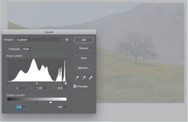
Note the power of the midtones. As you slide these, especially on an exterior shot, notice how the time of day seems to change, which also affects your emotional response to the shot.
Figure 8.18 is the finished result, after straightening the image, cropping, and adjusting levels. See how she “pops” off the page? It’s a much better image.
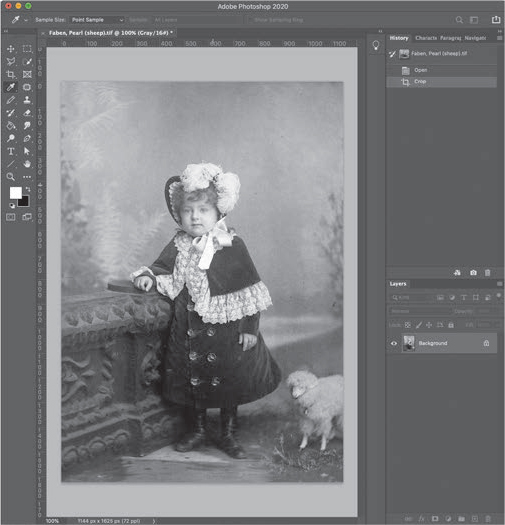
Figure 8.18 The finished image.
Adjust Color
There is an automated tool that solves another problem: incorrect color. I am not a fan of automated color tools; most of the time I prefer my own settings. But, this one can bail you out in a pinch, without you having to know anything about color theory or color correction.
Many times we need to deal with a color cast, which results in an image that’s too green or blue or orange. Figure 8.19 is a good example of this. Choosing Image > Auto Color will remove most of that color cast. Generally, this will get you close, but it won’t equal the results of using more specialized color tools in Photoshop.

Figure 8.19 The plane’s image is too green (left). After applying Image > Auto Color, the green cast is removed, and the image looks “normal.”
A Fast Way to Create Black-and-White Images
Thinking of color, to quickly make any image black-and-white, choose Image > Mode > Grayscale. When the “Discard Color” warning appears, click Discard. However, once you save that image, all the color information is removed—it will be black-and-white permanently.
Figure 8.20 illustrates another use of these tools: not to repair an image but to create a look. Here, I adjusted the Levels to give the image a washed-out look. Then, I reduced the saturation (the amount of color) more than 60 percent using Image > Adjustments > Hue & Saturation and dragging the Saturation slider to the left.
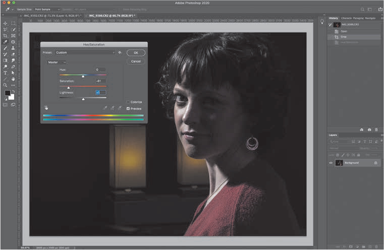
Figure 8.20 An image with 50 percent saturation, that is, with half its color removed, using Image > Adjustments > Hue & Saturation.
These washed-out, desaturated images are often used as “before” images in a commercial comparing the results of using a product. Black-and-white is also popular for these Before & After comparisons.
Color Balance
There’s one more tool I want to introduce to you: Color Balance (Image > Adjustments > Color Balance). This allows you to adjust the amount of red, green, and blue in the shadows, midtones, and highlights of an image. (Photoshop pros would point out that Curves take these adjustments to an entirely different level, but explaining how to use Curves is well outside the parameters of this chapter.)
In Figure 8.21, the source image of a cabin in the woods was green, not surprising with all the foliage around it. I applied the Color Balance tool, which allows us to adjust the amount of color in the shadows, midtones, and highlights. Virtually all color adjustments, especially the easy ones, are made in the midtones.
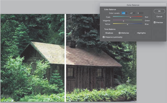
Figure 8.21 The source image was green. Using Color Balance, I removed some of the green from the midtones and added red.
To remove a color, slide the control toward the opposite color. So, to remove green, slide the control toward magenta, which is the opposite of green. (“Opposite” refers to the color wheel presented in Chapter 5.) To increase the amount of red, drag the top slider toward red. Keep adjusting until the image looks “right” to you.
As you can imagine, there is a lot you can do with color, as you’ll discover as you experiment on your own. These tools will get you started. The good news is that you don’t need to be a color expert to improve your images. In most cases, we only need to make minor adjustments to an image. These tools are here to help.
Monitor Calibration
As you start to adjust images for grayscale and color, it is useful to make sure your monitor is calibrated. This adjusts your computer monitor so that you are seeing accurate colors. While this may not be essential to your work, it is often reassuring to know that your monitor is displaying colors accurately. Visit www.datacolor.com to learn more.
Key Points
In this chapter, we looked at how Photoshop can help edit and repair single-layer images. Here are the key points I want you to remember:
-
 Any image editing involves ethical
decisions. Treat your images and the people in them with
respect.
 -
 All digital images are bitmaps, which
are a rectangular grid of pixels.
 -
 When editing an image, the two most
common improvements are straightening and cropping the image.
 -
 When repairing or adjusting an image,
the two most common fixes are the Spot Healing Brush and
Levels.
Practice Persuasion
Using the image editing tools on your cell phone or computer, take a photo you shot for the exercise at the end of Chapter 7 and:
-
 Remove the color.
 -
 Boost the amount of color using
saturation.
 -
 Adjust levels to make it more or less
“contrasty.”
 -
 Modify the colors to make it more
gold, blue or green.
How do these changes affect your interpretation of, or emotional response to, the image?
PERSUASION P-O-V
FINAL MEMORIES
Natasha Mary (and Michelle
Benton)
Owners: Tasteful Transitions
www.tastefultransitions.com.au
You get only one chance to evoke a response in people using the images they provided to create an emotional funeral slideshow.
When you attend a funeral, the funeral director or family present a photo slideshow to attempt to relay the meaning and magnitude of the deceased life. Often the photos are randomly sequenced to a song with no apparent connections. This means people are not drawn into the visual story, not drawn into the emotional experience of this life. They become just photos to a song.
Family photos are the raw materials I use to create a wonderful living memorial to evoke feelings and enhance the memories of lives shared. Working with families to depict who their loved one was means conveying who they were through images and the deliberate sequencing of those images. As we go through the photos, I listen to the information and stories the family tell me in relation to who their loved one is to them. As we are talking, I move the story into a visual format using the photos we are sorting. The combination and arrangement of the photos and the experiences they are sharing provide the “magic” people witness at the end.
The family and contextual needs are different for different age groups, and the audiences have different responses and associations with images. Here are four examples.
The death of a baby is always difficult. In this world of cell phones, even a short life is well-documented. Olivia was a cot death baby of 3 months. She was her mother’s dreamcatcher baby. Mum had a tattoo of a dreamcatcher to represent Olivia. I used photos of this and the photos of the dreamcatchers hanging in her room to weave through the photos of her to help create the story of this short but impacting life. The slideshow had some snippets of her ultrasound with sounds of her heartbeat at the beginning. I photographed her toys and things of meaning to her family. I did some of these with Mum and Dad holding each side of a “green screen” in front of her toys and memorabilia where I later inserted some photos of Olivia to give a greater depth of context to her slideshow.
Tracey was a young artist who did amazing and intricate line drawings, especially of her first love, animals. I photographed some of these artworks and wove them through parts of the slideshow. She drew a fine-lined tiger, and I faded this through to a photo of her with a tiger. There was a photo of her feeding parrots all around her, which I was able to incorporate into her amazing drawing of parrots with hearts as feathers on the wings. Her slideshow represented a major part of her eulogy for the service. This pictorial spoke to a great extent for the family.
Everyone who knew Audrey knew how much she loved lavender. She loved to look, smell, and grow it. Her garden was filled with it. Photos of Audrey’s lavender featured strongly in her slideshow along with the photos of her. I was aware that bunches of lavender were going to be handed to all who attended the funeral as they entered the chapel. Consequently, the fragrance of lavender was rich throughout the service and created an especially deep sense of connection as people literally smelled her garden as they watched her slideshow.
When one of the partners in a marriage that lasted 50–60 years dies, it is important to depict the couple together and their shared experiences with an emphasis on the deceased. People in this age bracket often have those wonderful old photos in sepia, of them as a baby, old color-touched wedding photos, and some great black-and-whites. I take the opportunity to rephotograph these and heal any of the age marks and blemishes to give them the best representation in their slideshow. Many photos of this era have the people and/or the date written on the back, and I photograph that for possible inclusion with the photo. I also photograph mementos in their homes to add to the slideshow so the family can hang on to some of the treasured memories of the family home when it is lost to progress. At the end, I revisit the best ten photos of the couple to illustrate their love and commitment to each other through the decades.
I know I have done my job well creating a representation of a life through a funeral slideshow when I see the audience laugh and cry then applaud at the end.