
Organizing the Space
The brief has been taken, the raw data scrutinized and analyzed, research undertaken, and the space surveyed. A concept has been generated to drive the project forward and to give that reassurance of a reference point for the design. So now for the part of a project that most enthuses the majority of designers. The time when your imagination is given free rein to envisage unique and special solutions. It is the time when ideas take shape and become clearly defined, when nebulous ideas are made manifest and given body and form through your sketches and drawings.
Design principles are the axioms by which we can control and organize a space. They have been tested over time and have proven to be resilient and adaptable to the needs of different design disciplines. Many are universal: recognized across different cultures. However, as a designer, you should not be afraid to question them. It would, perhaps, be more appropriate to view the principles as guidelines–good solutions will usually be achieved by following them, but truly spectacular and inspiring results are sometimes only achieved by working contrary to the accepted ways. As with most disciplines, though, having a sound knowledge of the basics is needed before the rules can be broken successfully.

5.1 The furniture pieces shown in this computer-generated visual of a Docklands apartment in London, UK, by Project Orange, complement each other through the use of color and shape. They have been cleverly placed to make the best of the space and to create separate areas.
Design development
Development is the process of taking an idea, identifying its strengths and weaknesses, and resolving any problems to create a strong design solution. Designers almost universally conduct the development process through sketching; but note that the term “sketching” does not necessarily mean the creation of drawings with artistic merit. Rather, it is about the use of a sketchbook as a notebook, a place where ideas are visualized, and about the way in which sketching enables the designer to express an idea visually through the use of pen/pencil and paper. Sketching should be one of the fundamental design tools by which you create successful design solutions.
One of the most important points for the new designer to understand is this: you cannot conjure up a fully resolved and finished design solution in your head and use drawing only as a means to record the finished product. It is the act of drawing itself that will reveal to you the extent of a design problem, and only further drawing will allow you to find the best solution from among many possible solutions. At this stage of the process, designers draw to identify and resolve problems on the way to creating fully developed and resolved solutions. Remember that sketching is an exciting process. What unique and beautiful solutions will you create to answer the practical and aesthetic needs of the project?
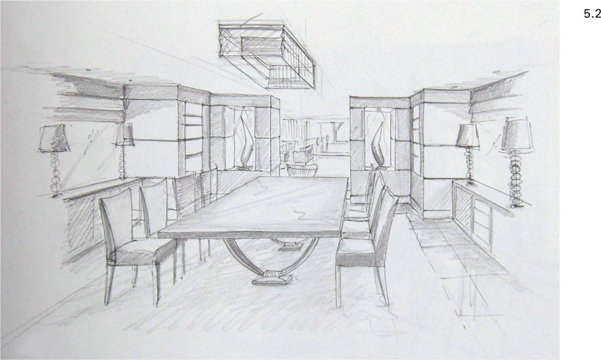
5.2 This perspective sketch has been carefully drawn using simple techniques to accurately assess the current state of the proposed design solution. Shading has been added to improve the three-dimensional qualities of the drawing.
How to sketch
So, how should you approach the task of sketching if you have never tried it before? Equip yourself with one or more sketchbooks, or even a pile of paper from the photocopier. It does not matter what it is, and it does not matter what your sketchbook looks like (though a proper sketchbook will allow easy access to sketches and help establish a timeline for the development of your ideas). Sketchbooks should be kept available all the time so that you can quickly and easily jot down your thoughts, and never lose the germ of a great idea. Many designers have sketchbooks of different sizes in use simultaneously, each suited to a different purpose.
A small pocket-size book (perhaps A5 or half-letter size, or even smaller) is most useful for keeping with you at all times, though the small format makes it very much a tool for taking visual notes, rather than an easy platform for developing a design. Books at A4 (letter size) can be carried in a briefcase, laptop case, or a shoulder bag, and are a good compromise between portability and ease of sketching. Larger books (A3 or tabloid) are useful to keep in the studio, and though they may not be used as often, their larger format helps with freedom of expression when sketching. Spiral-bound books are easier to hold open when drawing, but hardbound books will often last better and are easier to file on the bookshelf. It really does not matter what you use, but do make sure you use something and keep on using it. Your sketching ability and confidence will improve through practice, even without formal training.
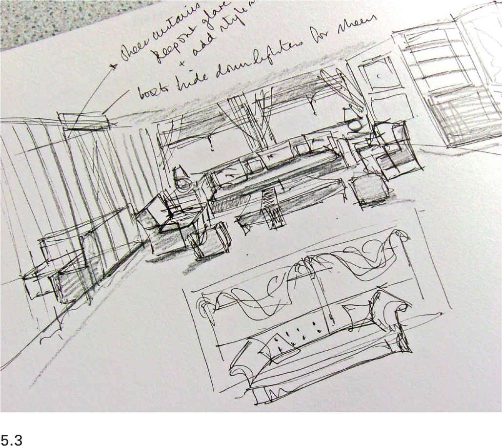
5.3 This sketch perspective is made carefully enough that proportions and planning implications can be assessed. It has been drawn quickly, which means that the designer can try out many ideas and options without becoming too precious about any of the ideas and unwilling to change.
Tools for sketching
There is no perfect pencil or pen to use when sketching; you should experiment and find the one that gives you the most satisfying mark; for example, designers might use traditional wood-cased graphite pencils, modern mechanical or technical pencils, ballpoint pens, fiber-tip pens, or fountain pens. Probably the one instrument that is least suited to sketching is the technical pen. These should be kept for their proper purpose of drafting on tracing paper or film and not used in sketchbooks as pen nibs can get blocked with the fibers from the paper.
When beginning to sketch, students are often apprehensive about making marks on the pristine pages of a sketchbook, particularly if they feel they do not have a talent for sketching. This is a real shame, as one of the keys to producing informative (but not necessarily beautiful looking) sketches is having a confidence in mark-making that only comes through practice. To start sketching, gather together a variety of pens and pencils and simply draw shapes in your sketchbook. Try cross-hatching the shapes you have drawn. Do not aim for perfection and, if using a pencil, do not be tempted to erase any lines that you consider to be wrong—ignore them and carry on. Notice how the different pens and pencils feel in your hand, and the range of different marks they make. Which tool do you feel most comfortable with?
The softer grades of graphite pencils most often used for sketching make fluid, dynamic lines that express spontaneity and movement. However, their lines can be prone to smudging. They can have a finesse about them that is missing from other mark-making tools, and they allow subtle shading effects to be included in the sketch. Harder grades of pencil are not usually the most suitable for sketching as their fine, faint, lines do not encourage freedom of expression, and they can be difficult to see. They produce drawings that feel timid and mean. Ballpoint and fiber-tip pens are often a good choice. They make bold, strong shapes on the paper and express confidence. First-time sketchers are often hesitant about using pens and would rather use pencils, but pens should be tried before you decide which is going to be your preferred method of mark-making.
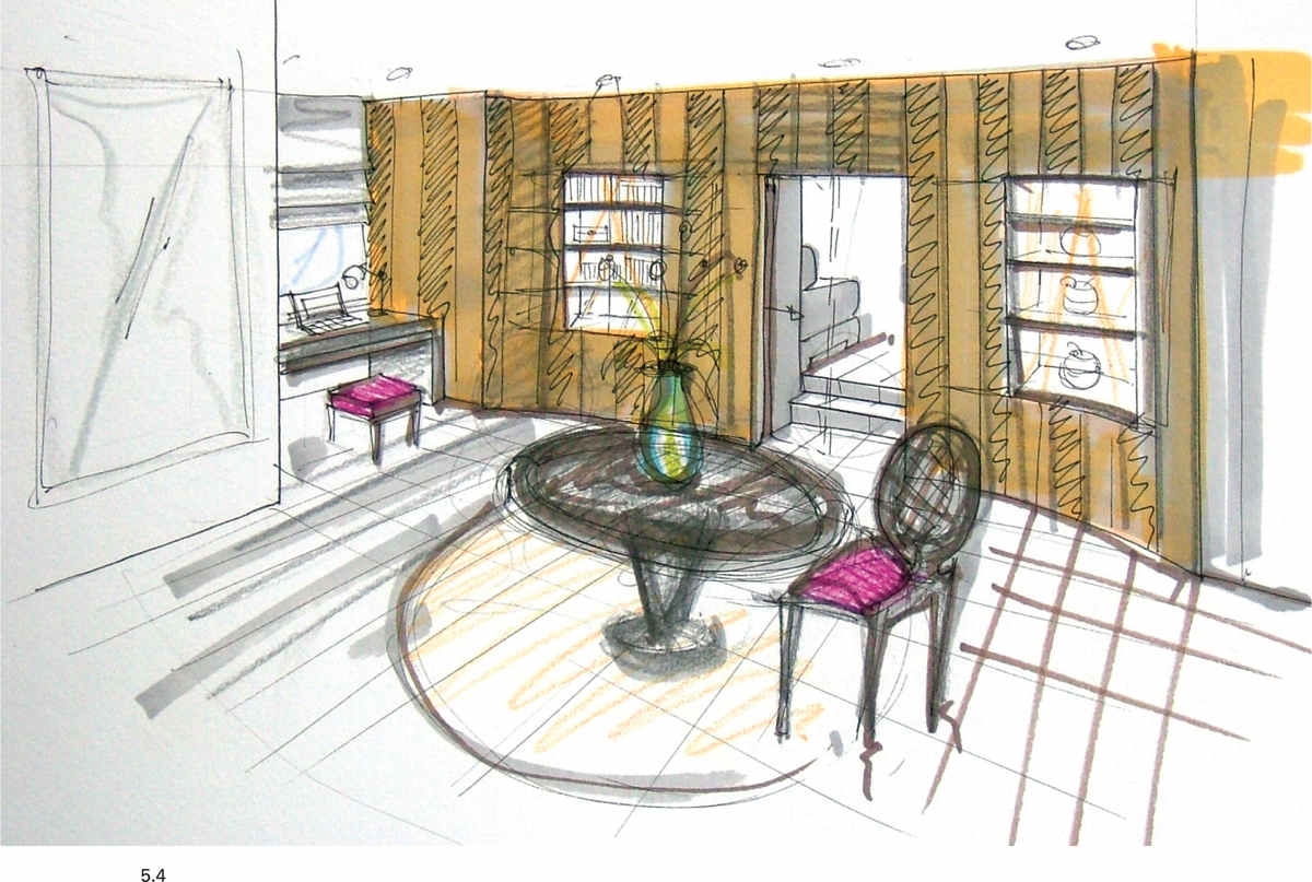
5.4 The addition of color to a sketch does a great deal to help the visualization process. It helps the designer to understand the implications of the decisions that have been made regarding the color scheme, which should be considered during the design development.
Practical tips for sketching
Sign and date all of the drawings you make in your sketchbook—from the very first seminal drawings to those that have developed the design in greater detail. This is helpful when you are reviewing your work, which is worth doing every so often, as a quick glance through old sketchbooks will remind you of ideas. More importantly from a business point of view, signed and dated drawings can prove to be a helpful tool should there ever be a dispute about the ownership of a design.
Get down on paper the first thoughts you have; do not dwell upon them before committing them to paper. Look at them, see their merits and problems, and sketch them again to see if you can make them better. Work with simple strokes; go over the drawing again and again; think about it or talk about it with someone else. At some point, you will know that you have solved most of the problems and have a good idea of how the design might work.
You will then need to start more accurate drawings (on the drawing board or with CAD) to make sure the design works. When things are drawn accurately in plan and elevation or section, you may realize that your initial ideas are not totally practical, so further work takes place on the drawing board. This is another point where manual drafting and sketching can be an easier way of taking the design forward. As ever, there is no single fixed way of proceeding, but various techniques are available to the designer. Many designers take a sheet of tracing paper large enough to cover the part of the drawing that needs resolving, lay it over the drawing, and sketch alternative ideas on to it, using the existing drawing as a guide. As one sketch is completed, the paper can be moved across the drawing to allow others to be made, until the problem is resolved.
These techniques for developing the design by drawing are used alongside an understanding of the principles discussed in the next section in order to create successful planning solutions.
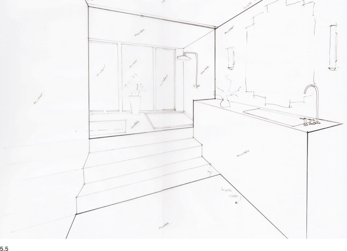
5.5 This is a loosely constructed draft sketch, but it still conveys the main themes of the design and helps the designer to develop ideas.
5.6 Through the use of color and tone, this sketch is developed to provide a clearer image of the ideas for the space. This helps viewers, such as the client, to understand the designer’s intentions.
Human dimensions and scale
The one common denominator that lies behind all space planning is people. Whatever the function of the space, whatever the scale of the space, people are going to be a part of it. If that is so, then it is right that we take time to understand how people connect with the world around them.
Ergonomics
Ergonomics is about designing for people and their immediate physical needs, and as a starting point it uses anthropometric data that details the range and diversity of human dimensions. There are many books of design data that are potentially helpful, but interior design is a real subject with practical problems and practical solutions; therefore, it would be a mistake to rely on someone else’s observations at the expense of making your own. For example, rather than working exclusively in plan and asking the question: “Is the access adequate?”, take steps to visualize the situation for yourself and use a tape measure to confirm the required dimensions. Visualization of the problem could involve acting out a movement or action, creating a mock-up of your proposal by using props such as pieces of existing furniture, or using tape to measure out shapes of walls or pieces of furniture on the floor or against existing walls.
Always remember that you are an individual, just as the client is, so you may need to modify your measurements accordingly. If you are designing for a large and/or indeterminate group of people, be aware of extremes of the population such as the very young and old. It is also important to think about volume in addition to area: the circulation space between two relatively low items of furniture can be considerably narrower than that between two items where one or both of them are taller, without the access feeling restricted.
Remember that ergonomics does not just cover size; it also looks at how much effort is needed to perform a task. Think about an everyday action, such as opening a door. How easy or difficult this is will be a real indicator of the quality of a design. A hand taking hold of an object like a door handle is a fundamental connection with the space, and the experience that the user has will influence their perception of the building. How does the door handle fit the hand? Does it feel sturdy or not? Does it embody a feeling of quality or not? How much physical effort is required to turn the handle? Overall, does this simple experience of opening a door give a positive or negative message about the space? Even if the experience is a good one for you, how do you think it would be for someone who is 40 or 50 years older than you? Will they have a positive experience, or will the effort required of them be unreasonable?
If you are designing for one client, or a limited number of people, it might be appropriate to tailor the design solution to them closely, but this can exclude or disadvantage people who may subsequently use the space. As ever, there is not a right or wrong answer to this problem, but careful analysis should lead to a conclusion as to which approach is most appropriate.
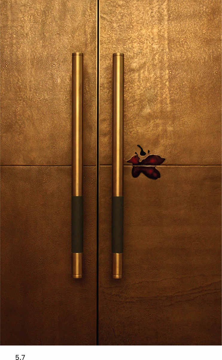
5.7 Door handles are one of the points at which we physically connect with design. They should be easy to operate and hold, whether they turn or not, and the feel of the materials also needs to be appropriate to the rest of the design. This design was created by Based Upon.
Proxemics
The way in which we interact with other people is an expression of their status within our social group. Proxemics is the term used to describe the study of the way we interact with others. We keep a distance between ourselves in interpersonal situations, which is an expression of various cultural and social factors.
The anthropologist Edward T. Hall described the relationship of distance to status. He divided that relationship into four categories:
→Intimate space: the smallest zone, where we embrace, touch, or whisper.
→Personal space: the next smallest zone, which we reserve for conversation with close friends or family.
→Social space: an intermediate zone, which allows for more general conversation and interaction with those whom we may consider as friends or acquaintances.
→Public space: the largest zone, which accounts for all other interactions with people.
Hall defined these zones by measurement, but there is actually considerable variation in the size of these zones by culture, gender, and individual preference. We are innately aware of the effect of proxemics; most people feel uncomfortable in a lift or elevator with other people that they do not know, an effect more pronounced when it is full. Though not as extreme, the same feelings are experienced in any space, and so it is incumbent upon the designer to consider how these feelings can be moderated and allowed for. Providing more seats than are expected to be required in public spaces should ensure that anxiety about proximity to strangers is kept to a minimum. Try to put yourself in different situations and imagine how you might tackle them through your planning solutions, remembering that the client’s reaction to a situation may not be the same as your own.

5.8 Proxemics is a particularly important consideration when designing public spaces. This small grouping of chairs and table provide an everyday reference point that help the user feel comfortable within this open space.
Scale
Measured (or mechanical) scale is the correlation between the actual size of an object and a standard system of measurement. Visual scale is a judgment we make about the relative sizes of objects and is not related to drawing scale described in the previous chapter. We are constantly and subconsciously comparing elements of the visual scene before us—is this chair small or large in relation to that one? Is that doorway small or large compared to the wall where it is positioned?
Human scale takes this desire to compare a stage further as it looks at the relationship between the dimensions of a space or object and their fit with the proportions of the human body. When something is scaled to fit or work easily with the human body, it can be said to be of human scale—examples could be a kitchen countertop or a flight of stairs. Sometimes buildings, furniture, and other elements of interiors we encounter are deliberately sized in opposition to the human body to provoke a response from us. Large spaces induce a sense of awe and wonder through their size, for example, but taken to extremes, this mismatch of scale could leave us feeling exposed and vulnerable. On the other hand, small spaces could feel welcoming and protecting, or they might feel claustrophobic.
Proportioning systems
Proportion is the relationship between one part (or parts) and the whole. It is the relationship between the parts of a whole that has been subdivided, of the vertical to the horizontal, the width to the depth, or the height to the length. It tells us whether something is thick or thin, wide or flat, tall or short. Proportion exists within an object (the relationship between the height to the width of a table, for example), or as part of a group of objects.
The brain naturally sees some proportional relationships as being more attractive than others, and we have discovered or invented many different proportioning systems to define and control proportional relationships as a result. Some of these systems are recent inventions; others have been in use for centuries and were well known to architects such as Andrea Palladio, who said that proportion is “harmony for the eyes.”
Proportioning systems can be very helpful to the designer, but however comfortable it can feel to design with the authority of an established system to govern design decisions, the system used should not be held as sacrosanct. Throughout the design process, the designer needs to remain self-critical, and if the results of applying a particular proportioning system do not add anything to the design, then it should not be used purely because of a dogmatic belief in its inviolability. When Le Corbusier’s assistants were struggling to apply the sensibilities of the Modulor scale (Le Corbusier’s own creation) successfully to a building, they asked the architect what they should do. He simply said, “If it doesn’t work, don’t use it.”
Proportioning systems exist to establish a consistent set of visual relationships between the parts of a design. Like the other design principles, proportioning systems are a method of formalizing the reasoning behind aesthetic decisions. Their implementation helps to unify and harmonize a set of disparate design elements, and so produce satisfying visual arrangements of building elements, furniture, accessories, and so on. Some of the most well-known proportioning systems are described here.
Golden section (or golden ratio)
Mathematically, the golden section is defined as the ratio 1:1.618. It might look mundane, but it is a ratio that surprises because of its universal popularity. It is seen by many people and cultures as a harmonious relationship between two unequal parts, and it is one that is found (at least approximately) in many instances in the natural world. A rectangle drawn with the length of its sides in accordance with the golden section has been used many times in art and architecture as the control for the proportions of the facade of a building or the composition of an artwork.
Golden rectangles are easily constructed: from the midpoint of one side of a square, draw a line to the opposite corner of the square. Use this as the radius of an arc, which can be struck from that corner until it intersects the extended side of the square. The point at which the arc and the extended side of the square meets defines the long side of the golden section rectangle (see diagram).
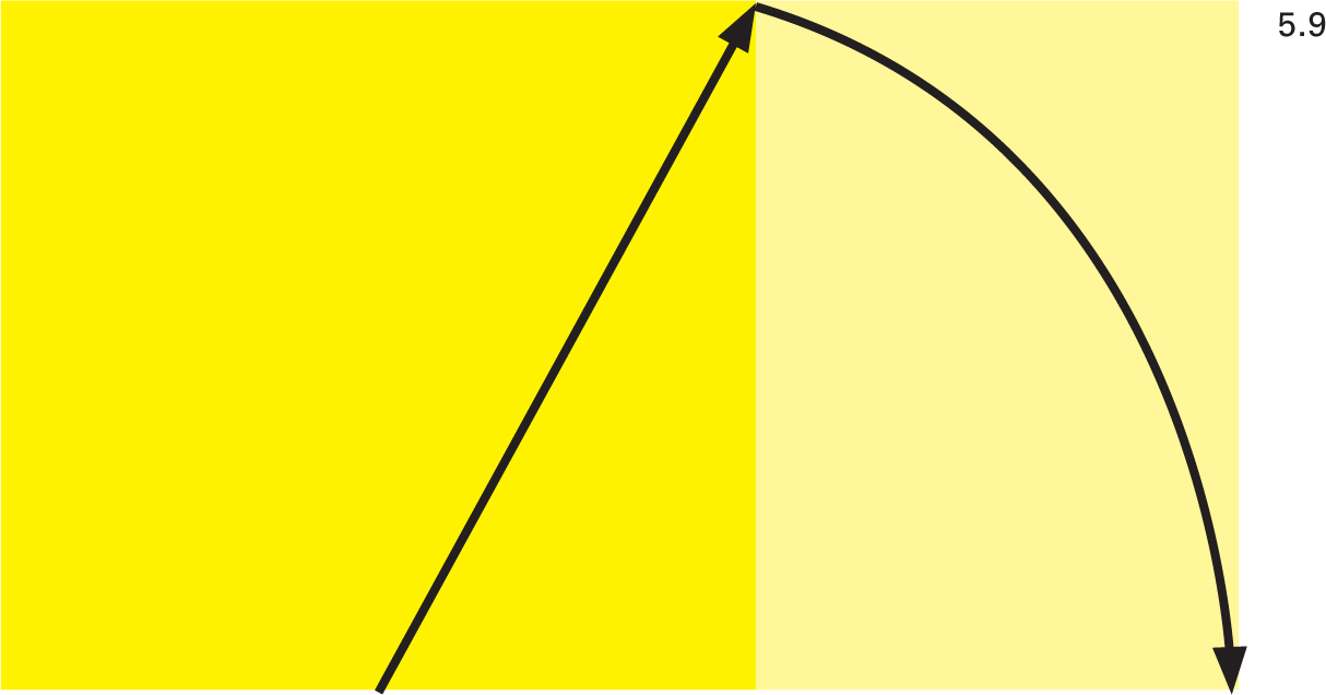
5.9 The golden section rectangle is relatively straightforward to construct and it can be used to define and regulate the proportions of many elements of a design.
The ken
A system developed in Japan, the ken is still used to define room sizes in houses built in the Japanese tradition. The system uses the traditional floor mat—the tatami—as the basic unit. The mats are usually standard sizes of 90cm x 180cm (35in x 70in), though there is some variation depending upon the region of Japan from which the mats originate. Rooms are sometimes defined by the number of mats that cover the floor area. For example, tearooms are often four and a half mats in size, whereas shops used to be five and a half mats. Because it is based on a standard size of mat, it is an absolute measure, not just a proportion. There are rules and traditions that govern the patterns in which the mats can be laid out. The mats are never laid in a simple grid pattern, and they are arranged so that no more than two corners meet at any point.
The Modulor
The Swiss-born architect Le Corbusier developed his own proportioning system, which he based on three main measurements derived from the human figure, though it also draws heavily on the golden section and the Fibonacci numbers. The Modulor system has many other measurements that originate from the three main ones, and all of these measurements were used to define elements of a design—from the facades of buildings, through elements of the interior design, to the dimensions of sofas and chairs.
Manufactured sizes
This is a very practical proportioning system. It uses the sizes of ready-made materials to define the ratio of width to length. For example, plywood is typically supplied in standard sheet sizes, and these dimensions (or multiples of them) could define the size of details made from the material, such as wall paneling. Using manufactured sizes means that the use of materials is very efficient. When working with manufactured sizes, it is clearly important to research the options available before commencing the more detailed design work.

5.10 Le Corbusier used his own proportioning system, the Modulor, to regulate the internal and external dimensions of his Cité Radieuse/Unité d’Habitation.
Fibonacci numbers
This series of numbers has been known for centuries and was first described in the West by Leonardo of Pisa (also known as “Fibonacci”) in 1220. The sequence begins with 0, followed by 1. Each subsequent number is the sum of the previous two numbers. Like the golden section, it appears in many instances in the natural world. A sequence of two, three, four, or more consecutive numbers can be drawn from any point within the series and used as regulators in a design. For example, drawer fronts often look well proportioned if the height of each drawer (from the bottom to the top of a cabinet) gets smaller, so a designer might choose to proportion the drawer heights in the ratio of 8 to 13 to 21.
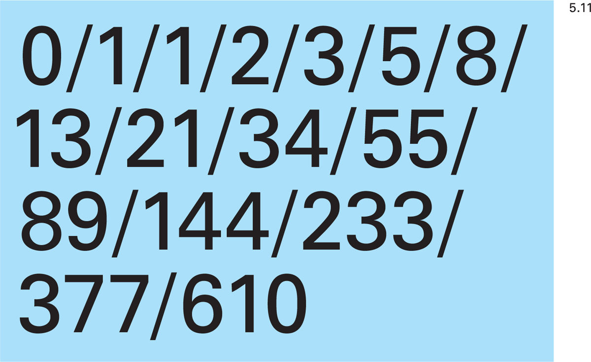
5.11 Adjacent numbers from the Fibonacci series appear in many instances in the natural world and can be used to regulate elements of a design
“My own” ratio
It does not follow that you must use a recognized proportioning system to help create your design. You can create your own regulating dimensions. Whatever they are, repeated use throughout the visual composition will provide unity and strength to the design. You might choose, for example, to create built-in furniture using a standard panel width of 450mm (17 inches) with a shadow gap between panels of 5mm (0.2 inch). This standard size (or multiples of it) could be used to describe the entire visual identity of the piece or space that you create. Your design work can be aided by drawing, to scale, a grid based on these dimensions over which you can place tracing or layout paper. It is then very easy to sketch ideas and check their feasibility and practicality, which is all part of the development of the design.
Ordering systems
If proportioning systems exist to help us define sizes and ratios, ordering systems are there to help us collate a visually attractive three-dimensional composition using the building and all that we are placing inside it. It will involve manipulating the existing and proposed elements, and it is primarily concerned with the aesthetic, so judgments about the relative importance of this and the practical side of the design will need to be made.
The desire for a strong aesthetic solution may sometimes demand that an element is added to the overall composition that has no practical purpose within the scheme. When this is the case, the designer should not underestimate the power and importance of the aesthetic and should be prepared to do what is necessary for the integrity of the design. Application of ordering systems usually means that the designer’s judgment will be used to decide at what point the optimum state is reached within the composition. This is one of those difficult-to-learn design issues, where there is no right and wrong, so it is important to try out different options (by drawing or other means) to ensure that the most favorable solution is reached.
Axis
This system uses an imaginary line to organize the whole, or parts, of the space. It is usually applied to the plan view of a space but could equally work in elevation. The organization of elements about the axis may be symmetrical or asymmetrical (this is explained later).
Balance
Each interior element has different properties—form, surface (texture), color, and size, for example. These need to be considered and arranged so that they balance with the same properties of other elements. The visual arrangement should be stable. This does not mean, though, that all things should be equal in size or placement, nor does it mean that the final composition will feel static. It is quite possible for the arrangement to be balanced and dynamic at the same time. There are different types of balance: symmetrical, radial, and asymmetrical.
Symmetrical balance works about an axis and suggests a mirrored arrangement of elements. Radial balance works around a center point or datum. Asymmetrical balance refers to the state of visual equilibrium achieved when elements of varying size, shape, color, and so on are arranged by careful consideration of their properties. More specifically, asymmetrical balance requires that strong visual elements are balanced by other less strong elements. Larger areas of more neutral colors may balance small objects or areas of strong color, for example. The careful distribution of “negative space” between the elements aids the composition.
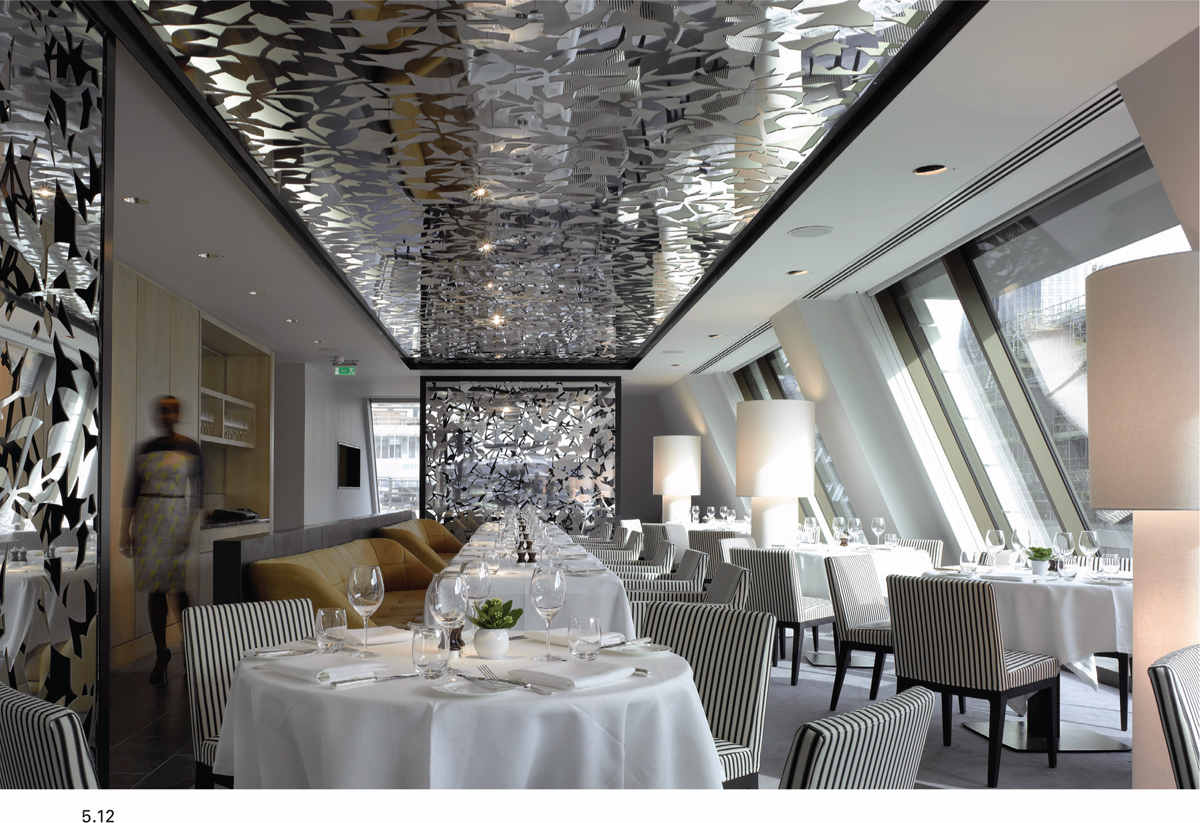
5.12 In this restaurant at the South Place Hotel in London, UK, designed by Conran & Partners, a strong visual axis has been created by the mirrorlike structure on the ceiling. It helps to disguise the awkward effect that the sloping wall has on this space.
Datum
This system uses a point or a center to arrange other elements of the composition. The datum could be an actual object or feature within the building structure and therefore visible, or it could be implied simply by the arrangement of furniture or other elements.
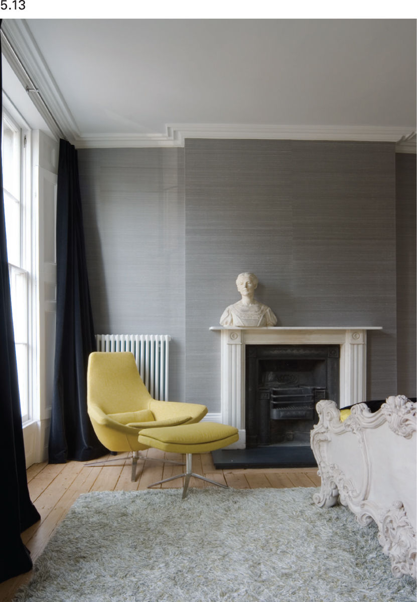
5.13 Harmony is created in this scheme through similarities in color and texture of different elements; the bust and the bed, and the rug and the wall covering, for example. At the same time, the contrast in the form and color of the chair avoids a stagnant scheme.
Harmony
Whereas balance seeks to achieve a visual congruity by careful placement of items that may not share properties of shape, color, and so on, harmony seeks to achieve a similar congress of parts, but it relies on the careful selection of elements that do share some common property.
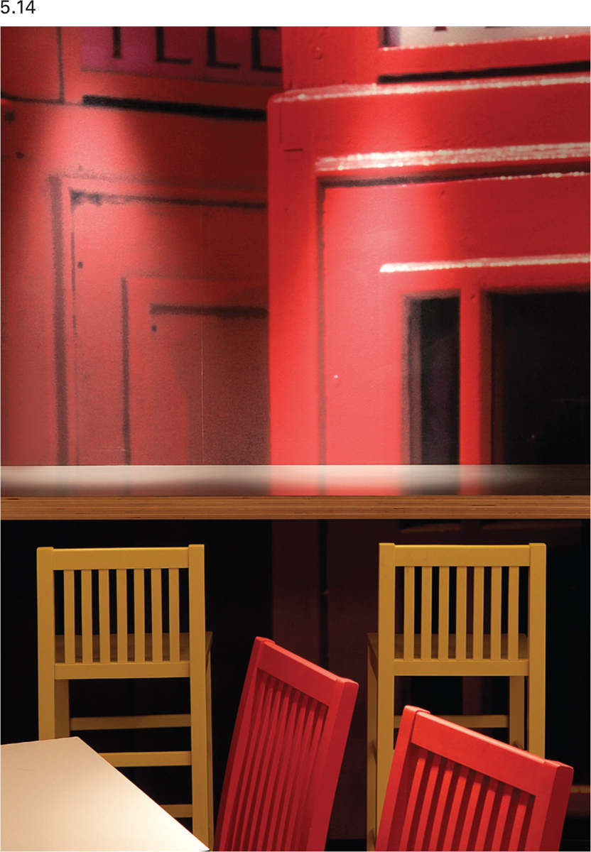
5.14 The designers have played with ideas of harmony, unity, and variety in this youth hostel café. The same style of chair is specified in different colors, and the simple shape of the chair echoes the regular lines in the graphic print of the telephone boxes behind.
Unity /variety
Remember that the principles of balance and harmony are just that: they are definitely not about uniformity. In all cases, we are talking about objects with numerous and multifaceted properties. It is possible to unify through a common property (material, color, texture, shape, location) and still retain variety in other aspects, generally leading to a more interesting design solution that avoids sterility.
Emphasis/dominance
A feature or element that is emphasized by some means becomes a focus for the space. Focal points give visual interest. They provide a point on which the eye can stop and take stock of the visual environment. As long as they are not too abundant, focal points describe a path that the eye can follow around a space, giving sense and order to an interior. Emphasis is often articulated through size, color, or shape, and this may be exaggerated to an unexpected degree to achieve emphasis. The placement of an object is also used for emphasis. Objects can be positioned at the end of an axis, at a datum, or they may be placed in opposition to the prevailing grid.

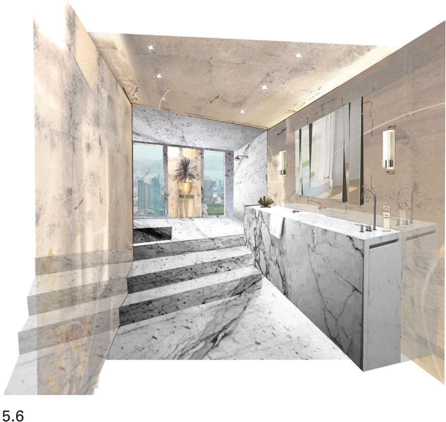
5.15 The focus of this contemporary bathroom is the bath. The overhead lighting scheme emphasizes and reflects the importance of this feature. The choice of materials has been limited so that the marble around the bath, the fireplace, and the floor are in harmony to create a tranquil effect.
Rhythm /Repetition
Rhythm naturally makes us think of music, or rather the division of a musical piece into a regular, repeating, ordered pattern of sound. Rhythm in visual design has a similar effect. It refers to the use of repeating patterns, shapes, and forms, which are recognized by the viewer and interpreted as an ordering influence on the space. Simple rhythms can be created by repeating features, such as furniture or windows, and more complex and subtle rhythms can be promoted through the similarity of color, size, shape, and so on. Rhythms can build in layers with simple bass drum-like rhythms of larger elements augmented by more subtle “hi-hat” rhythms; for example, a pattern applied to a surface. Rhythms created in one medium can be echoed in another. Although we may only pick up on rhythms in a subconscious way, they provide visual measurement and punctuation of a space, the effect of which is to animate the space and to help it flow.

5.16 This hotel bedroom uses a sophisticated and muted palette of colors. These colors are not only used on the textiles on the bed, but they are also repeated in the furniture and in the surface decoration on the cupboards and walls.
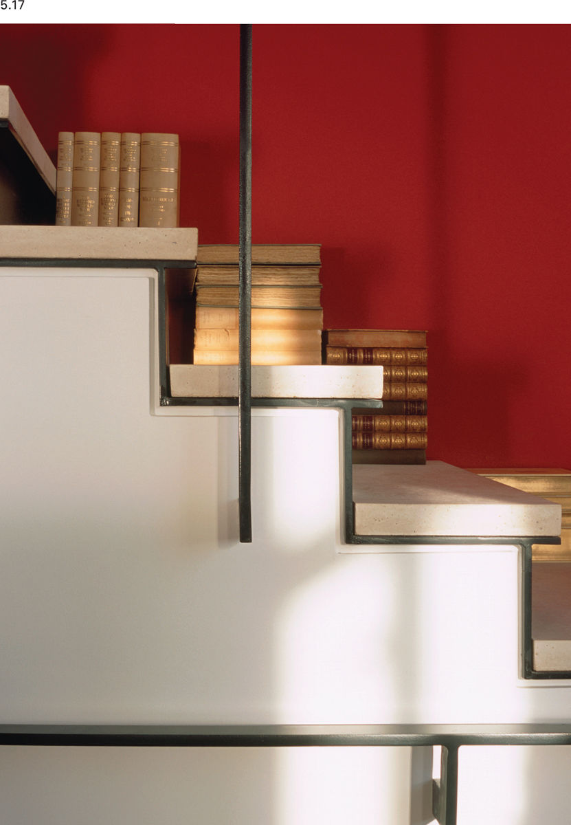
5.17 Alternating horizontal and vertical staircase elements create a familiar and reassuring rhythm that is gently bolstered by the use of a uniform material (steel) for the handrail, balustrade, and stair edging detail to create a powerful but discrete composition. Hard edges are visually softened by the proximity of the books.
Thinking point: Zoning
If the functional requirements of the brief are such that the space will play host to more than one specific activity, the first step to achieving a planning solution is to look at the zoning of the space. This assessment will show which functions fit best in specific parts of the space, and it should be conducted in very broad terms, without any reference to specifics of furniture dimensions. Different zoning layouts should be tested, and by compiling lists of strengths and weaknesses for each zoning option, it should be possible to identify a preferred zoning proposal. This will then be taken as the basis for more detailed planning.
For the next stage, the designer will attempt to fit furniture to the zoning layout. One of the easiest practical ways to do this is to use templates (scale representations of the furniture), which can easily be moved about the plan to try out planning options. Reference should be made to ergonomic requirements and the design principles. As soon as viable planning solutions begin to emerge, the designer will need to consider the three-dimensional implications of the two-dimensional plan by making simple drawings (sketch elevations, sketch axonometric, isometric views or sketch perspectives) using the proposed furniture layout. Despite being sketches, if they are carefully drawn they will give a strong indication of the effectiveness of the proposed design. Decisions can begin to be made about the balance of the composition and if necessary adjustments can be made to improve aesthetic or practical aspects of the work.
It is probable that initial selections of furniture that work with the overall style of the project will already have been made by this stage, and the dimensions of these pieces should be reflected in the planning options considered. However, it is vital that the designer remains flexible throughout the planning process; it may be necessary to source new pieces of furniture if the planning shows that the original selections are inappropriate in terms of size. Revisions to the plan during space planning do not indicate any failure on the part of the designer; rather they show that the process is working as it should to produce the best possible solution. It is important to ensure that the balance between practical and aesthetic is carefully considered, as planning naturally tends toward the practical, sometimes at the expense of good aesthetics. The evolving design should be continually questioned and, where necessary, any problems should be resolved by further planning and visualization.
Inclusive design
It is human nature to imagine that, to a large degree, the abilities (and therefore the experiences) of others closely mirror our own. If we have no difficulty getting around in our day-to-day use of buildings, then we expect that others will have a similar encounter with the buildings that they use. Given a little thought, it should be obvious that many people will actually have a very different experience of a building to ours. Not to consider their needs means that we potentially exclude them from the spaces that we design, which is not a moral (or legal) position that designers can justify. Inclusive design tries to understand the needs of all potential users of a space and to provide for these needs. It ensures that people are put at the center of the design process and responds to human diversity in a positive way. It provides the individual, whatever their abilities, with freedom, dignity, and choice about the way they live their lives, and it delivers spaces that retain flexibility of use.
The range of people who might experience problems using buildings is wider than many would appreciate. It does, of course, include those with disabilities (accounting for almost 20% of the population), but it also includes senior citizens, parents with young children, and people carrying heavy or awkward items. All these groups may have difficulty in negotiating entrances or navigating spaces that ambulant people take for granted. Visual or hearing impairments and learning difficulties cause problems for some, while others face problems because of a lack of manual dexterity.
Addressing these issues may be achieved through research into the problems and solutions available, or it might be appropriate to use access consultants or other specialists who can advise on the practical measures that should be considered.
Good inclusive design will make the planning solutions that are developed better for everyone, and it will always make sense to build inclusive solutions into a design from the very beginning of a project rather than retrospectively. When aiming for the highest standards in all aspects of design, it can be challenging to find aesthetically rewarding solutions to some issues. There is, however, a great deal of scope for developing bespoke solutions in some situations. Manufacturers of kitchen and bathroom equipment are beginning to see the opportunities for incorporating inclusive solutions into their designs, but it is still incumbent on the designer to consider the potential issues and provide fully resolved designs that meet the needs of a diverse population.
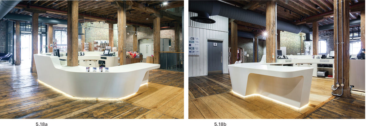
5.18a–15.8b Accessible design does not need to be brash or visually clumsy to meet the needs of all users. The form and positioning of this reception desk at the Museum of London means that wheelchair users have easy access to the low-level reception desk. It is also brightly lit meaning that it is easy to identify for those with visual impairments, and that users of the space who are hearing impaired should be able to lip-read staff more easily.
Case study: The Old Bengal Warehouse, UK
Conran and Partners were engaged by restaurant owners and operators D&D to develop a design solution for The Old Bengal Warehouse, a 300-year-old building in London, UK. For much of its working life, the building was used to store many exotic imports and prime among these were spices, cigars, mother of pearl, and wine.
The warehouse space available for development consisted of several spaces with limited circulation between them, though each of the four major spaces could be accessed from the same street frontage.
After initial research on the history and potential of the building, one of the first decisions that had to be made was whether to treat the building as four separate units linked only by their common history and location, or whether to unite the four spaces under one overarching concept.
The concept design presented to, and ultimately agreed to by, the client proposed four discrete units, each one focusing on a unique food and beverage offer aimed at a unique customer demographic. Each unit would adopt one of the major imports (spices, cigars, mother of pearl, and wine) to drive the aesthetic and material considerations of the space. The units were resolved in the following way:
→A bar with indoor and covered outdoor seating. Spices are the concept adopted for this space.
→A fine-dining steak restaurant. The rich luxury of cigars defines the feel of this unit.
→An informal fish restaurant. The natural maritime connection with mother of pearl gives creative direction here.
→A wine shop with a limited food and drink offering. Traditional wine crates offer a simple but effective link to the concept.
Through materials and color, the designs for each space allude to their concept but still allow the history and construction of the building to show through, with original features such as cast iron columns and brick kept visible.

5.19 Concept images for the fish restaurant evoke an appropriate atmosphere.
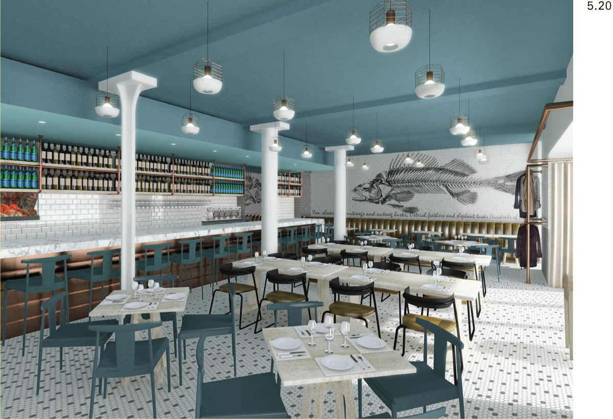
5.20 A computer-generated rendering of the proposed design helps to communicate the proposal.
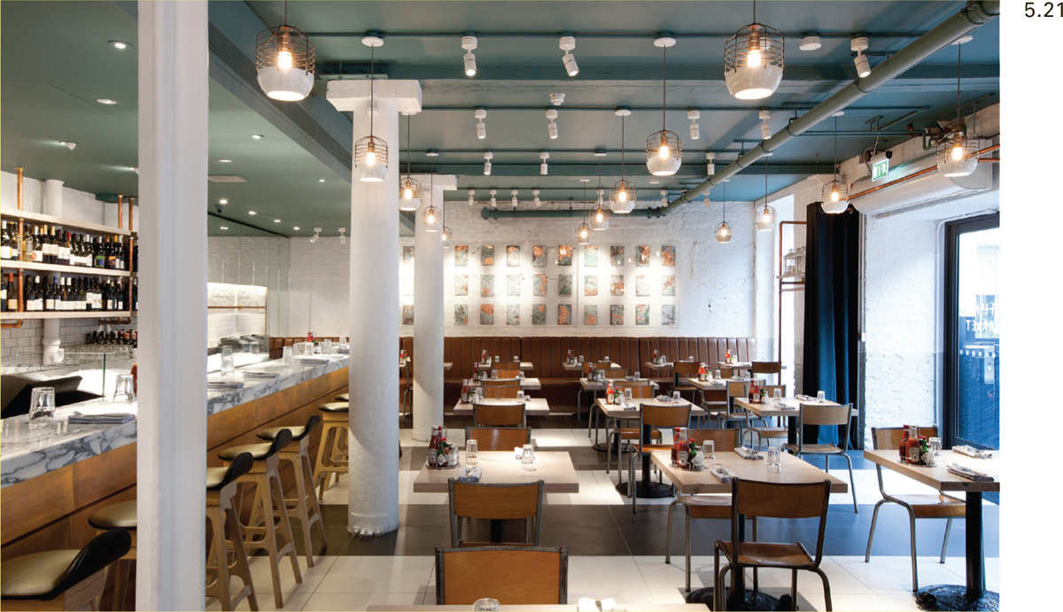
5.21 The completed restaurant: note the similarities and the differences against the visual.
Interview: Conran & Partners
Tina Norden, associate director at Conran & Partners discusses hospitality design, which includes sites such as restaurants, hotels, spas, bars, and nightclubs. Good organization of the space is critical to successful hospitality design.
What do you find challenging and interesting about hospitality design?
→I love the fact that it’s design for enjoyment, for people’s relaxation and pleasure. Hospitality projects allow for creativity and imagination whilst also being intensely challenging, as everything needs to run like clockwork in a hotel or restaurant and that requires all parties, from designer to operator and everyone in between, to work closely.
Are there issues in hospitality design that set it apart from other areas of interior design?
→Hospitality projects tend to have a quick turnaround. One key item they all share is that functionality is a huge part of a successful design. Whether flow of service, wide enough corridors, back-of-house delivery routes, or simply space between chairs—if the function is not right then the project does not work.
Our initial experience of a space is usually driven by the visual impression it makes. In hospitality design, how important are other sensory aspects?
→A noisy, buzzy space says something very different to a hushed, calm, and quiet ambience. Getting this right for the concept is key. We always end up with debates over the type of music played as this makes a huge difference to the guest experience.
Hospitality design sometimes requires spaces to be multifunctional. How do you reconcile the need for flexibility while still producing interesting interiors?
→Hospitality design is intrinsically multifunctional but some areas, in particular lobbies and function rooms, really do need to work for a multitude of uses. Design is best when it can be tailored and specific, but if it has to be all things to all people it is more difficult to create personality.
Is it possible for hospitality design to be both luxurious and sustainable?
→Luxury and sustainability are not opposites, a sustainable approach is possible for any project—it simply comes down to the aspirations and attitude of client and design team.
How do you see hospitality design developing?
→People are much more design-educated today and recognize good design whether it is a budget hotel or a five-star resort. It is also important to keep moving with the zeitgeist and keeping up to date, being aware of industry trends, and looking at each project afresh. The challenge is to achieve all of this on ever-tighter budgets!
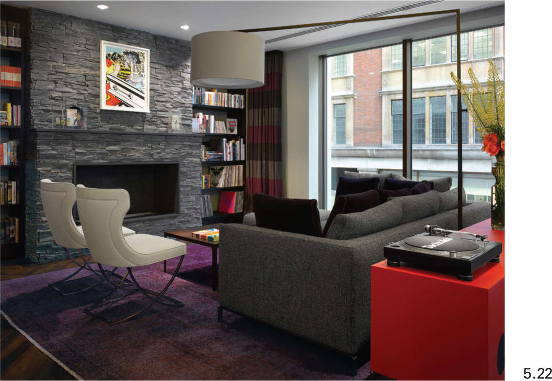
5.22 Careful choice of materials and furnishings allows this hotel to reach a very high standard of environmental performance. One of the suites is illustrated here.
Activity
01. While visiting a large public space (e.g. a museum or a restaurant):
→Look for evidence of any ordering systems within the space. If they are evident, ask yourself if you would have applied them in a similar manner to the design. If they are not present, can you suggest ways in which they could have been used to enhance the experience of the space? You could try sketching some suggestions.
→Observe how people react to the space, and how they interact with each other. Does the design make interaction between individuals easy and comfortable? What steps has the designer taken to enable this aspect of the design to work. Is the design inclusive?
02. After your visit to a large public space, consider a much smaller residential space with which you are familiar.
→Do you think it is easier or more difficult to apply ideas, such as ordering systems, to this space?
→Is it easier or more difficult to make the design inclusive?