Chapter three. Elements of iconic design
Anyone can design a logo, but not everyone can design the right logo. A successful design may meet the goals set in your design brief, but a truly enviable iconic design will also be simple, relevant, enduring, distinctive, memorable, and adaptable.
This many requirements might seem like a tall order, and it is. But remember, you have to know the rules in any creative endeavor before you can successfully break them. A Michelin-star chef doesn’t just pluck ingredients from thin air. She takes a tried-and-tested recipe and adapts it to create her signature dish. This also applies to creating a company’s visual identity. The basic elements of iconic identities are the ingredients in our recipe, so let’s take a close look at each one before you go out and earn your own awards.
Keep it simple
The simplest solution is often the most effective. Why? Because a simple logo helps meet most of the other requirements of iconic design.
Simplicity helps a design be more versatile. Adopting a minimalist approach enables your logo to be used across a wide range of media, such as on business cards, billboards, pin badges, or even a website favicon.
Simplicity also makes your design easier to recognize, so it stands a greater chance of achieving a timeless, enduring quality. Think of the logos of large corporations like Mitsubishi, Samsung, FedEx, BBC, and so on. Their logos are simple, and they’re easier to recognize because of it.
FedEx
By Lindon Leader, 1994

And simplicity aids memorability. Consider how our minds work, and how it’s much easier to remember a single detail, such as Mona Lisa’s smile, than it is to remember five: the clothes Mona Lisa wears, how her hands are placed, the color of her eyes, what sits behind her, the artist (Leonardo da Vinci—but that one you did know, didn’t you?). Look at it this way: If someone asked you to sketch the McDonald’s logo, and then sketch the Mona Lisa, which would be more accurate?
Consider a different example.
The National Health Service (NHS) logo is one of the most visible logos in the United Kingdom, so much so that its use as the emblem of British health care was made government policy in 2000.
National Health Service (NHS)
By Moon Brand, 1990
Designer:
Richard Moon
“The NHS logo has become so ubiquitous that most people forget there was a time when it was not around. More critical still, it has been allowed to grow partly because nobody believes it was ever ‘designed,’ but that it simply evolved over time. However, this really is a case of intelligent design.” Richard Moon

Initially designed in 1990 by Moon Brand, this logo includes a simple, clean color palette and type treatment. The fact that the design has remained unchanged for nearly 25 years is a testament to its success.
“We kept the design deliberately simple for three reasons: to make it easy to implement, to last as long as possible, and to go undetected by the British media who often see such identity programs as an extravagant use of public funds,” said Richard Moon, director at Moon Brand. “By the NHS’ own reckoning, the branding program has saved tens of millions in pounds by employing a distinctive, easy-to-use brand program.”
Make it relevant
Any logo you design must be appropriate for the business it identifies. Are you designing for a lawyer? Then ditch the fun approach. Are you designing for a winter-holiday TV program? No beach balls. How about a cancer organization? A smiley face clearly won’t work. I could go on, but you get the picture.
Your design must be relevant to the industry, your client, and the audience to which you’re catering. Getting up to speed on all these aspects requires a lot of in-depth research, but the investment of time is worth it: Without a strong knowledge of your client’s world, you can’t hope to create a design that successfully differentiates your client’s business from its closest competitors.
Hawaiian Airlines
By Lindon Leader, 1993

Keep in mind, though, that a logo doesn’t have to go so far as to literally reveal what a company does. Think about the BMW logo, for instance. It isn’t a car. And the Hawaiian Airlines logo isn’t an airplane. But both stand out from competitors and are relevant within their respective markets.
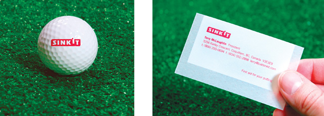
Vancouver-based smashLAB came up with a brilliantly relevant brand name and accompanying design for Sinkit, a tool that helps golfers with their putting.
Sinkit
By smashLAB, 2005
Creative director:
Eric Karjaluoto
Designer:
Peter Pimentel
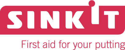
“To understand the logo, it’s important to consider it in its full context,” said smashLAB’s Eric Karjaluoto. “Our insight that this was really a golf-aid, as opposed to a luxury product, informed our overall process. We felt that few would admit to owning one, and that most would only use it in private settings. In fact, we felt that it was really something that one might even buy jokingly, as a gift for a friend with putting problems. As such, we centered the campaign on the notion of ‘first aid for putting.’”
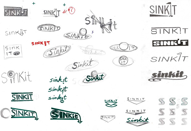
This was an adaptable direction as it allowed smashLAB to employ treatments and color selections that weren’t familiar in most golf shops. The identity displayed a somewhat clinical design with translucent paper stocks, a minimal appearance, and a red and white color palette. Given the nature of the product, and how new it was to the market, smashLAB wanted it to stand out from more traditional golf packaging.
“The logo itself had some technical challenges associated with its creation,” Eric notes. “One was to separate the words ‘sink’ and ‘it’ in order to avoid being misread as ‘sin kit.’ We did this by raising the ‘I’ and accentuating the dot, which became a golf ball about to drop into the hole. This built a sense of anticipation and excitement, leaving the viewer wanting to see the ball complete its drop.”
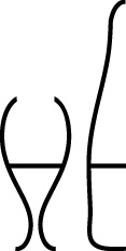
If used properly, negative space can certainly help to deliver a distinctive mark. This “HE” monogram was one of the two design options I presented to French wine producer Henri Ehrhart back in 2009.
Henri Ehrhart
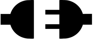
In 2008, Alberta-based Josiah Jost of Siah Design worked with Ed’s Electric, a local electrical company, to create a new logo. Not only did Josiah deliver a design that’s relevant, but he also created one that most viewers won’t easily forget with a nice use of negative space.
Ed’s Electric
ico in London created a good example of how what’s not there is just as important as what’s there with this design for the Dolphin Square apartment complex.
Dolphin Square

Another Moon Brand design, this time for Vision Capital, epitomizes this notion of relevance within a company’s identity. During discussions with the client prior to starting any creative work, Moon Brand designers discovered that Vision Capital is about more than just capital: It’s also about raising funds for investors using a very strategic approach to buying company portfolios. So the designers decided to base their exploration on this “more than” idea.
Vision Capital
By Moon Brand, 2007
Designer: Peter Dean

The resulting logo conveys the concept in an intelligent way. By rotating the “V” for vision, it becomes the “greater than” symbol, allowing viewers to easily interpret the logo as signifying “greater (or more) than capital,” while still clearly featuring the initials of the company.
Just because you’re designing a logo that must relate to the stereotypically dull financial markets doesn’t mean it can’t be dynamic and full of meaning.
Incorporate tradition
When it comes to logos, it’s best to leave trends to the fashion industry. Trends come and go like the wind, and the last thing you want to do is invest a significant amount of your time and your client’s money in a design that will become dated almost overnight. Longevity is key, and a logo should last for the duration of the business it represents. It might get refined after some time to add a little freshness, but the underlying idea should remain intact.
Vanderbilt University
By Malcolm Grear Designers, 2002
“The toughest person to please in any logo design project should be the designer who creates the mark. It’s challenging because the work must be memorable and as timeless as possible. I never want to be in vogue. I want to set the standard and not follow others.” Malcolm Grear
Such elegance doesn’t come without a lot of trials and behind-the-scenes exploration.
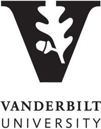
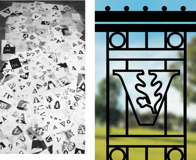
The Rhode Island–based studio Malcolm Grear Designers created the logo for Vanderbilt University by integrating two symbols long associated with the school: the oak leaf (strength and steadfastness) and the acorn (seed of knowledge). These elements also reflect the school’s status as an active arboretum.
Aim for distinction
A distinctive logo is one that can be easily separated from the competition. It has a unique quality or style that accurately portrays your client’s business perspective. But how do you create a logo that’s unique?
The best strategy is to focus initially on a design that’s recognizable—so recognizable, in fact, that just its shape or outline gives it away. Working in only black and white can help you create more distinctive marks, since the contrast emphasizes the shape or idea. Color, although important (as shown in this next identity), really is secondary to the shape and form of your design.
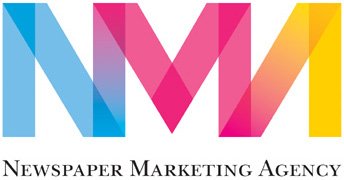
NMA
By SomeOne, 2003, refreshed in 2011
Design and creative direction: David Law
“We gave the client three different design options as it was a very rich territory and we couldn’t decide—so we asked the clients if they’d like to do that bit for us.” Simon Manchipp, co-founder, SomeOne

SomeOne, a London-based design practice specializing in the launch and relaunch of brands, worked with the Newspaper Marketing Agency (NMA) to create two distinctive identities. The first identity includes a monogram using the characters NMA. It looks like it was a fairly simple mark to create: mainly just a series of three sets of up and down strokes. Okay, so there’s a little more to it—just coming up with the idea is the challenge—but the monogram is bold, simple, and relevant. Most of all, it’s distinctive and likely something viewers won’t forget.

It’s much quicker to experiment with a pen and paper than it is to push a pointer around a screen.
Then when the main design idea is in place, you can have some fun with color and style.
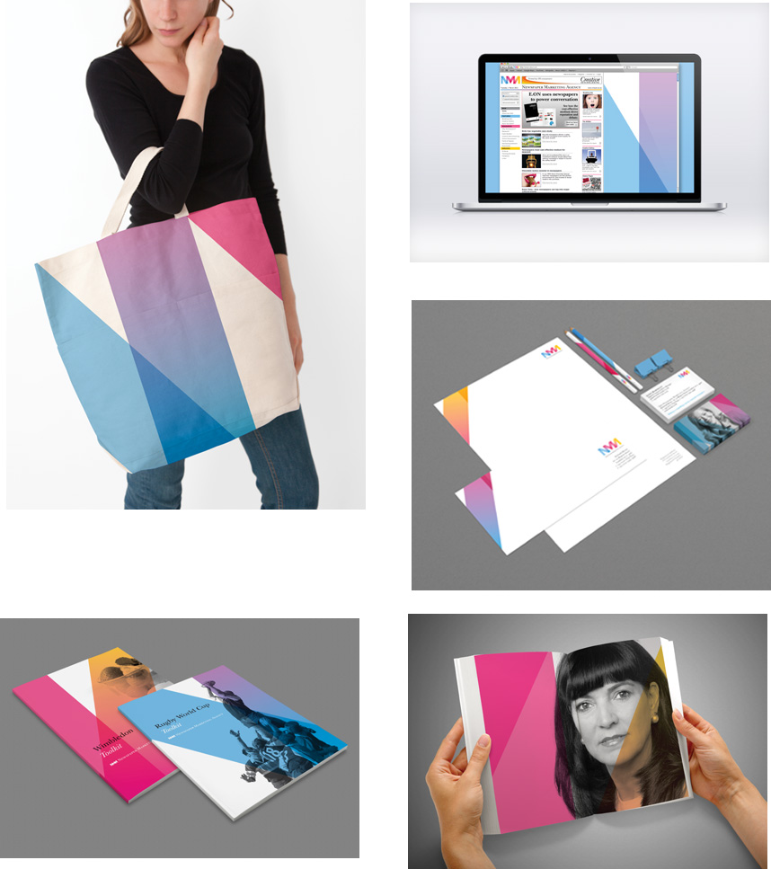
“The Newspaper Marketing Agency is an interesting brand in that it occupies a curious position. It’s paid for by a conglomerate of newspaper owners to promote the effective ways newspapers can be used by marketing agencies to better connect, reach, and talk to national audiences. So it’s a business-to-business brand that operates in a public arena. These B2B plays are typically dark blue, dull, and opinion-free—we wanted to fly in the face of that accepted thinking,” said SomeOne’s Simon Manchipp.
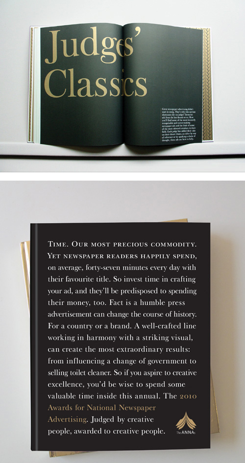
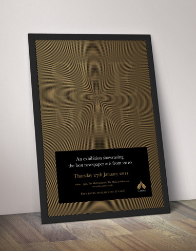
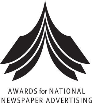
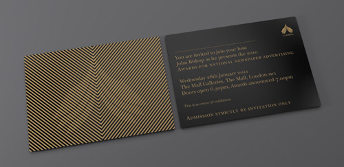
The second identity from SomeOne includes a stylized “open newspaper” symbol in the shape of the letter “A” for the Awards for National Newspaper Advertising (or ANNAs, run by the NMA). It’s another mark that works very well in black and white. Notice how easy it was for me to describe it? That’s because distinctive marks are almost always simple enough that they can be easily described.
ANNAs
By SomeOne, 2006
Design and creative direction: David Law
The following touchpoints were produced for the annual awards’ 2010 theme.
In another example, England-based designer nido cleverly transforms the familiar letters “a” and “e” in Talkmore, a wholesaler of mobile phones and mobile phone accessories, into quote marks. This treatment is brilliantly relevant to Talkmore’s business name and market sector. Most of the design is created in black and white, with just enough color added to call attention to the letter transformation. It’s a classic example of how text doesn’t need to be lifeless.
talkmore
By nido, 2001

Commit to memory
A solid iconic design is one that onlookers will remember after just one quick glance. Think, for instance, of passengers traveling on a bus, looking out the window, and noticing a billboard as the bus drives past. Or what about pedestrians, looking up just as a branded truck passes by. Quite often, one quick glance is all the time you get to make an impression.
But how do you focus on this one element of iconic design?
It sometimes helps to think about the logos that you remember most when you sit down at the drawing table. What is it about them that keeps them ingrained in your memory? It also helps to limit how much time you spend on each sketch idea—try 30 seconds. Otherwise, how can you expect an onlooker to remember it with a quick glance? You want viewers’ experience with your client’s visual identity to be such that the logo is remembered the instant they see it the next time.
Malcolm Grear Designers worked with the New Bedford Whaling Museum to craft its brand identity. The museum is the largest in America devoted to the history of the American whaling industry at a time when sailing ships dominated merchant trade and whaling.

By combining boat sails with the tail fin of a whale and employing a unique use of negative space, the resulting logo reflects the idea of “whaling in the age of sail.”
Think small
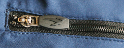
As much as you might want to see your work plastered across billboards, don’t forget your design may also need to accommodate smaller, yet necessary, applications, such as zipper pulls and clothing labels. Clients are usually enthusiastic about, and demanding of, an adaptable logo, since it can save them a substantial amount of money on printing costs, brand implementation meetings, potential redesigns, and more.
In creating something versatile, simplicity is key. A solid logo should ideally work at a minimum size of around one inch, without loss of detail. The only way to accomplish this is to keep it simple, which will also increase your chances of hitting on a design that is likely to last.
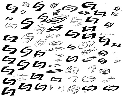
Nancy Wu, a designer in Vancouver, British Columbia, came up with this design for Sugoi, a 20-year-old technical cycling apparel company founded in Vancouver. Over the years, the brand had evolved to embrace runners and triathletes, so the company wanted a renewed icon, one with an extra nod toward active lifestyle brands.
Sugoi
By Rethink Communications, 2007
Creative directors:
Ian Grais, Chris Staples
Designer: Nancy Wu

The logo symbolizes a stylized s-shaped figure, “striving ahead, communicating the brand’s forward momentum and representing core strength emanating from within,” said Nancy.
Focus on one thing
Iconic designs that stand apart from the crowd have just one feature to help with differentiation. That’s it. Just one. Not two, three, or four. You want to leave your client with just one thing to remember about your design. As I’ve touched on already, your client’s customers won’t spend a lot of time studying a logo. Usually, one quick glance, and they’re gone.
In 2008, the design for the French Property Exhibition was in need of a makeover. The exhibition is the largest property event in the United Kingdom for people who are interested in buying homes in France. Executives at French Property News, the U.K.-based French-property publication that organizes the event, felt that the original logo was no longer appropriate.
It was more reminiscent of a French bistro than a major exhibition event. The angle of the brushstrokes was a distortion of the French tricolor. And the type felt a bit too frivolous.
England-based designer Roy Smith was given the task of redesigning the logo.
“I explored various directions in the form of thumbnail sketches—a vital part of the conceptualization process. The French flag, rooftops, and louvred shutters—very much a French icon,” said Roy.
His final idea makes use of the French flag but focuses on one relevant attribute of property—the open door, welcoming everyone in.
French Property Exhibition
By Roy Smith, 2008
Old (left), new (right)
“The new design is an evolution of the French tricolor. It can be interpreted as open shutters or an open door, subtly welcoming visitors. It also resembles the exhibition panels themselves. With three lines of type, I decided to use the evenly weighted Avenir in uppercase, to keep it flush with the clean lines of the mark.” Roy Smith

It’s French. It’s property.
Brilliant.
Roy could have easily added another mark to the design, perhaps something obvious that resembled the shape of the Eiffel Tower. After all, everyone would immediately equate that with France. But then he’d force the viewer to consider an unnecessary element, making the design less memorable.
The seven ingredients of your signature dish
We’ve talked about the elements that should be part of your iconic designs, and we’ve looked at a few worthy examples to back them up. How memorable are these principles for you now? Since they’re not as easy to remember as a minimal black-and-white design, it might help to do a quick review:
Keep it simple. The simplest solution is often the most effective. Why? Because a simple logo helps meet most of the other requirements of iconic design.
Make it relevant. Any logo you design must be appropriate for the business it identifies. For example, as much as you might want to use a witty design that makes everyone smile, that’s hardly an ideal approach for the local crematorium.
Incorporate tradition. Trends come and go like the wind. With visual identities, the last thing you want is to invest a significant amount of your time and your clients’ money in design directions that look dated within a year or two.
Aim for distinction. Begin by focusing on a design that is recognizable—so recognizable, in fact, that just its shape or outline gives it away.
Commit to memory. Quite often, one quick glance is all the time you get to make an impression. You want your viewers’ experience to be such that what you’ve designed is remembered the instant they see it the next time.
Think small. Your logo should ideally work at a minimum of around one inch in size without loss of detail so that it can be put to use for many different applications.
Focus on one thing. Incorporate just one feature to help your designs stand out. That’s it. Just one. Not two, three, or four.
Remember that rules are made to be broken
By sticking to the rules for creating iconic designs, you stand a greater chance of delivering timeless and enduring logos that impress and excite your clients. But can you do more? And do you always need to play by the book? Keep in mind that rules can always be broken. It’s up to you to tread new paths in your attempts to create designs that are a cut above the rest. Whether your results are successful is another matter, but you’ll learn so much more and so much faster when any potential mistakes are your own, rather than someone else’s.
