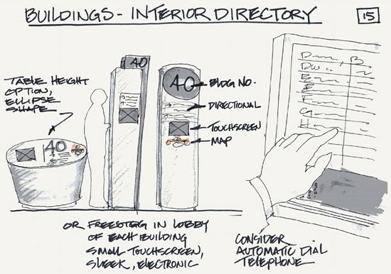
IN THIS SECTION, WE LOOK AT USING EXPLANATORY SKETCHING TO organize and present your ideas. Whether it is a network diagram drawn on a meeting white board or a presentation sketch of a product idea, these visual explanations involve “sense making”: communicating an idea—be it object, activity, or information—in an accessible way that permits an audience to understand its nature and significance. This section describes ways to enhance the clarity and compelling nature of your drawn explanations.
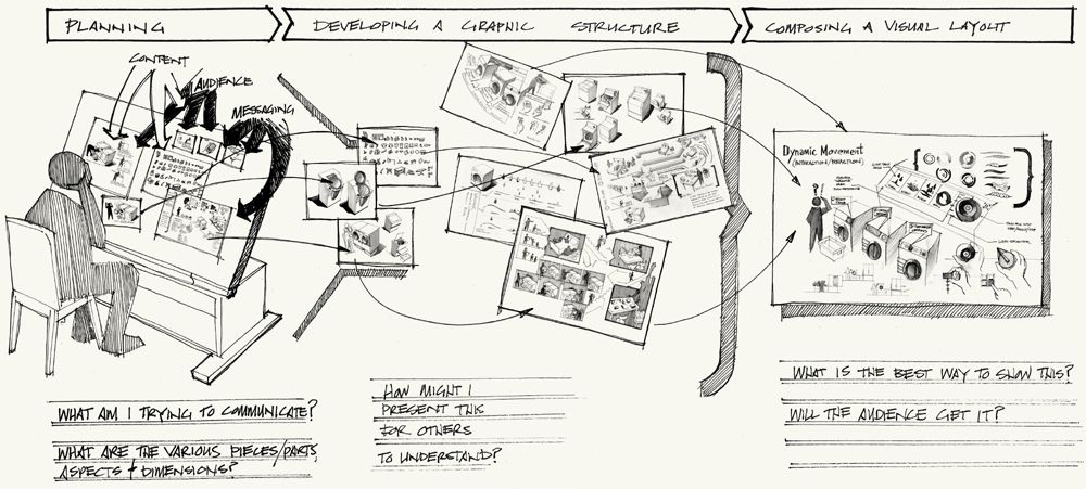
When we explain ideas, we enter a realm where the appearance and organization of a drawing becomes important. To be effective communications, explanatory sketches need to clearly show the character (shape, form, features, and so on), patterns, and contextual relationships (reasons, causes, interactions) that define a subject. In other words, organization is an important expression of your point of view. By nature of choice, your presentation’s form highlights certain qualities while obscuring others. Getting people to see and agree with your point of view requires thought about how your sketch’s content, structure, and layout can be crafted to support understanding and persuasion. An approach to explanatory sketching should include three key steps: planning, developing a graphic structure, and composing a visual layout.
Carefully consider your objectives and approach behind your explanatory sketch. You should be aware of how structures within a sketch and their characteristics help communicate your ideas.
4.1 PLANNING YOUR EXPLANATORY SKETCH
THE IMMEDIATE DESIRE with any explanatory sketch is to start drawing and “figure it out” as you go along. Spontaneous sketching may yield interesting possibilities while exploring ideas, but it produces unreliable results for visual explanation. Taking the extra moment to think and plan promotes more efficient drawing and produces more effective, articulate sketches—something any audience will appreciate.
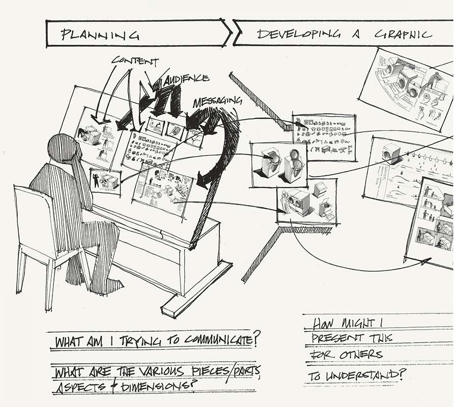

inventory what you know
Start with a text checklist inventory of what you know. Methods of information gathering, such as the “5W’s and H” (who, what, where, when, why, and how) are simple and practical means to build a list of possible information you can use to describe objects, people, situations, or idea concepts.
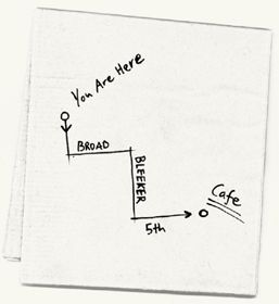
Once you have an inventory of potential information to include in your explanation, next consider complexity. Simple, visual explanations are easy to create when the information and graphic structure are obvious. For example, to visually explain “Where is the café?” we draw a map showing geography and position. Further information adds detail to increase context and relevance, such as a “you are here” marker and a directional route line of how to get there.
| PERSPECTIVE | DESCRIPTION | |
| Who |  |
Characters, entities, organizations |
| What |  |
Activities, objects, quantities |
| Where |  |
Geography, relative position, hierarchy |
| When |  |
Time frame, sequence |
| How |  |
Connection, method/mode |
| Why |  |
Objective, motivation |
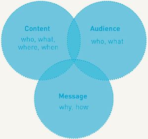
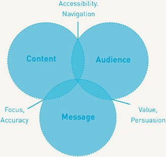
In contrast to such a simple visual explanation, most of our ideas often involve complex, multiple aspects we wish to explain and not just describe. But time is an issue when it comes to presentations. An inventory of information offers little guidance for building clarity and persuasion when we are dependent upon audience attention span and understanding. Great visual explanations of ideas for products, services, or beliefs involve compact, organized arguments that show relevance and value. To build an effective, efficient explanatory sketch we need to look at information through three core elements for idea communication: content, audience, and message. Understanding these elements and their interrelationship offers insight into developing clear, accessible visual explanations that persuade audiences.
UNDERSTAND YOUR CONTENT
Your content is a collection of facts, figures, data, or information associated with your idea. Understanding content involves having a strong grasp of not only this collection and the relationships between its parts but also how external relationships define the content’s perceived shape, character, and role through context. This should be a basic, not exhaustive, process. Recognize your content relationships enough to digest down to the essentials, editing out irrelevant or redundant information while also filling any potential gaps that may exist.
Observation and notation are effective ways to gather an understanding of your content and gain insight into what it is and what it is not. Start with a summary review of your recorded notes, exploratory sketches, and other sources of information. Putting all content in view using a table, wall, or pinup board to spread out inventory and sort your material can help you identify commonalities, associations, underlying patterns, anomalies, and holes.
KNOW YOUR AUDIENCE
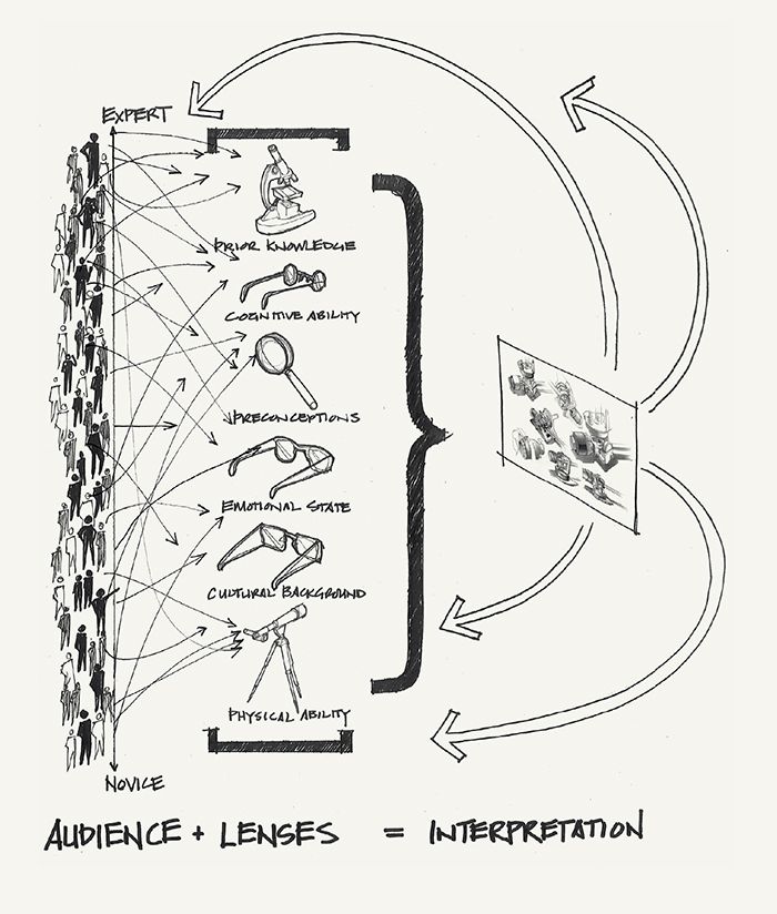
Your viewers are defined by their abilities, preferences, and experiences. Knowing your audience is about recognizing what conditions may affect viewing and comprehension of your explanatory sketch. Your audience has physical needs (for example, vision, reading comprehension, capacity) and cognitive states (frustrations, interests, opinions, a body of prior experiences, and so on). Taking time to know your audience and consider its needs might seem an impossible task given that explanatory sketching can be fast-paced. We can’t fully know and predict people’s behavior; we can, however, anticipate the likely overall condition of our audience and its probable needs.
At a minimum, take a moment before sketching your explanatory sketch to define who your audience is and what they typically need and want. Your audience’s condition and interests should help drive your explanation’s style and argument.
Audience needs considerations:
• Experience and cultural opinions, such as prior knowledge, preconceptions, or biases
• Cognitive ability, such as reading level and ability to process information
• Physical ability, such as visual acuity and sight line with respect to age
• Emotional state
• Pain points
FIND YOUR MESSAGE
Chances are you already know generally what you want to say, but have you taken the time to define it well? To be effective, your explanation needs to express your idea with a clear, well-defined message that specifically frames how you want someone to see an idea. Finding your message is about confirming and prioritizing simple objectives for your explanation (for example, reduce energy use, prevent forest fires, show car efficiency). It often helps to jot down a simple message statement before sketching your explanation. Like a company mission statement, an explanation message statement can help clarify your communication objectives and priorities (even before you consider how they relate to your audience’s needs and interests). Message statements can be a written sentence or paragraph, doodle, or bulleted list that captures the reasoning for why/how you plan to explain your idea. This is an important precursor to creating an effective argument.
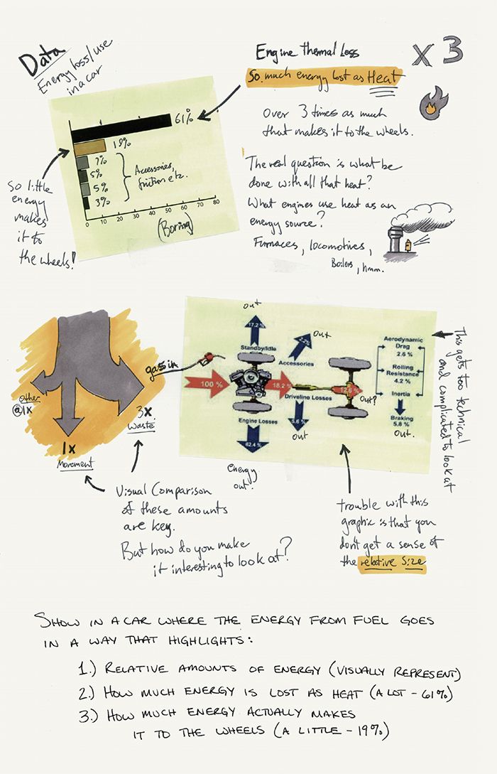
see the interrelationships
Once you understand your content, audience, and message individually, consider their relationship (i.e., message–audience, content–message, content–audience). These relationships provide insight to their mutual influence, such as how the type of audience affects your choice of message. Supporting interaction between the three core elements of idea communication augments the clarity, accessibility, and persuasion in your explanatory sketch.
MESSAGE–AUDIENCE
The message–audience relationship is key for promoting your ideas through explanation—it is the primary source for argument. What parts of your message does the audience perceive as relevant and significant? Persuasive argument includes a comprehensive mix of:
• Logical appeal by means of clear statements of facts that are seen as objective truth. Persuasiveness comes from a rational demonstration of subject knowledge.
• Ethical appeal by means of qualities that elicit trustworthiness, such as a sense of character authority with respect to topic or a relation between source and audience. Persuasiveness comes from a demonstration of relevant credentials and/or personal familiarity (i.e., the speaker can be identified with).
• Emotional appeal by means of aesthetic qualities that elicit an emotional reaction based on prior experience and preference. Emotional relevance often resonates empathy and compassion for universal human needs and shared values, such as quality of life.
Forging these three argument appeals as part of a message–audience relationship involves connecting your message objectives to your audience’s needs and interests. This can help guide an explanation’s development, ensuring that the sketch’s argument is compelling and audience-centric.
Showing elements that qualify expertise and authority is a way of drawing ethical appeal.

Showing important factual detail such as an object’s form and its relationship of parts is a way of drawing logical appeal.

Showing human connection to universal needs and values, often through a contextual story, is a way of drawing emotional appeal.
CONTENT–MESSAGE
The content–message relationship involves focus and accuracy. How clear is your message’s point of view about the content? Does your content adequately support your message? Your message directs attention to show the content’s significance. At the same time, content serves as a message’s descriptive evidence. Establishing a strong content–message connection involves finding links between your message and relevant, supporting content, and then using content order as a lens to focus audience attention toward a specific point of view.
There are two types of content you can link to a message. Effective explanatory sketches include a mix of direct content and contextual content.
1. Direct Content
Direct content to communicate the message itself. For example, drawing:
• A route line on a map to show a preferred path through an environment
• Buttons, edges, surfaces, and physical features to describe an object’s shape and its interaction points
• A bar within a bar chart to show a specific quantity
2. Contextual Content
Contextual content to provide the relative frame of reference needed to see direct content’s significance and meaning. For example, drawing:
• A visual landmark, “you are here” marker, or distance scale on a map for orientation and measurement context of a route line path
• The human figure, hands, the surrounding environment, and other objects (especially related to a system) to show an object’s relative scale and use
• Other bars within a chart to reveal the relative magnitude of a highlighted quantity bar
Finding the appropriate balance of direct and contextual content depends upon an explanatory sketch’s intended use. Urgent presentations, such as emergencies, warrant an almost exclusive presentation of direct content with minimal accompanying contextual content to reduce reading time. Presentations involving complex or controversial ideas may require a higher degree of contextual content to support understanding of form and significance. As you consider direct and contextual content, ask yourself:
• Is it easy to distinguish between direct vs. contextual content and therefore see the focus of your explanatory sketch?
• Does the amount of contextual content adequately frame and not overwhelm direct content?
• Does the content adequately address the characters, causes, situation, and environment that involve and interact with the subject of your explanatory sketch?
• Does the mix or direct and contextual content adequately support your message?
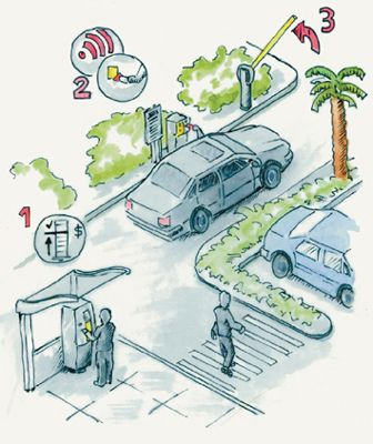
Showing an object in use blends direct and contextual content.
Ordering Content
Your choice of content order (by time, location, and so on) in an explanatory sketch is a message in itself. Order highlights a desired perspective of content. For example, if we choose to order by time, we focus attention on cause-effect sequence relationships. If we choose to order by location, we focus attention on relative position and distribution. Chosen order guides your audience toward the significance you see in the content, strengthening the content–message relationship. Methods of order can be applied alone or layered together depending on need and specificity of the explanation.
Ordering by location in a sketch focuses attention on relative position, distance, and distribution. Location is useful when explaining the function and shape describing networks and objects.

Ordering by letters and numbers (alphanumeric sequence, such as the first letter of the words circle, square, triangle) in a sketch focuses attention on words and nomenclature, often in linear fashion (for example, a phone book). Ways to visually show alphanumeric order include lists and indices.

Ordering by time in a sketch focuses attention on changes in state and evolution, including cause-and-effect sequence relationships. There are inherent expectations of linearity and scale involved with time. Ways to visually show time include time lines, storyboards, flowcharts, and action scenarios.

Ordering by category in a sketch focuses attention on objective or subjective variables, such as size, color, shape, and emotion. It is especially useful for showing group associations. Ways to visually show category include graphic coding (color hue, value, shape, size, orientation, and so on) and position.

Ordering by continuum/hierarchy in a sketch focuses attention on scalar relationships (i.e., ranking). Ways to visually show hierarchy in sketching include changes in size, hue, value, and position within a sketch composition. Showing continuum on sketches in an impartial way usually involves horizontal organization to minimize bias.

CONTENT–AUDIENCE
The content–audience relationship involves accessibility and navigation. Can your audience easily access the content in your explanatory sketch? Does your choice in content correspond with your audience’s knowledge and abilities?
To be understood, your explanatory sketch content has to be conceptually accessible. Establishing a strong content–audience connection involves anticipating how the audience will interact with your content. In the context of planning your explanatory sketch, this means recognizing how an audience’s abilities, actions, interest, and knowledge will affect reading and recognition. Ask whether your explanatory sketch content will be:
• Dependent upon the audience’s experience and prior knowledge for understanding and meaning. This includes issues such as bias impact, word choice (acronyms, industry terminology, metaphors), and graphic coding types (symbols, icons, and pictograms).
• Considerate of the audience’s reading and processing ability, environment, and situation of use (affecting word choice, coding, size, contrast, viewing angle and position, color choice).
• Digestible and navigable in conceptual scale and structure (sentence and graphic complexity; language in respect to age, culture, and disability).
• Absent of confusing redundancies or similarities (visual, conceptual, phonetic, and so on).
If you think your audience may have trouble seeing and understanding your idea content, then consider your choice in content, or take steps to make it more accessible; try streamlining, dividing (with pauses, divisions, breaks), or transforming it through metaphor, or framing comparisons to facilitate comprehension. “Bite-sized” content is friendlier to attention span and working memory. Divisions in your content provide important pauses for your audience to cognitively catch its breath and see meaningful order (a meal is divided into courses with appetizers and dessert, geography is divided and organized by continents); however, too much division can appear fragmented. A good guide to follow is a rule of five to eight: for clarity, divide into and present no more than five to eight separate elements at a time. This applies to groups, codings, bulleted items in a list, and so on.

1. a common everyday thing.
2. a simple, direct comparative match that doesn’t add confusion.
4.2 CHOOSING A GRAPHIC STRUCTURE
AFTER CONSIDERING THE content, audience, and message involved in your explanatory sketch, consider what graphic structures you will use to communicate your idea. A graphic structure is a visual form that provides an architecture for organization, such as a map, diagram, or storyboard. As expressions of content order, graphic structures help explain an object or process by focusing on a desired perception of an idea. This makes graphic structure important to consider as you start sketching. Your choice in structure will play a role in your explanatory sketch’s argument and clarity.

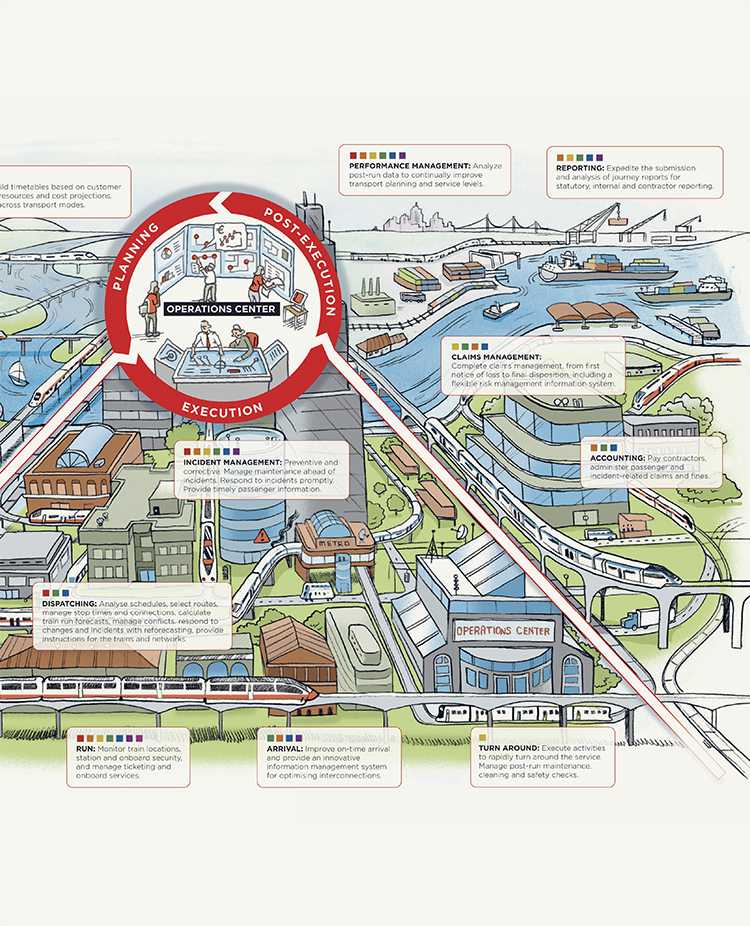
graphic structure qualities and considerations
Between maps, diagrams, storyboards, time lines, charts, wireframes, renderings, and many others, there is a daunting array of graphic structures from which to choose. The visual variety of these options makes comparison of graphic structures difficult. To best understand and evaluate graphic structures, we need to look at how their qualities dictate their role and effect in an explanatory sketch.
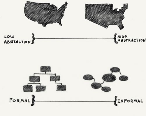
With graphic structures, two principal qualities to consider are abstraction and formality. Abstraction involves the degree of accuracy and distortion in its representation of a subject. Formality involves the degree of explicit character and structure in a subject’s appearance. Each graphic structure involves different levels of abstraction and formality in its presentation. A diagram is more abstract than a map. An isometric diagram is more formal than a wireframe.
Since levels of abstraction and formality are scalable, the distinction between some structures can blur (such as a map vs. a diagram). It is therefore important to look at graphic structures with some flexibility to their definition. Leaving room for adjustment (map or object drawn with diagrammatic qualities) allows us to follow an unspoken rule of thumb that should guide development of any explanatory sketch: For efficiency with respect to your time spent sketching and the audience’s attention span, be as representational as necessary but no more. Be as formal as necessary but no more.

sketches, schemas, proxies, models
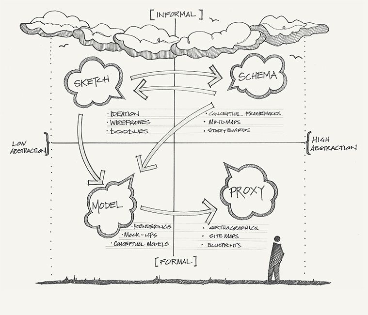
When we look at abstraction and formality together, we see four effective roles that graphic structures can play in an explanatory sketch. These roles are sketch, schema, proxy, and model.
• Sketches are informal yet representational forms that produce suggestive, evocative drawings through their rough, selective reveal. They include wireframes, doodles, and ideation sketches in which there is less expectation about completeness and precision.
• Schemas are informal, abstracted forms that eschew detail for a simplified, summary view that draws attention to conceptual relationships. They include conceptual frameworks, mind maps, and storyboards in which a loose overview assists memory (see A Few Types of Common Graphic Structures).
• Proxies are formal yet abstract representations used as a substitute presentation to show design aspects such as composition and sequence. They include stylized, highly structured presentations, such as orthographic views, information architecture site maps, and blueprints in which consistency supports instructional reading.
• Models are formal, representational forms that faithfully describe an idea in a literal, factual manner. They include highly descriptive and precise renderings, mock-ups, and concept models in which the expectation is for accuracy and detail.
Considering the role a graphic structure plays in your explanatory sketch will help you choose a structure that responds to content-audience–message considerations, discussed in See the Interrelationships. It can also help us see how we can shift the qualities of a structure to better support an explanation. For example, is a high degree of focus and accuracy needed to support the explanatory sketch’s content–message relationship? The need for added focus may move you toward lower abstraction and less formality (a sketch role). A need for added accuracy may move you toward lower abstraction and greater formality (graphic structure in a model role). If audience engagement and persuasion is of primary concern to support a message–audience relationship, you may shift toward lower abstraction and less formality to be evocative (a sketch role). A need for more persuasion may move you toward lower abstraction for clearer logical appeal and less formality for emotional appeal (sketch role) or lower abstraction and more formality for ethical appeal (model roles). Is conceptual accessibility and navigation particularly important for supporting a content–audience relationship? A need for greater accessibility and ease of navigation may move you toward higher abstraction and more formality to methodically direct attention (a proxy role).
Keep in mind that while role recommendations such as these are great ways to respond to needs you identify while planning your sketch, they are not absolute formulas. Also, it is possible to include multiple graphic structures in your layout if needed. What roles offer is a big-picture perspective of function.
abstraction
If we look in more detail at abstraction as an adjustable quality of graphic structure, we see it involves fidelity—the degree of accuracy in description. The importance of abstraction as a useful tool for explanatory sketching is clearest when comparing maps and diagrams. The degree of abstraction affects how audiences perceive an explanatory sketch’s content and message.
MAPS
The graphic structure of a map comes with an expectation of accuracy. Audiences view maps as accurate, representational accounts of environments, objects, and information. Unless contradicted by what is seen or known, a map’s associations with the physical world (features, interactions, distributions, and relationships) cause them to be relied upon as fact. As maps and object renderings demonstrate, we can use less abstraction to persuade through a logical appeal in argument, relying on detail as evidence of our credible knowledge. The more literal and concrete we are in detail and structure, the greater the audience’s assumption and belief in accuracy will be.
DIAGRAMS
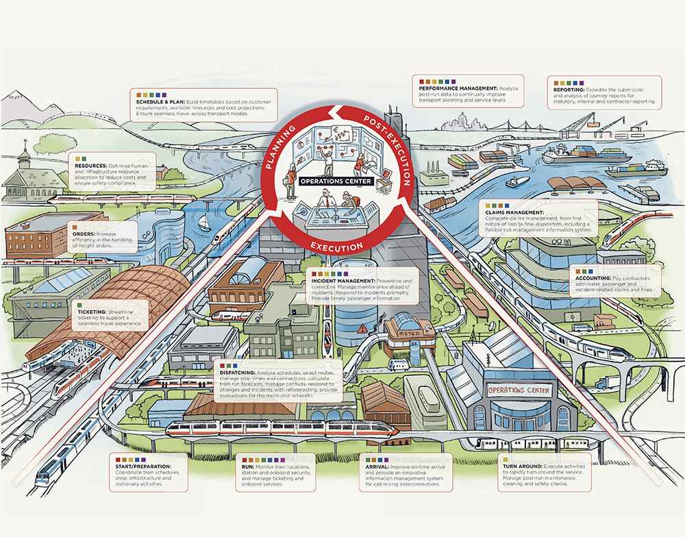
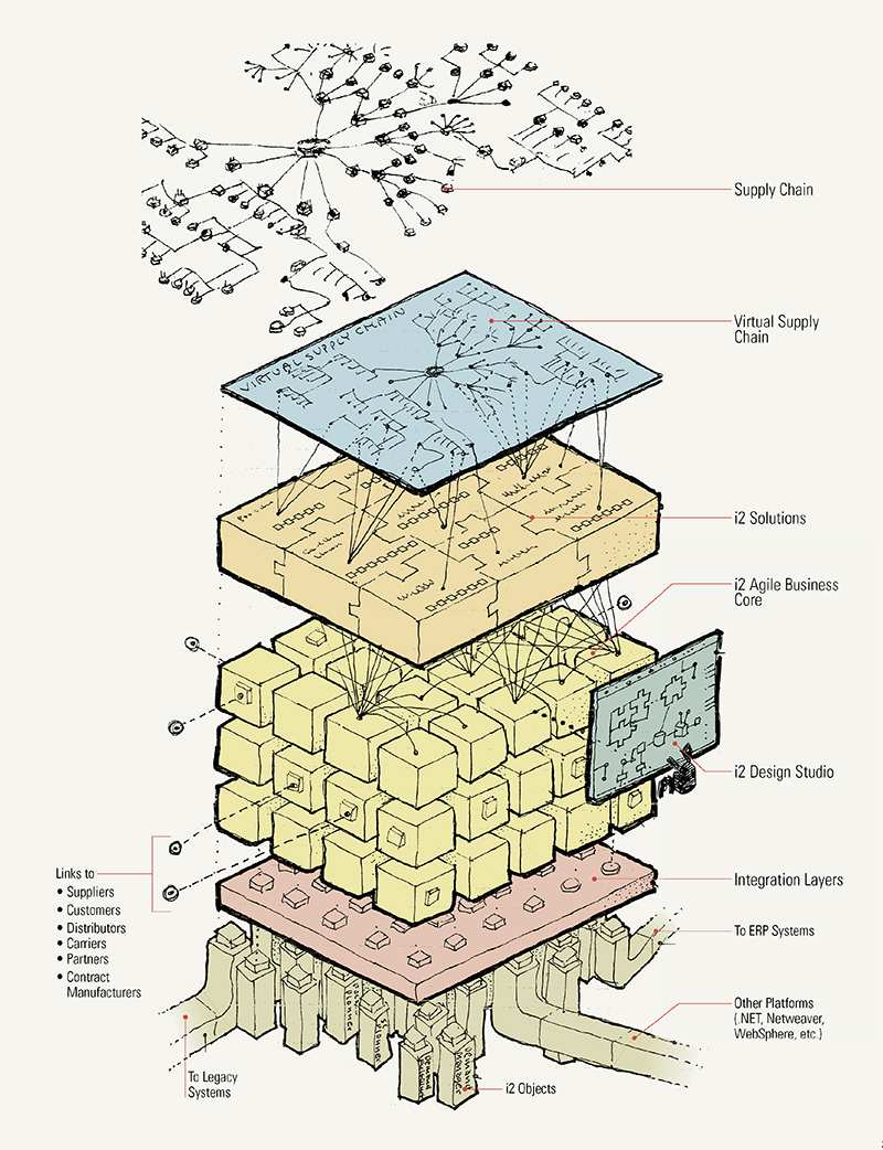
Diagrams are functionally not very different from maps. They describe interactions, distributions, and relationships, but their artificial style and level of detail suggests reductive, symbolic representation. Diagrams come with an audience expectation of efficiency with a directed, distilled view. As diagrams demonstrate, we can employ abstraction to focus attention for clarity and memorability. Flexibility to deviate from reality and use of a stylized visual vocabulary provides freedom to present ideas and physical forms in revealing yet nonrepresentational ways. A diagram, mind map, or blueprint presents information in an artificial way to describe essential relationships in a simplified fashion. An exploded diagram of an object provides insight through a constructively distorted view that is not normally possible.
DIAGRAMMATIC MAPS
Hybrid “diagrammatic maps” best demonstrate a “middle ground” of partial abstraction to enhance visual clarity and memorability. Limited distortion is the mapmaker’s true friend. Simplified curves, lines, and other features can be modified to memorably reveal appealing geometric patterns. Streamlined shapes and route lines can facilitate the audience’s ability to read and understand.

formality
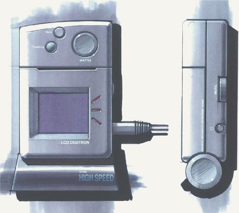
Formality is an adjustable quality of graphic structure involving the degree of explicitness in presentation, often visible through a structured style. Doodles, mind maps, and wireframes include informal qualities that suggest an outline or overview of a conceptual idea that, as a whole, is more significant than its details. This makes informal structures evocative but forgiving. Audiences see informality as a sign of evolving development, with room for interpretation and adjustment. In contrast to this, formal graphic structures are highly specific expressions. The formal qualities of a blueprint, orthographic model, or rendering suggest a concrete view supported by precise detail. Formal structures are often used to assert factual truth. Audiences view formality as a sign of a decisive, complete description.
The added time that is involved in developing formal qualities in an explanatory sketch limits its usefulness. Most explanatory situations favor quick, informal sketch expressions of ideas; however, formality is of practical value where we need an explicitly structured style for visual consistency, facilitated navigation, and a sense of knowledgeable expertise. The use of specialized projections of graphic structures is a good example where applied formality enhances an explanatory sketch’s accessibility and perception.

The complex form of a hockey glove can be depicted through orthographic drawings. When aligned and oriented together, you can see how each perpendicular viewpoint provides enough information to understand the form as a volumetric object.
ORTHOGRAPHIC PROJECTIONS
Orthographic projections are formal views that show objects or environments in a flattened two-dimensional format, usually from the top (plan view) and front and side views (elevation views). The main purpose of orthographic projection is accessibility. Architectural plans and blueprints use orthographic projections to provide consistent proportions that facilitate measurement of individual parts (micro view) and enable a better appreciation of relative size. Orthographic projections are simple and quick to construct; however, if audience understanding of a whole object or environment is important, then the projections need to be accompanied by a three-dimensional rendering for added reference.
ISOMETRIC AND AXONOMETRIC PROJECTIONS
Isometric and axonometric projections are hybrids of perspective (three-dimensional) and orthographic (two-dimensional) views. They show objects or environments in three dimension using parallel lines that do not converge at a vanishing point and therefore omit foreshortening. Isometric projections involve base angles in 30-degree increments, while axonometric projections involve 45-degree increments. As an applied-use formality, isometric and axonometric projections systematically distort to combine the realism of a perspective view with the quicker drawing and facilitated measurement of orthographics. The result is a stylized, modular presentation that explicitly describes features and components.
MODIFYING PROJECTIONS
Combining formality with abstraction in an explanatory sketch projection allows us to provide clarity with views that are either difficult or impossible to see under normal viewing circumstances. Doing so helps direct attention.
Explosions and disassemblies break content into an array of distinct components to better parse and explain the composition.

Cutaways and sections remove or divide a portion of content to reveal layer relationships and underlying hidden parts.

Subtractions remove a large key component of content in its entirety to highlight obscured content and structure.

Inversions show the negative form around an object to emphasize the overall shape of the object itself. This highlights cavities, angles, curves, and other object features that define character and composition.

scale and simplicity of graphic structures
Besides abstraction and formality, graphic structures involve other adjustable qualities that are worth consideration. Two of them are simplicity and scale.
Simplicity would seem a straightforward quality for explanatory sketch success. The common notion is that simpler is better; to reduce clutter and show ideas in a clear, efficient manner, simplify your graphic structures by removing unnecessary detail and ornament. While simplification reduces distracting visual noise, it introduces a paradox. Simplicity can lack interest. Graphic structures in explanatory sketches need to be simple for understanding but also have visual richness and complexity to be engaging. We inherently search for pattern and meaning in what we see; we are attracted and engaged by complexity’s ability to stimulate thought. Graphic structures are therefore a balancing act, employing simplicity and complexity in concert—or as Albert Einstein said, “Everything should be made as simple as possible, but not simpler.”
Scale’s importance in graphic structure involves the impact of vantage point, how the scope of view frames relationships within an explanatory sketch with context. Do you show an object at a distance, or do you show a close-up view that affords space for only a few detail features? Your choice in scale should consider both its informational and psychological effects. A macro-scale view in graphic structure calls attention to “the whole of details,” particularly overall shape and larger patterns among associated parts and features. Distance emphasizes formality and objectivity. In contrast, a micro-scale view calls attention to the relationships of specific features. Closeness is subjective in what it chooses to show and tends to create an intimate presentation that is at times comparatively informal.
When choosing scale for graphic structures with your explanatory sketch’s layout, consider:
• The effect of scale on comparisons within a graphic structure and on the mood of an explanatory sketch.
• How variety in scale when showing multiple graphic structures affects attention and hierarchy (see Depth Cues).
• How unusual vantage points heighten interest.


TRUST IN GRAPHIC STRUCTURES
A discussion of graphic structures in explanatory sketches is incomplete without mentioning audience trust. Visual presentations of objects and information are seen as “real,” and so attract a surprisingly high level of automatic trust. Your audience’s tendency to trust graphic structures is what affords some stretching and distortion for reasons of clarity. For example, most maps can—and should—be stretched to facilitate reading or highlight important information; however, automatic trust of graphic structures brings risk and a high cost if they appear “broken.” Trust is lost if what is seen does not reflect reality because of a major omission or distortion that appears accidental. The result is expansive. If the accuracy of a single feature in a graphic structure is proven false, then the audience will question the truth (accuracy) of everything else associated with it. The more representational and formal the graphic structure, the more this is an issue.


4.3 COMPOSING A VISUAL LAYOUT
AFTER PLANNING YOUR idea’s explanation and choosing one or more graphic structures through which you will communicate it, the next step is to compose a visual layout—how a composition of graphics, text, and spaces fits together in your sketch.
Layout is an opportunity to establish tone with a visual reading sequence. A good sketch layout draws the reader in and directs attention to what is necessary for understanding and action. With explanatory sketches, this involves four major considerations: form for defining space and tone, association for relationships that structure and order, hierarchy for direction in navigation, flow for movement that supports reading sequence.
Putting these considerations together, composing visual layout for explanation involves drawing an expressive form containing a hierarchy of associated structures that provide a reading flow to see your idea. Structures and a related reading path establish a visual narrative sequence that supports processing and understanding. The result should be clear, concise, and progressive.
As you develop an explanatory sketch layout, it is helpful to initially move in drawing scale from macro to micro, starting by outlining major elements and finishing with detail. Doing so avoids unexpected distortions of layout that result from being “lost in space” when drawing on large poster sheets and white boards. Starting to define a sketch at macro scale also steers away from organic drawing that can produce loose, ambiguous compositions that are hard to read.

form
Form involves how layout space is defined by shape and composition. In this respect, form has a communicative effect at all scale levels of layout and helps establish presentation tone. When your audience first reads a layout, especially at a distance, overall shape in form is one of the first things noticed. This makes form a good consideration to start with, as it will roughly outline how the surrounding drawing space will interact with your sketch composition.
Several qualities of form—such as shape, orientation, scale, and balance—help establish the underlying tone and expression of an explanatory sketch. This starts with qualities of the drawing area and its relationship to your sketch composition. Horizontal (landscape) orientation conveys an informal, peaceful tone, while a vertical (portrait) orientation is more formal and active. Increased space bordering your sketch provides a separation from the physical environment that conveys the importance of the subject, drawing the reader in both physically and mentally.
Within a layout, the shape of overall composition and the contours of objects are expressive. By influencing the paths our eyes follow when we look at structure and layout, shape can augment concepts behind ideas; lines suggest progressive and finite movement, circular shapes suggest renewal, and the points in bullets bring stationary attention.
Scale is expressive. Close-up views from visual cropping bring a personal and interactive energy for engagement, showing greater detail and drawing the reader in. Faraway overviews bring a formality with a viewing distance that suggests contemplation and objectivity. Achieving balance in your composition’s form by creating qualities such as symmetry reinforces a sense of solidity and harmony. Imbalance (tension) through qualities such as asymmetry brings dynamic interest and activity.
SHAPES AND THEIR VISUAL CONNOTATION
Shapes communicate at all scale levels of layout.

visual associations
Visual association within layout is fundamental to recognizing meaning through structure and order. Communicating the conceptual relationships behind ideas with explanatory sketches depends upon making connections visible and understood. To fully understand your idea in explanation, the reader must see how parts interrelate at every scale of presentation to form a cohesive structure, from elements to objects and the layout itself. Visual associations of lines, shapes, and words fit together to form identifiable objects, sentences, and sequences that operate together as an ordered visual framework to aid understanding. Whether desired or not, your audience automatically infers meaning from any organization it perceives within your layout. Planned visual relationships are therefore important for clarity and focus in order to avoid arbitrary or ambiguous associations that may lead to unintended interpretation of your idea, its significance and meaning.
Visual perception knowledge of how we process our everyday physical environment can inform our drawing of a sketch layout’s artificial environment. Gestalt psychology principles of perceptual organization provide an easy, basic way to understand how visual qualities produce an associative effect. Principles of similarity, proximity, symmetry, closure, continuity, and common fate work individually or together in additive fashion as the reader’s mind seeks to understand what it sees by simplifying visual elements and objects into recognizable pattern structures. Functional confusion and increased reading effort occurs when intended associations conflict with these principles.
SIMILARITY PRINCIPLE
We associate elements and objects of similar visual nature (in shape, size, color hue, value, alignment, orientation, texture, and so on), no matter how intermixed in space. Degree of similarity within an associated group and difference to items outside this group influence the clarity and depth of association. Coding of drawing information keys is an example where similarity (and difference) is important for clarity. It often helps to reinforce the difference of individual keys using more than one visual characteristic, such as color plus shape.
SYMMETRY PRINCIPLE

We associate elements and objects with a symmetrical arrangement aligned around a focal central point (hub). Proximity affects the clarity and depth of symmetry’s association. Symmetry’s framing quality is a particularly eye-catching means to heighten a reader’s attention. Parentheses and brackets are examples of symmetry focusing attention on the content between the two graphic punctuation forms.

PROXIMITY PRINCIPLE

We group elements and objects of close visual proximity into pairs or clusters. Figure-ground relationships (the relationship of objects to their surrounding background) are important for proximity, since the degree of distance in between elements and objects communicates the depth of association. Items with comparatively less space between them are seen as having a stronger relationship bond. Labeling is an example in which proximity is important for clarity.

CONTINUITY PRINCIPLE
We associate elements and objects according to a perceived visual pattern, such as a line, favoring the smoothest direction that best corresponds to overall form. Flow diagrams and route maps rely on continuity for navigation, often rounding the corners of lines to help make them easier to trace and follow.

CLOSURE PRINCIPLE

We associate elements and objects according to perceived geometric or semantic relationships, reflecting our need to overcome interference or incompleteness. This association partly depends upon our prior understanding and experience. Closure is what allows us to omit or obscure detail in sketches through layering and simplification without sacrificing their understanding. The mind is able to fill in the gaps of what is partially obscured and still see the intended object. The ability to see and still recognize a cigarette in a no-smoking symbol is a good example of closure.

COMMON FATE PRINCIPLE

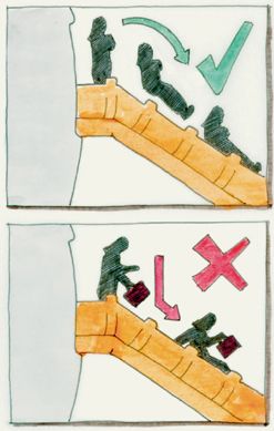
We associate elements and objects with a common direction of movement, either observed or perceived. In explanatory sketches containing a sequential series, such as a storyboard, we experience common fate by associating objects that “move” in common fashion across each frame within the series. In the examples that follow, head and body are associated by common direction of movement on the escalator.

structure in layout
Without a clear structure from visual associations, layout can be chaotic and confusing. Layout structure should be immediately visible in pattern and extent. If missing content or visual qualities lead to ambiguous interpretation, then the structure warrants further consideration or visual reinforcement. Structure should include adequate separation to clearly see its parts, such as features, columns, modules, or blocks. Too little separation can compromise the reading of hierarchy. Too much separation can weaken perceived connection. As an additional rule of thumb, proportions in the figure-ground relationship of objects and negative space involved in separation should avoid a 1:1 ratio to prevent perceptual confusion.
Grids are an example of layout structure used to divide space as an organizational aid. Their presence is an application of visual association that creates meaningful cohesiveness to layout. Grids come in many forms, with cells that vary in size to reflect layout needs; however, grid use should be kept as simple as possible to not overplan an explanatory sketch.
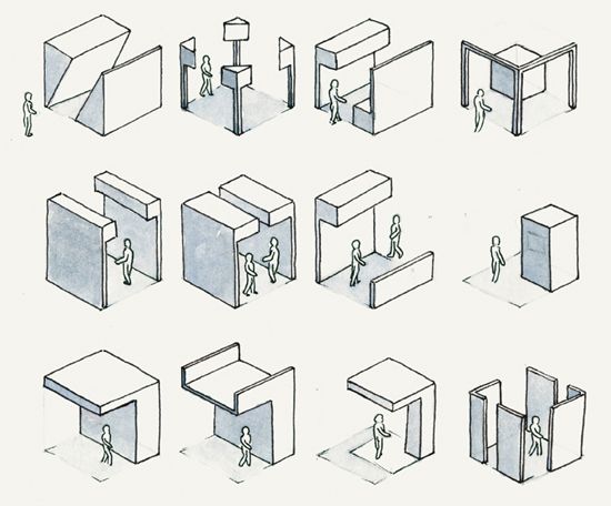
depth cues
Hierarchy within layout is fundamental to direction for navigation. Unfolding an idea in an explanatory sketch depends on directing attention toward a clear visual sequence. Not only does visual hierarchy aid in reading flow but it adds visual contrast for drama, interest, and stronger engagement.
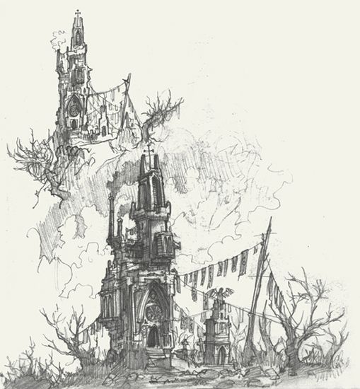
For explanatory sketch layouts, we can turn to visual perception knowledge of “depth cues” to understand how the mind perceives hierarchy from visual contrast in what we see. Depth is deeply tied to interest level. Our sense of depth prioritizes attention of our environment, with objects perceived closer to the viewer receiving greater initial attention. In explanatory sketches, we can use visual depth cues and contrast within layout to establish a visual hierarchy and emphasize direction in reading sequences. On a macro scale, contrast through depth cues can visually highlight a starting point and sequence. For example, changes in rendering fidelity (detail) of drawn objects in layout from low to high indicate evolution toward a concrete final idea. On a micro scale, contrast through depth cues can help separate visual foreground and background elements to help identify groups of associated items. Directing attention in these ways allows us to reinforce explanation timing and order. Depth cues tend to work together in additive fashion; we rarely see depth cues individually in our environment, because they tend to operate in concert. Most depth cues fall into three categories: perspective, occlusion, and focus cues.

PERSPECTIVE DEPTH CUES
We perceive hierarchy through contrast in the relative size, height, and position of objects within the context of an environment or sketch layout’s space. Perspective cues include size/texture gradient and linear perspective.
SIZE/TEXTURE GRADIENT

Objects of the same size appear proportionally smaller the farther away they are from the viewer. This proportional contrast exists in both the overall size of objects and similar features on their surfaces, such as textured bumps or buttons. In explanatory sketches, size gradient brings a reading hierarchy that draws attention to larger objects over smaller accompanying objects. Texture gradient brings hierarchy by providing repetitive surface information that indicates the position and depth of planes and their edges. To establish visual hierarchy, vary the scale of drawn objects and their surface features within your layout.

LINEAR PERSPECTIVE (RELATIVE POSITION)

Parallel patterns of objects or object features appear to converge toward a single point on a horizon line. This is due to reduction in visual scale that perceptually causes objects and object features to appear closer together at farther distances. Contrast in the position of objects relative to one another and the horizon is therefore associated with depth. In explanatory sketches, this helps to move our eyes along a visual series or line. To establish visual hierarchy, vary the scale and spacing of objects accordingly to harness linear perspective’s ability to communicate a flow in direction.

OCCLUSION DEPTH CUES
We perceive hierarchy through contrast from object occlusions, such as overlap. Simplification from Gestalt principles of continuity and closure establishes strong binary sequences that stratify what we see yet offer little information about the degree of depth. Occlusion-based depth cues include overlap/interposition and cast shadow.
OVERLAP/INTERPOSITION

When the Gestalt principles of closure and continuity extend the contour of a partially obscured object into the space occupied by another object, our mind perceives the partially obscured object as comparatively farther back in space. Contrast in the visibility of objects is therefore associated with depth, helping to establish a cascade of depth-associated layers to a scene. In explanatory sketches, layering facilitates comparison through direct overlay with the most important information in foreground. Contrast in the visual characteristics (shape, hue, value, and so on) of each object layer reinforces the sense of depth. Visual similarity weakens it.

CAST SHADOW/REFLECTION

Objects accompanied by a corresponding silhouette on a surface appear closer to the viewer, relative to this surface. Gestalt principles of proximity, similarity, and symmetry influence the degree of depth. Contrast in the corresponding position of shadow or reflection is therefore associated with depth. In explanatory sketches, cast shadow helps separate drawn objects and information from their surrounding background and provides a sense of volume to three-dimensional objects. To establish visual hierarchy, use differences in shadow or reflection to establish layers in composition.

FOCUS DEPTH CUES
We perceive hierarchy through contrast in visual density. Biomechanics of the eye and environmental conditions affect the clarity of what we see, from which our mind infers depth information. Focus-based cues include relative focus, relative intensity, and atmospheric perspective.
RELATIVE FOCUS

Objects with comparatively less sharpness in contour and features appear farther back in space. This is due to constraints in the eye’s lens and fovea that limit optical focus to a specific area at a single focal length (distance). As a result, peripheral objects and objects at other lengths appear blurred. Contrast in the sharpness of objects therefore communicates depth. As the phrase “focus of attention” would suggest, relative focus is connected to attention because of the conscious action it requires. In explanatory sketches, relative focus explains how increased sharpness in detail attracts greater attention. To establish visual hierarchy, include sharper detail on objects of primary importance while degrading the detail on secondary objects.

RELATIVE INTENSITY/ATMOSPHERIC PERSPECTIVE
Objects with comparatively less intensity in value and/or chroma (color strength) appear farther back in space. This is due to both environmental and biomechanical factors. Environmental factors involve interference due to atmosphere quality (for example, haze and smoke) and illumination. Atmosphere quality involves haze from particulate matter suspended in the air, such as water and dust. These dull the contrast value and chroma of distant objects. Illumination involves proximity to a light source. In bright conditions, overexposure reduces the contrast value and chroma of objects closer to the ambient light source, making them appear farther away. In dark conditions, objects closer to a light source are more intensely illuminated and perceived closer to the light source’s position. Biomechanical factors relate to the arrangement of our eyes’ sensory cells that limit color vision to the main line of sight and not the periphery. In explanatory sketches, relative intensity explains how strong values and colors attract attention. To establish visual hierarchy in layout, use higher values and chroma to highlight and separate key information from a background involving a more muted palette. This is particularly useful to separate important information such as overlaid annotations from their referred objects and background elements.
flow
Flow is the difference between good and great explanation. In explanatory sketch layout, flow is the quality that directs the reader’s eye along an intended path. When this path is clear in its shape, structure, connection, and direction, then visual movement in reading facilitates the audience’s cognitive movement through an idea explanation. Flow ensures that the unfolding process in an explanatory sketch is both clear and engaging.
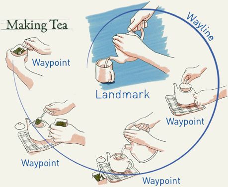
Ensuring visual flow in your explanatory sketch layout involves using form, association, and hierarchy in combination to define a clear visual path that supports reading. A good reading path involves three major elements—landmarks, waypoints, and waylines—and should always include characteristics or instances of all three. Thinking about flow in spatial terms helps to see layout as an environment that requires visual aids for navigation.
LANDMARKS
Layout landmarks are visible entry points within an explanatory sketch layout that act to orient the reader. They include a major contrasting image, text title, graphic, or other dominant visual object within layout space. As one of the first things noticed during reading, landmarks provide an anchor and a starting entry point that help prevent an uncertain, confusing read. Placing a landmark in your explanatory sketch layout should involve thinking about its impact on priorities in your explanation and layout shape:
• What is the first thing you want the audience to notice about your idea explanation? Is your landmark a visual expression of the idea itself (a graphic structure such as an object or system diagram) or another element such as text that introduces the perspective required to understand your message?
• How will your landmark’s presence and position affect the overall shape and structure of a layout and reading flow? For example, if the landmark is a central object, will the reading flow circle around it? Does the position take into account audience considerations, such as cultural reading directions (clockwise, top-to-bottom, left-to-right reading of Western cultures)?
• How will your landmark contrast with its surroundings for visual hierarchy? Will it be clearly primary but balanced against other visual elements to avoid dominating your layout and disrupting flow?
WAYPOINTS
Waypoints are small but distinct graphics and text in explanatory sketch layouts that act to orient the reader and introduce detail information. As lesser visual landmarks, waypoints often identify transitional events or key moments within explanation. For example, a paragraph title serves as a waypoint to indicate the start of a new section or topic. Building waypoints within layouts should involve thinking about the divisions they help identify:
• Clarity in content: As a transitional event in a reading sequence, a waypoint should help to orient the reader with its information. Within a waypoint’s content, the transitional change and an idea-related message should stand out. Visual or semantic ambiguity within waypoints results in confusion that disrupts reading flow.
• Clarity from surroundings: Waypoints should be distinct steps, both visually and cognitively. Their boundaries and visual form should easily separate them from their surroundings, including other waypoints.
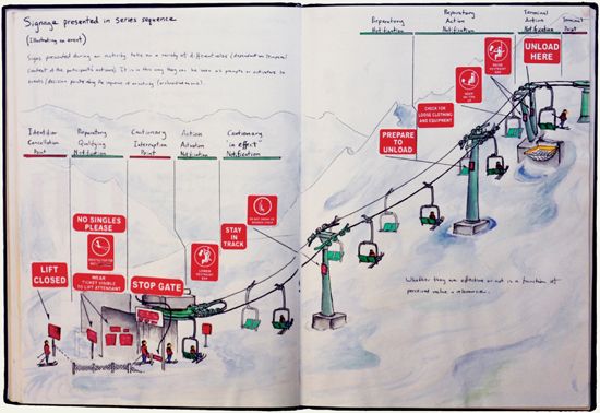
WAYLINES
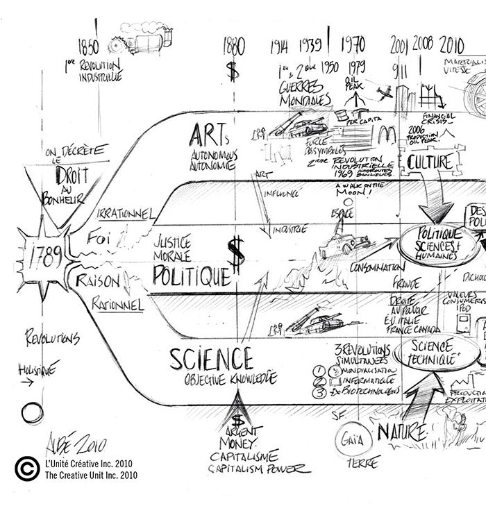
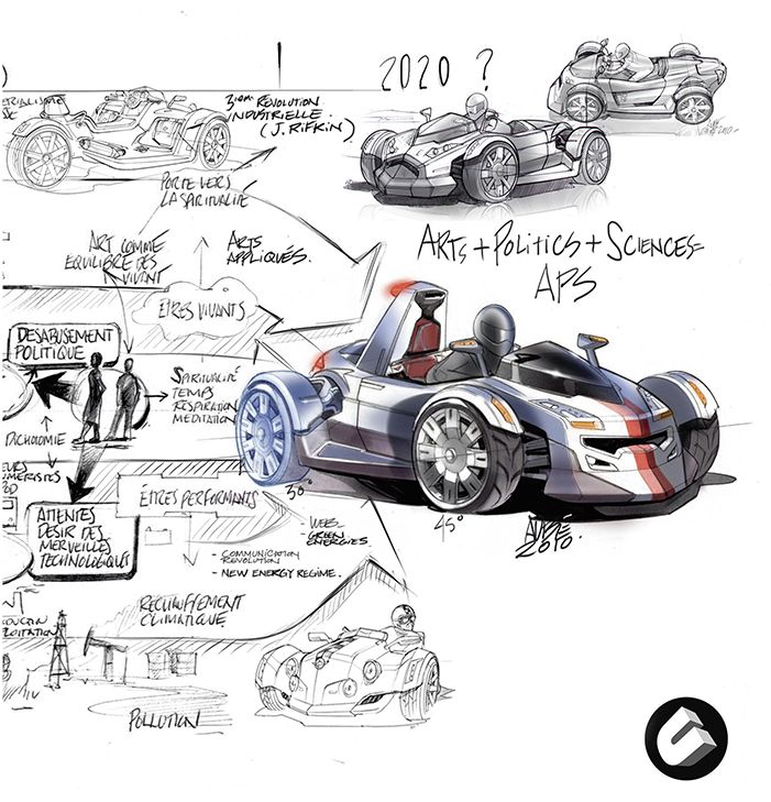
Waylines are a series of objects in explanatory sketch layouts that together, implicitly or explicitly, identify a reading path through layout space. Their linear nature creates a strong flow. Implicit waylines involve landmarks, waypoints, and visual objects indirectly associated through their spatial relationship or common content. Explicit waylines use notational elements such as visible lines, arrows, dots, or text to depict a path of activity and connection. Organizing your explanation around a wayline’s path brings several considerations:
• Implicitness/explicitness: If you identify a wayline’s path implicitly, then consistency becomes important. Standardized increments, shared qualities, or repeated elements are necessary for seeing a common pattern for connection. If you identify a wayline explicitly, notational clarity becomes important. Draw visible wayline elements with different line weights or distinct color to ensure visibility. Avoid long waylines or branching out into more than five lines to ensure legibility.
• Shape: A wayline’s shape is often tied to the effect of overall layout shape. Most readers prefer to follow smooth, simple waylines such as straight lines, curves, circles, or serpentine shapes. Angular or abrupt changes to a wayline’s overall direction disrupt flow.
• Spacing: A wayline’s visual rhythm (pattern) of its components reinforces flow with continuity and pacing. Ensure a strong visual connection, particularly for visual evolutions such as methods of construction, operation sequences, or biological morphs. Too much separating “space” disrupts flow.
• Sequence: Waypoint sequences within waylines should clearly show a reading progression. Two or more waypoints together need to communicate a direction along a wayline. On a local level, look to see whether this direction is clear, considering your audience’s knowledge, and abilities.
• Cultural preferences: Keep in mind your viewers’ cultural reading directions, such as top left to bottom right. Adhering to common reading patterns brings familiarity. Breaking convention adds interest but can cause confusion.


4.4 DETAIL FEATURES OF AN EFFECTIVE EXPLANATORY SKETCH
GRAPHIC DETAILS SUCH as line style, text, and color offer opportunities to augment sketch expression and function. This chapter addresses some of these details and provides advice in the context of explanatory sketches.
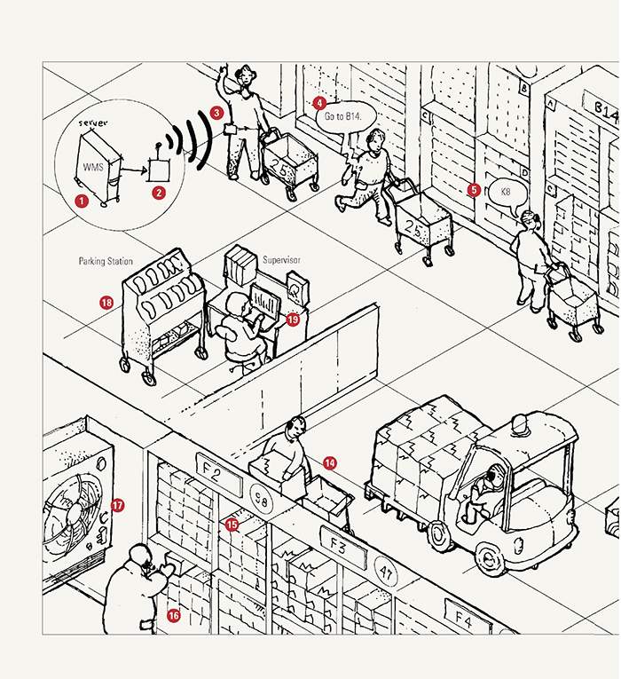
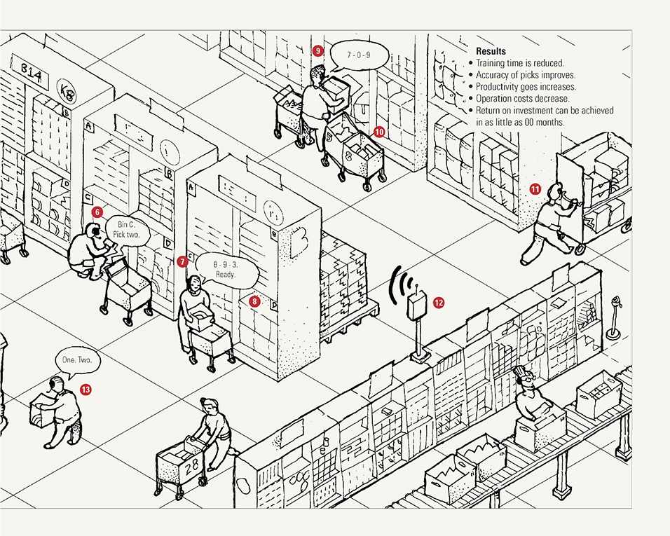
drawn lines
In explanatory sketches, drawn lines have many functional uses. They can define form, partition as a dividing element, and function as a physical link or border. Drawn lines are also emotive marks and can help establish a visual tone in their drawn character, such as calmness or urgency. For purposes of clarity, it helps to consider how line qualities affect function and perception.
LINE WEIGHT
Drawing line thickness speaks of emphasis. In function, varying the line weights in an explanatory sketch helps direct attention by highlighting features and objects, thereby supporting association and visual hierarchy. In perception, line weight is a sign of mood and intent, as evidenced by the physical pressure used to make a mark. It is in part for this reason that we associate bolder, heavier lines with emphasis through a visual intensity. Thicker lines are characteristic of fast, simple, bold gestures, whereas thin lines are more delicate, contemplative, and supportive of detail.

LINE STYLE
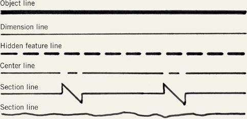
The style of your lines—in color, shape, and form—conveys meaning. Some of this is inherent: we use dashed lines to indicate obscured features because of the partly hidden nature of the line itself. Other line styles depend on convention: engineering has established line styles to communicate divisions, sections, axes, etc. Longer dashes are peaceful, particularly with a high ratio of dash to space. In contrast, shorter dashes project a higher degree of energy. Dashed lines with a 1:1 ratio between dash and space are particularly active because of the seeming vibration created by their equal, ambiguous figure–ground relationship.

LINE COMPOSITION
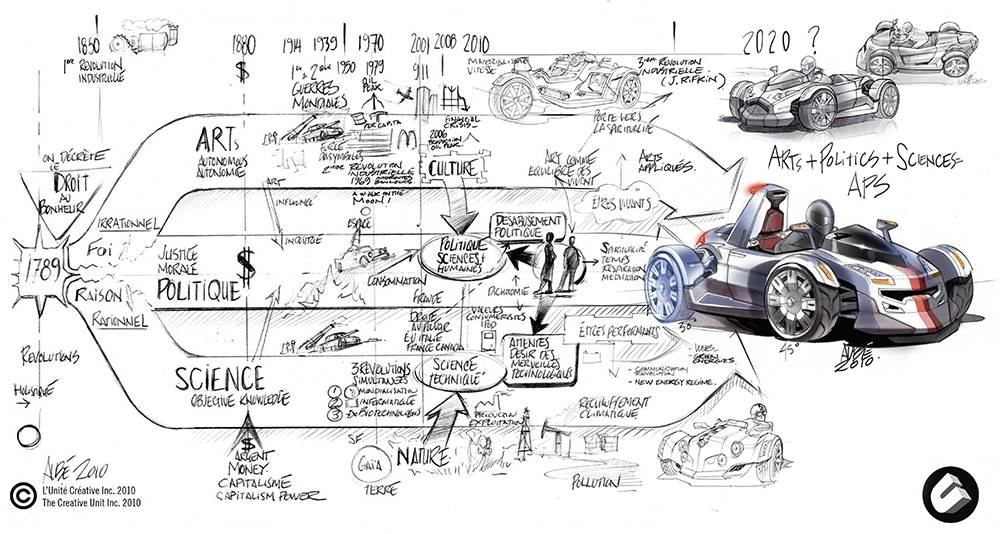
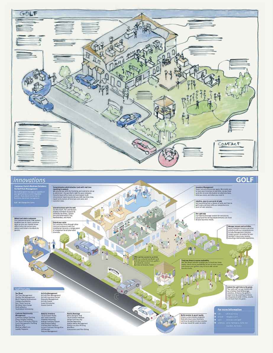
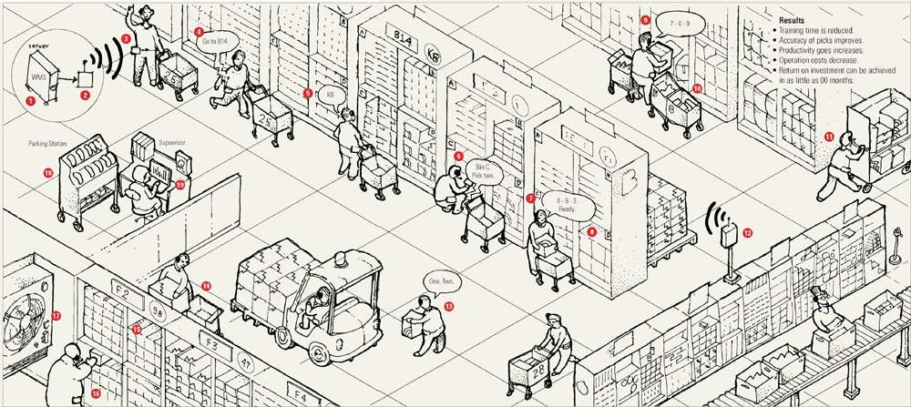
In some explanatory sketches, such as route maps, a drawn line is the primary element of visual explanation. In others it serves as an associating element, such as a leader line to link descriptive text to a drawn object or feature. For explanation purposes, associating line composition should be easy to trace with the eye. In simple layouts (as in the first image that follows), organic drawn lines are recommended. In complex layouts (as in the second image that follows), it is best to simplify and group line paths. This can involve color-coding, dashing, and standardized orientations (0/45/90 degrees) to avoid a confusing spaghetti mess.
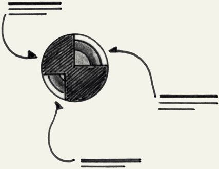
Simple line composition
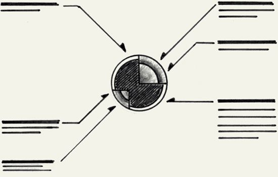
Complex line composition
title blocks and drawing frames
In explanatory sketches it is often helpful to include a framing element such as a box and title block to formalize a presentation. A good title block not only provides a visual boundary to make a drawing more formal and official but is also a valuable organizational reference. When collaborating with others or working on an idea over a long period, it can be frustrating to remember the origin and chronology of a collection of loose sketches without information such as basic dates and version numbers.
Some helpful things to include in title blocks are:
• Drawing title
• Drawing date
• Version or iteration
• Names (client, company, or designer)
• Additional comments
• Considerations
• Next steps for development
• Notes


VIGNETTES
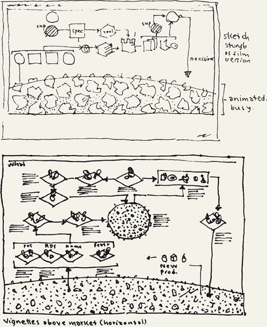
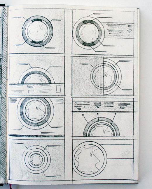
As explained earlier, vignettes are a form of frame used within a sketch that enables you to bound together a group of visual elements in a composition and link it to other similarly shown groupings to suggest a larger relationship. Storyboard templates and comic books are a prime example of their use in support of explanations that involve a timed sequence. Vignettes associate with one another through shared qualities such as size, shape, and alignment. In explanatory sketches, vignettes help to reinforce visual presence and association. The next section in this book about narratives provides more information about their application.

text
Explanatory sketches include titles, captions, labels, and short descriptive statements to provide contextual information that highlights a point of view. Text also is an opportunity to establish tone with its content and appearance. Explanatory sketch text needs to be visible, legible, and easy to understand. This is a matter of both visual form and content. As you include text in layout, consider the reading relationship and sequence between text and graphics. What do you want your audience to pay attention to first? Is there a desired sequence? How will text and graphics reinforce each other? The following advice about text will help you achieve legibility and expression in your explanatory sketch’s text.
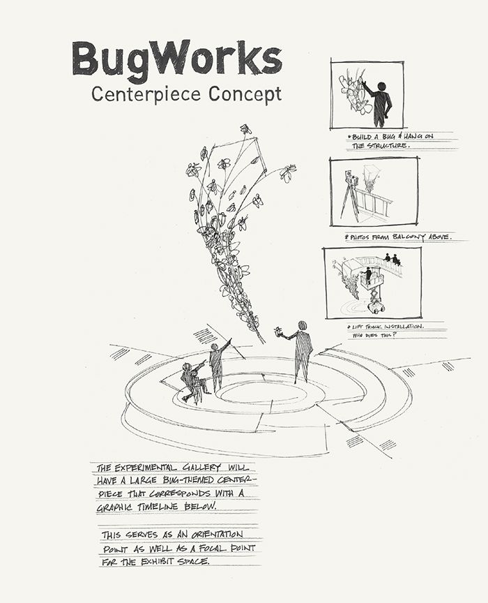
STYLE
Text style is expressive in character with subtleties in its shape, color, angles, and so on. We can use these qualities to create presentation tone with a visual voice. For example, thick, bold letters in red visually shout, while gray, thin letters comparatively whisper in restraint. Text style affords broad opportunity for expression but requires care. Ornate text using drop shadows, silhouette lines, and three-dimensional effects can grab initial attention, but will rapidly decrease legibility and distract from subsequent reading of the remaining layout. As general principles:
• Consider how typographic style and flourishes can augment your point of view by reinforcing a desired tone.
• Use typographic ornamentation sparingly to avoid overwhelming your drawing.
• Hand-drawn text in explanatory sketches should be simple and less prominent to the objects and other graphic structures it accompanies. Audiences expect explanatory sketches to be visually driven and concise. When text competes with graphics for visual prominence in a layout, a conflict results because the reader’s eye will want to favor the graphics first.
• Unless seeking a structural feeling and look with all capital letters, favor a combination of upper- and lowercase letters for easier reading.
SPACING, SCALE, AND CONTRAST
The scale and space—both around and between letters, words, and lines of text—are also expressive.
• Greater space helps establish a calmer tone.
• Vary the scale of titles, subheads, and other text for hierarchy and flow in your layout. Consider type size in respect to desired attention in sequences (larger first, then smaller).
• Uppercase letters in titles and other major text should be approximately 1 inch (2½ centimeters) in height for every 5 feet (1½ meters) of intended viewing distance.
• Text should clearly contrast from its surrounding area. Unusual drawing surfaces and colors, or poorly lit presentation environments, may require emphasizing contrast through color choice, larger text, and/or greater spacing.
PLACEMENT
How and where you place your text in layout can affect its reading and association. Text length, orientation, and alignment are all factors to consider.
• Avoid positioning text too close to graphic structures, especially above drawn objects—a location where text can feel cramped and heavy.
• Draw a topline or baseline (better) as a guide for drawing text.
• Group text and graphic annotations to avoid clutter and preserve white space.
• Keep line lengths and paragraph widths short.
CONTENT AND COMPOSITION
Audience understanding of your text depends on content and composition. Can an audience comprehend its meaning? Is it easy to read? Reading text out loud is a good test. If it does not flow naturally aloud, then it is likely hard to read.
• Aim for direct language that considers audience knowledge.
• Avoid odd visual breaks in sentences, particularly with multiline text.
• Vary sentence length for interest.
• Limit bullet lists to a maximum of five to eight items.
• Number sequences clearly.
TITLES
Drawing titles provide an opportunity for a large, expressive statement that engages audiences and helps make your explanation desirable to read. Decisions about titles depend on their need for prominence in a layout. Does a title need to be read first to frame the explanation with context? Style, spacing, scale, contrast, and position are ways to heighten title attention. Title content is also particularly important. Rather than a descriptive title that simply says “How Coffee Processing Works” or “Bike Helmet Concept 1,” seek to use evocative and personally engaging language. Use titles such as “Roasting for Success: The Miracle of Coffee Production” and “Can a Smart Bike Helmet Save Your Life?” Evocative titles pose questions and make expressive statements that open the door to interest and curiosity in your visual explanation.
ANNOTATIONS, CALLOUTS, AND LABELS
Text annotations, such as callouts and labels, identify and describe parts and features. This text should involve simple terms and concise, common language for ease of reading and less distraction from your drawn objects and other graphic structures. If you are not sure about what you want to say, write it out and then cut the length in half by removing unnecessary words, particularly prepositional phrases, adjectives, and adverbs. Look to reduce adjective and adverb clauses (for example, “This idea which is innovative for transportation” becomes “This innovative transportation idea”). Short statements are more authoritative than longer, emotive paragraphs.
Just as with leader lines, alignment is particularly important with labels. When labeling your explanatory sketch, group and organize your labels in a consistent alignment and with appropriate space from your sketch. This avoids clutter and helps to separate your labels from the rest of the drawing.

color: associating important information with color appeal
Color use is a difficult detail feature of explanatory sketches. It can elicit an unpredictable, strong reaction because of personal taste and deep cultural association. The benefit to color is in its appeal and function. Used well it not only adds life to a sketch but also strongly directs attention, helps associate important information, and can provide a scale for measurement.
For clarity of explanation, always use color sparingly. Overuse of color dilutes emphasis with a rainbow that is as distracting as it is undistinguished. Simple, limited applications of color are invariably stronger in graphic effect and appeal. Enhancing your explanatory sketch depends on understanding some basic principles:
• In drawing, there are three basic applications of color:
1. Color as a ground element to set a drawing apart from its page and add atmosphere.
2. Color as a figure element to add dimension and presence to drawn objects and graphic structures.
3. Color as a detail element to emphasize components or features of objects and graphic structures.

• When color is used in a graphic code, a scale, or serves to differentiate information or objects in an explanatory sketch, anticipate the possibility of color deficiencies in eyesight, particularly with red/green color blindness. Color hue should not be the sole means of differentiation. Other variables such as shape and value should help differentiate objects and accommodate impaired audiences.
• To enhance the clarity of a drawing and support visual hierarchy, background elements should favor “ground” colors for rendering most shapes and defining major areas. Ground colors are usually low intensity and light values, such as warm and cool grays, and pastels, that preserve the visibility of hand-drawn lines in a sketch, thereby maintaining that sense of a sketch as a conceptual draft.
• Important and highly directional elements should sparingly involve a “spot” (highlight) color that is comparatively intense in hue relative to the overall drawing. Spot-color usage is best to bring particular attention to annotation labels and detail features such as annotations, small buttons, lights, and dials that might otherwise be overlooked. Minimal applications are cleaner and increase attention to highlights.
• Bold, dominating colors indicate a higher degree of rendering fidelity (accuracy) to a drawing.
• Avoid pairing colors of similar value to avoid a vibrating effect.
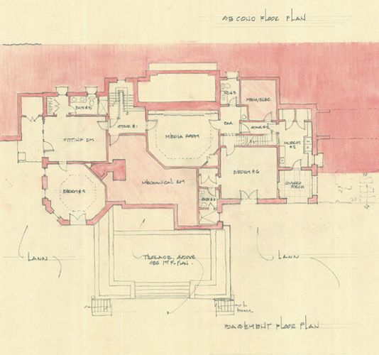
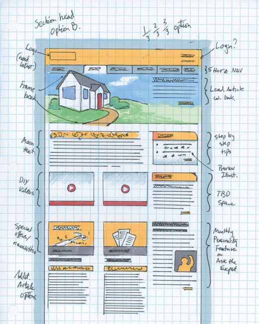
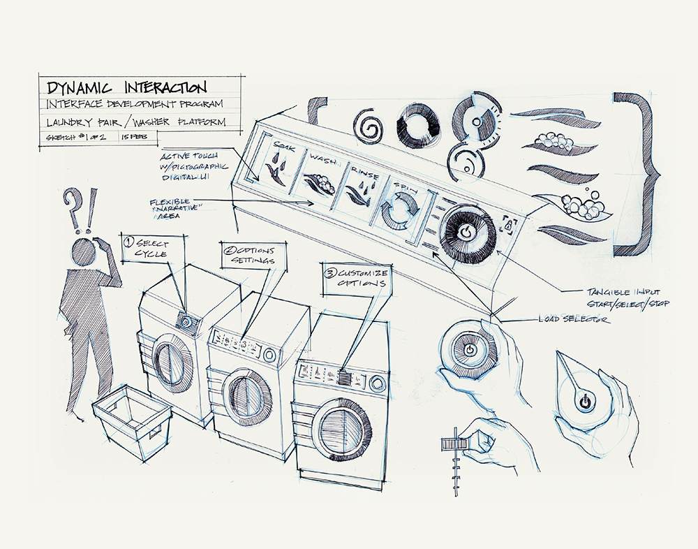
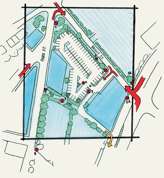
Architectural floor plan
User interface study
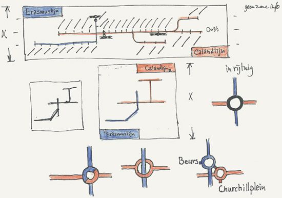
Transit route map study
orienting features
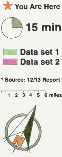
Explanatory sketches depend on a collection of features for orienting information. This includes objects and figures shown for comparative size, scales for measurement, compasses, information keys, and “You are here” markers. Such familiar features are essential context for recognizing meaning and significance. A tool is hard to appreciate in size without the context of a hand holding it. A map has little use for navigation unless we see its context relevant to our position and where we want to go. Orienting features provide a link that creates a personal connection between reader and idea by answering common questions such as “How do I hold this to make it work?” and “Are we really that far away?”

Here are a few principles for orienting features:
• With the exception of “You are here” and other origin/start markers in maps, most orienting features should be secondary in visual hierarchy to objects or graphic structures. For example, in an industrial design sketch, a hand shown holding a tool for human scale should be less detailed in rendering than the tool that is the subject of explanation.
• For comparative scale, a familiar reference is important when showing unfamiliar objects in your explanatory sketch. Provide your audiences with a stable, everyday object that they are familiar with, such as a coin. Visual references that are uncommon, not immediately visible, or drastically variable/ambiguous in size are problematic. A height comparison to the Empire State Building in New York is hard to appreciate by someone who has not seen it. Screwdrivers and trees are poor objects for comparative scale since their dimensions vary widely.
• For a strong connection between an orienting feature and its related object or graphic structure, keep the space between them small, or emphasize their association with a visible connection such as a leader line.
COMMON ORIENTING FEATURES
The following are orienting features frequently used to provide context:
• Objects for comparative scale, such as the human figure, a hand, pencils, coins, and cars
• Scale marker
• Information key/legend showing meaning of colors and symbols used
• Grid lines (to assist in measurement)
• “You are here” marker
• Physical landmark
• North arrow (also called a compass rose) that indicates cardinal direction
• Clock or other indication of current or elapsed time
• Rule lines that provide spatial context to recognize scale changes and the depth relationships of objects (for scale)
• Source or credit line
signs and symbols
Explanatory sketches frequently rely upon signs and symbols such as pictograms. Such coded associations and symbolic representations provide a quick, compact way to convey concepts such as stop, on/off, airport departures, and baggage claim. Sign and symbol effectiveness depends on your audience’s ability to recognize and understand their meaning. This requires forms that correspond to cultural exposure and topic familiarity. A largely universal object such as a bus provides a recognizable symbol to represent public transportation. Invisible phenomena, such as wind, or culturally specific phenomena, such as rodeos, can be difficult to visually symbolize and depend upon cultural experience for recognition.
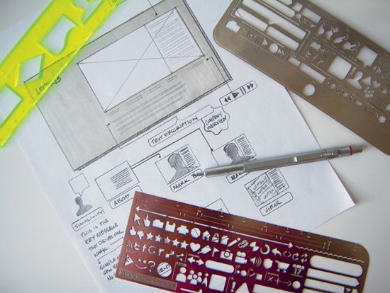
Templates from UX Stencils
Here are some general principles for sign and symbol development and use in explanatory sketches:
SIGNS
These are basic visual forms with a coded association to ideas (for example, a check mark, an arrow, or a star used to identify a location).
• To avoid confusion and unintended association (grouping), visually differentiate signs as much as possible. Use at least two methods of coding (for example, shape, hue, value).
• Unless a sign is pervasive in the audience’s environment, don’t assume it is readily understood. A sign’s dependency on convention and environmental context can make recognition and understanding largely depend upon cultural experience (industry, society, region).
• Accompany signs with text to reinforce meaning, particularly in initial introduction or through an information key for reference.
SYMBOLS
These are pictograms and other graphics that are visually simplified representations of objects and actions.
• Where possible, favor use of popular, “known” symbols to save time and ensure familiarity, such as an airplane to identify an airport, a trash can to identify file deletion, and so on.
• Consider abstraction level, scale, and simplicity. This is a balancing act; elaborately drawn symbols contain unnecessary detail and may be harder to quickly recognize at a distance, while overabstracted symbols risk misreading.
• Consider alternative viewing angles if you are having trouble drawing a representative symbol.
• For aesthetics and ease-of-reading, make symbols graphically consistent in style. This involves recurring internal shapes, stroke weights, and so on. A mash-up of significantly different symbols is less cohesive and authoritative.

putting it all together
Explaining your ideas in a clear, persuasive fashion requires thought about craft and how your visuals relate to your audience. This is perhaps why a great explanatory sketch requires some planning and thought. Compared to notational sketches, a little more polish and voice is required for explanation. Your informal sketch or more formal drawing needs to stand out and communicate faithfully and clearly what you want to say. It is a fundamental necessity that a visual explanation be both visually engaging and as efficient as possible in presentation. Audiences have little patience for visual confusion. Designers with great ideas have a limited chance of success if their sketch can’t be understood. Success, therefore, depends upon understanding the nature of your communication (content, audience, message) and the means to realize it through the visual structure and layout. This is what it takes to make a great explanatory sketch.
